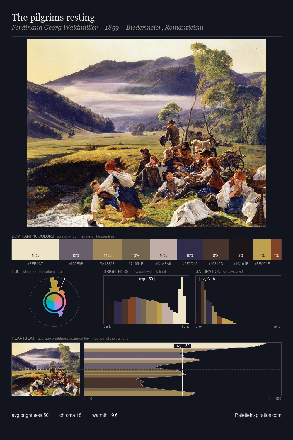
Gerard David Palette 7

Palette Analysis
Values in Gerard David rest in the mid-range - neither dramatically lit nor steeped in shadow. Gerard David tilts toward cool - blues and silver-greys carry the structural weight. Every colour is desaturated; the palette proceeds through near-neutrals and gently-coloured greys. At 10.6%, #1B1D38 carries the palette's sharpest chromatic charge: an accent that earns its place precisely because it is withheld. 54 units of value spread create a palette that is varied but unified - contrast in the service of harmony. The mid-to-high key, cool bias, and moderate chroma point to outdoor observation - sky and diffused daylight as the dominant light source. Palette 7 sits within the larger chromatic argument that Gerard David's complete body of work advances.
Example use cases
- premium streaming
- cocktail bars
- fashion campaigns
- book covers
- music labels
I Love This!
Copy, export, or download for your project