Emile Claus Palette 1
Blazing Cream
Blazing High-chroma, high-key - the intensity of open flame or direct sunlight.
Cream Warm white - slightly yellowed, rich, the color of heavy dairy.
Palette Analysis
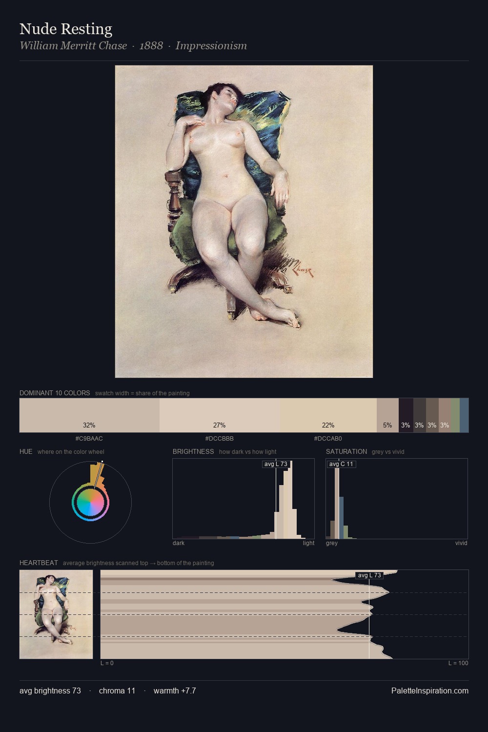
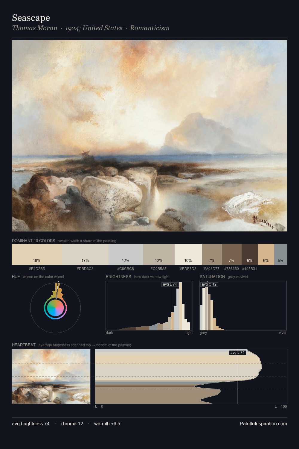
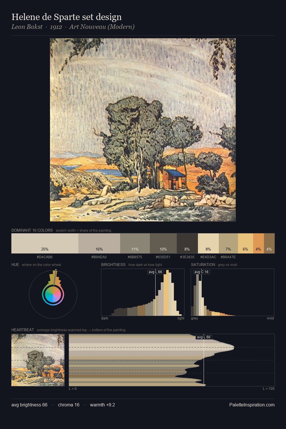
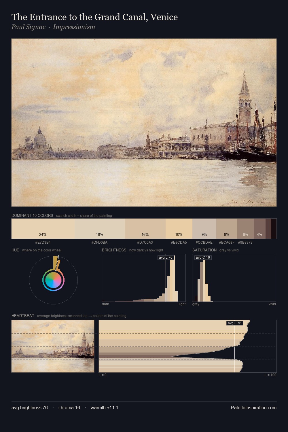
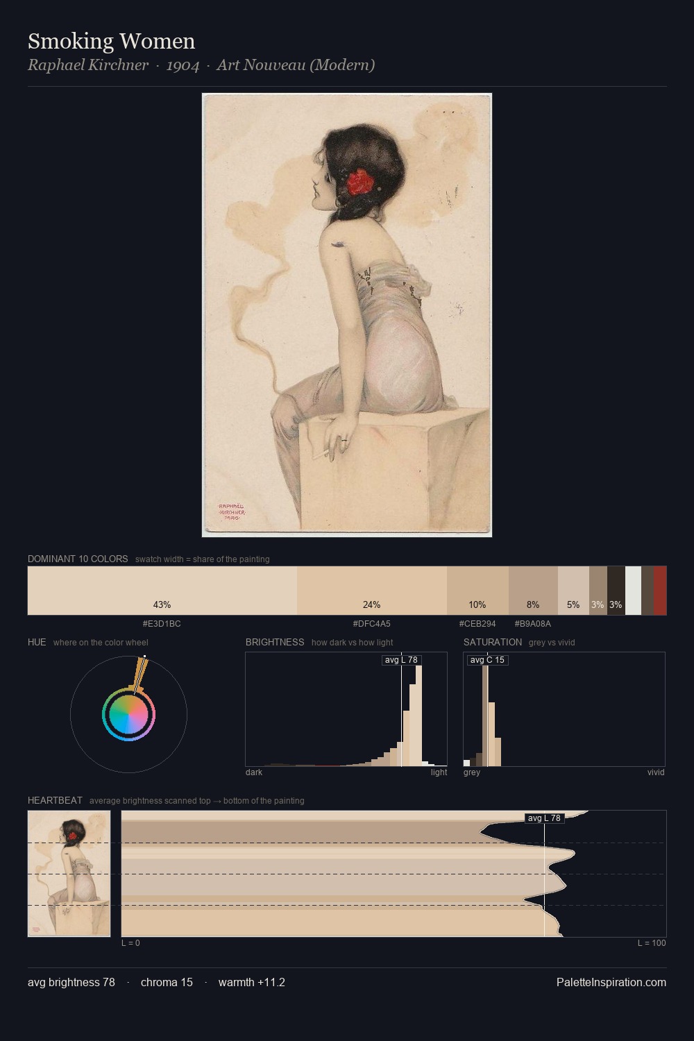
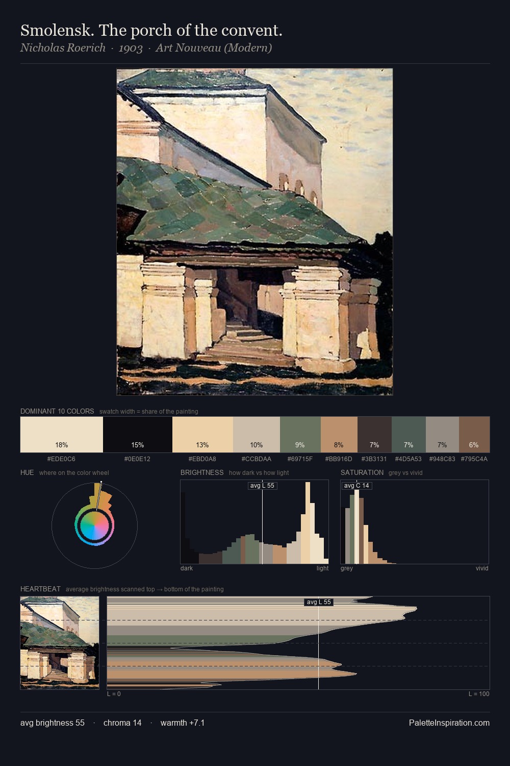
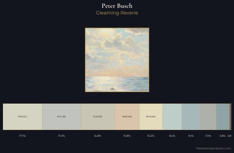
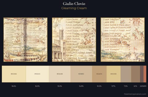
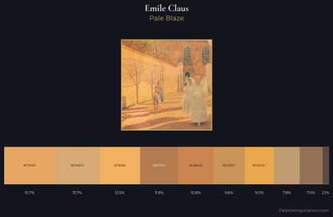
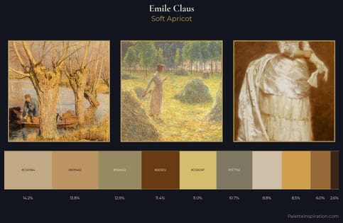
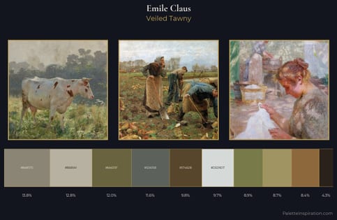
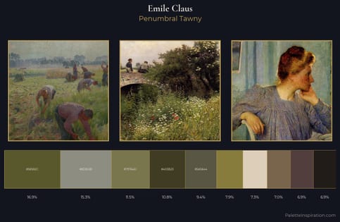
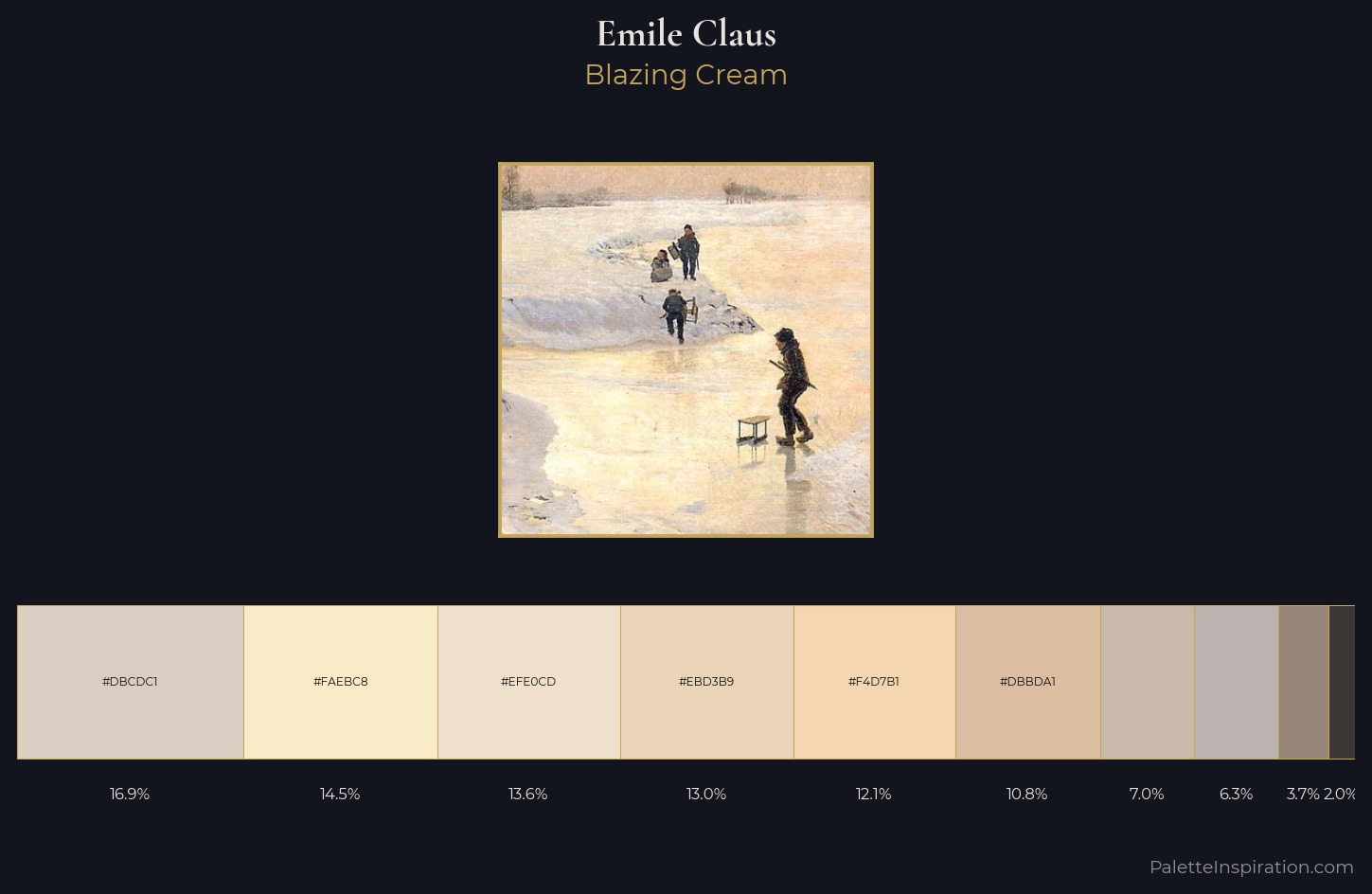
Values in Emile Claus tilt decisively toward white, giving the palette its luminous character. Warm hues command this palette; Emile Claus favours the reds, oranges, and yellows of firelight and earth. Chroma is kept low across all colours, producing the soft, enveloping quality that characterises tonal painting. #EBD3B9 delivers the chromatic peak at only 13.0% - a small shot of colour with outsized visual impact. The full value range is 60 units: broad enough to build convincing three-dimensional form. Palette 1 sits within the larger chromatic argument that Emile Claus's complete body of work advances.
Example use cases
- design agencies
- product brands
- e-commerce
- editorial sites
- publishing
I Love This!
Use This Palette
Copy, export, or download for your project
Copy, export, or download for your project
Copy:
Download:
Share: