Giulio Clovio Palette 1
Gleaming Cream
Gleaming Bright and polished - high-key, often warm, suggesting reflective or luminous surfaces.
Cream Warm white - slightly yellowed, rich, the color of heavy dairy.

Palette Analysis
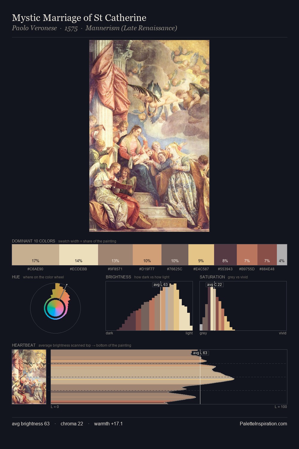
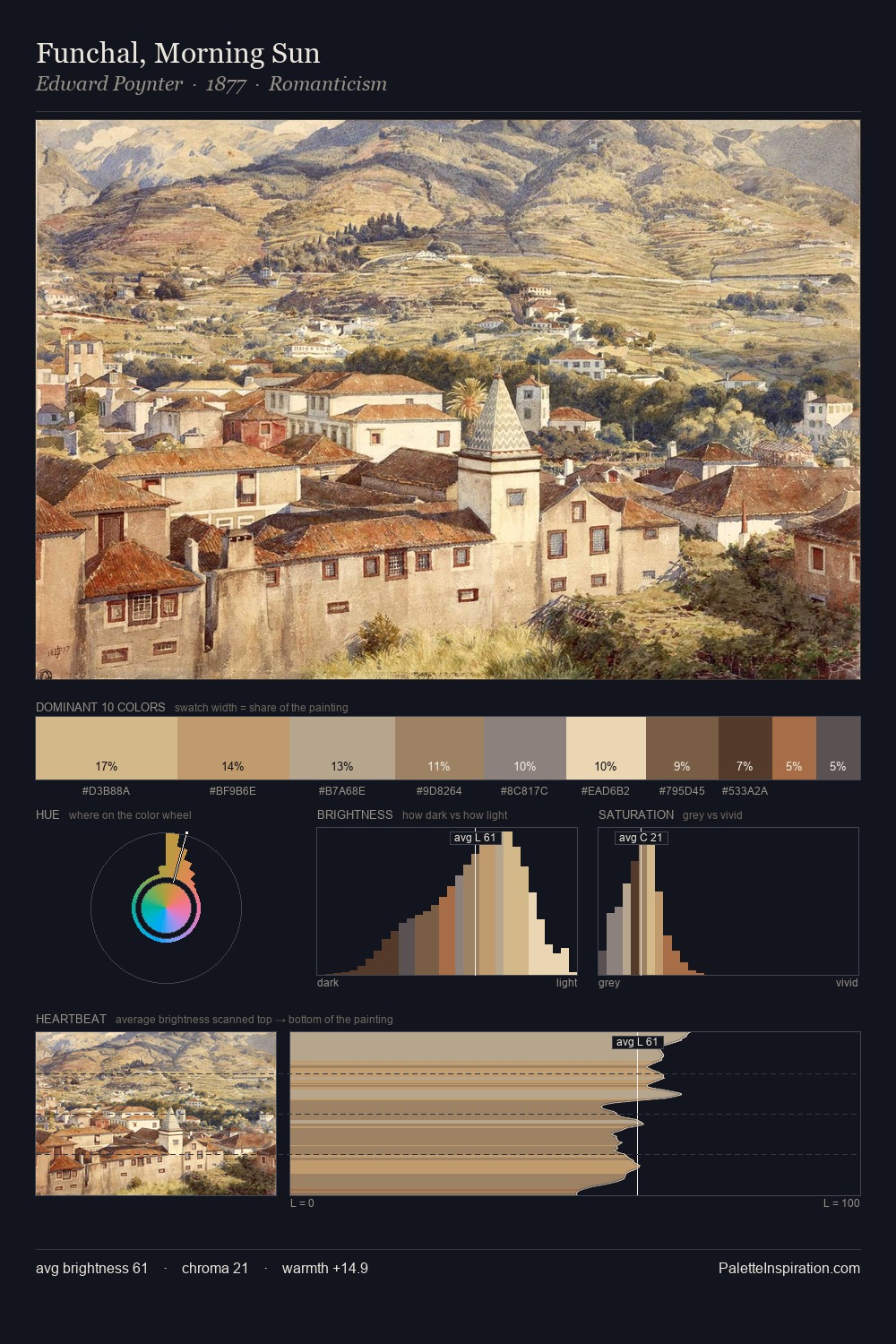
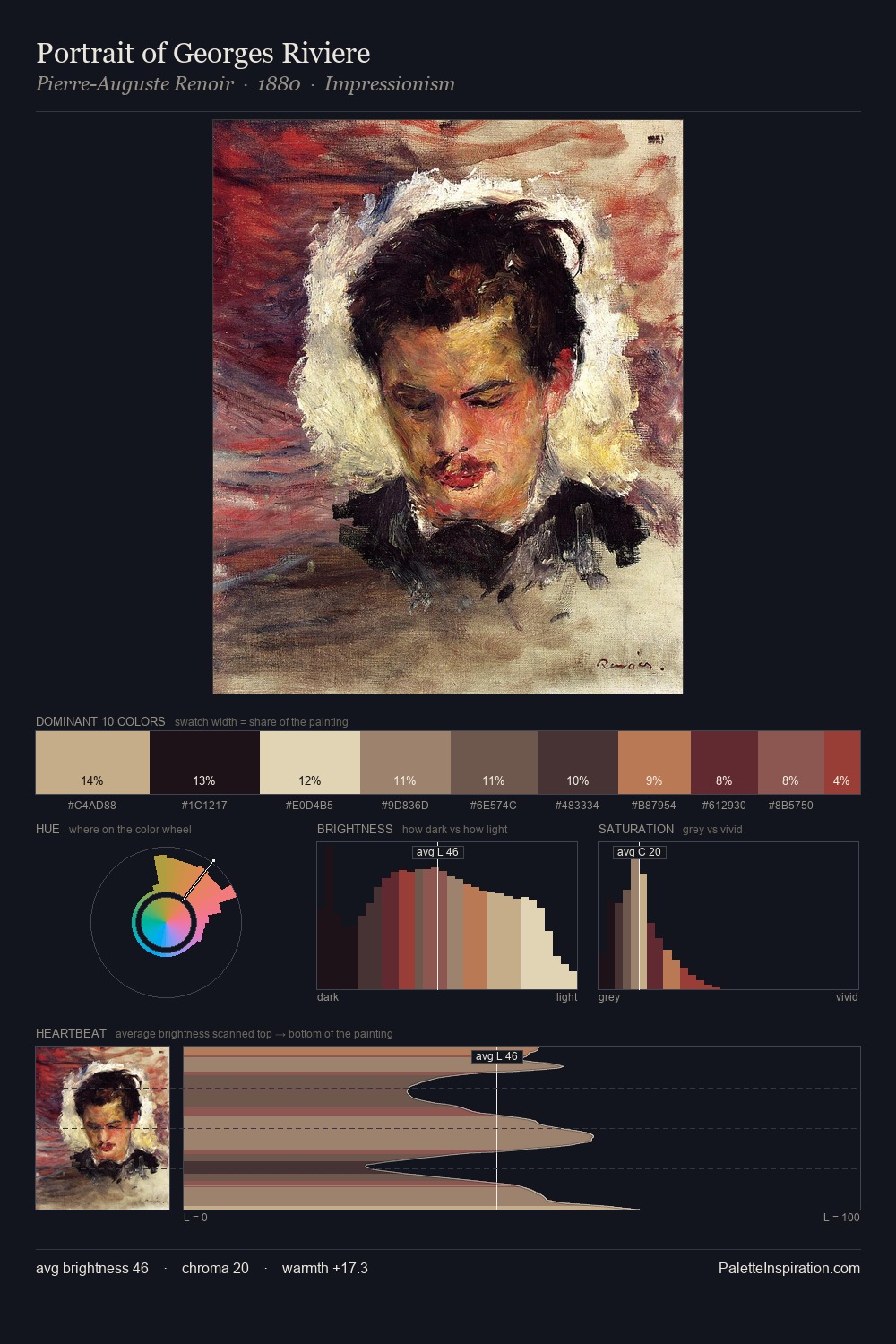
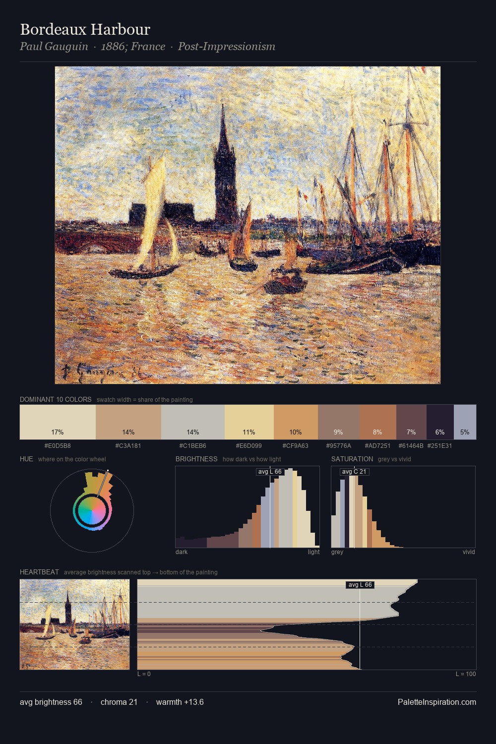
Values in Giulio Clovio tilt decisively toward white, giving the palette its luminous character. Giulio Clovio tilts toward cool - blues and silver-greys carry the structural weight. The absence of saturated colour is itself an expressive choice: this is a palette of restraint and atmosphere. The highest-chroma note - #BD7056 - appears at just 1.8%, deployed as a precision accent against the quieter ground. At 46 units across the value scale, the palette keeps contrast readable without letting it dominate. High luminosity and cool temperature suggest the plein-air condition: unfiltered daylight and open sky. This is palette 1 of Giulio Clovio's sequence - a single chapter in a chromatic story told across many works.
Example use cases
- publishing
- corporate identity
- consumer apps
- hospitality
- design agencies
I Love This!
Use This Palette
Copy, export, or download for your project
Copy, export, or download for your project
Copy:
Download:
Share: