Emile Claus Master Palette
Veiled Apricot
Veiled Partially obscured light - mid-dark with a hazy, scrim-filtered quality.
Apricot Soft warm orange - peach-adjacent, the color of ripe stone fruit.
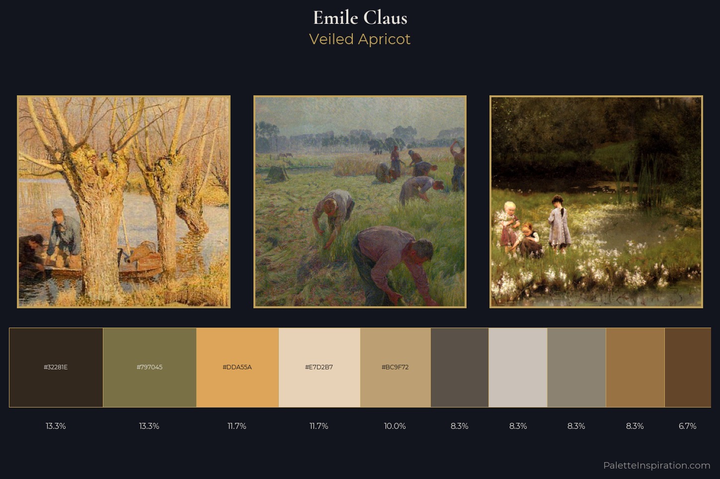
Palette Analysis
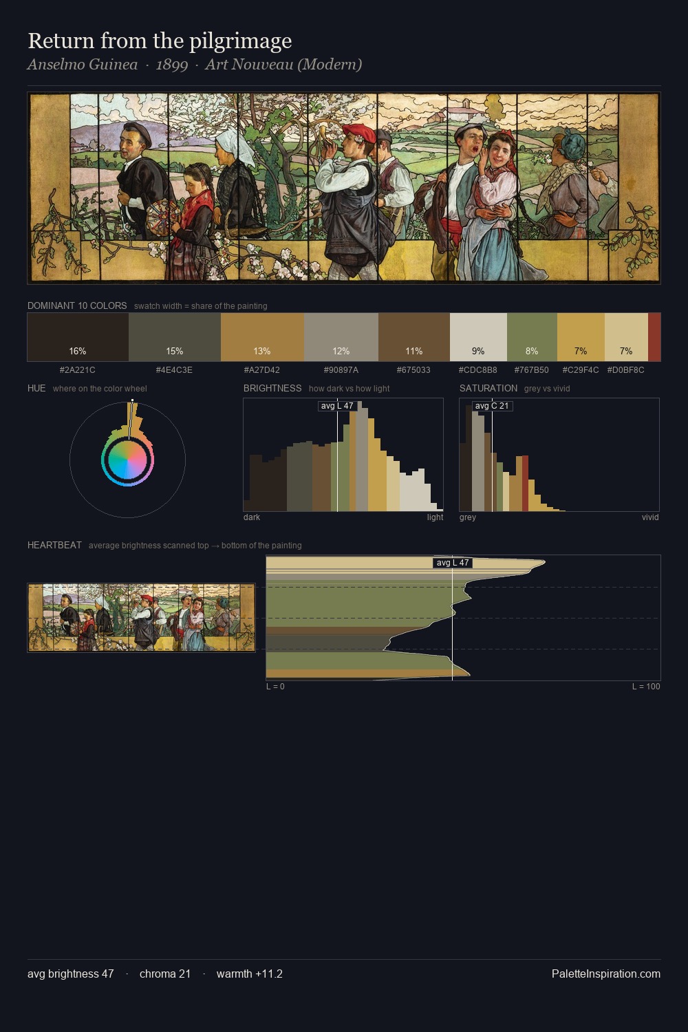
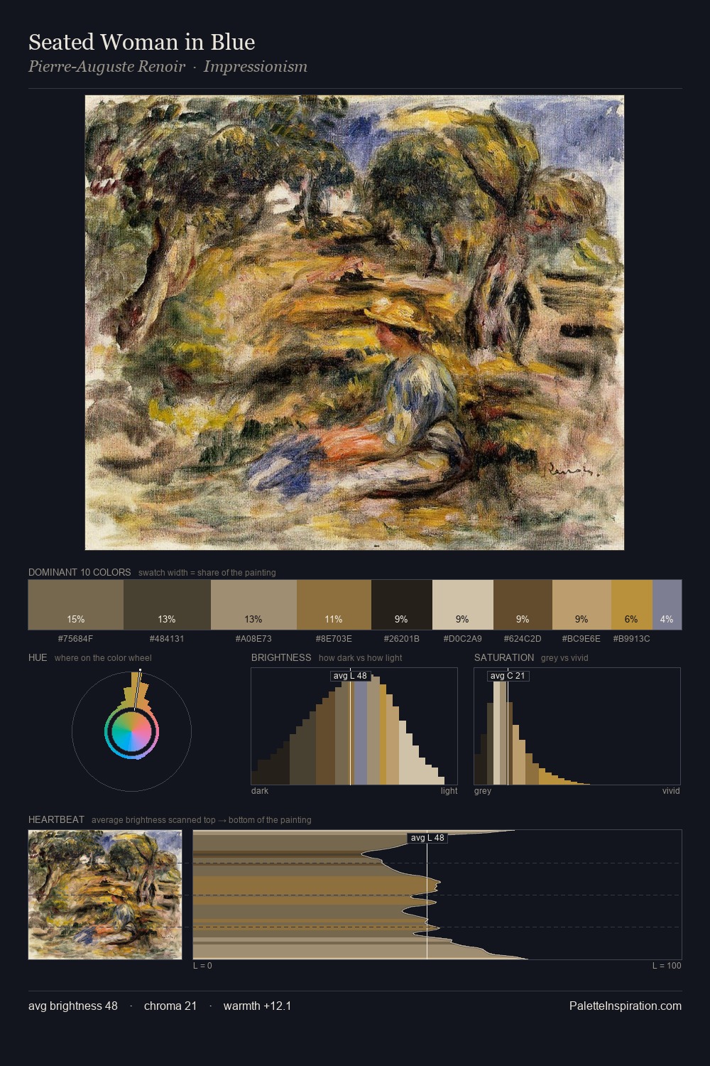
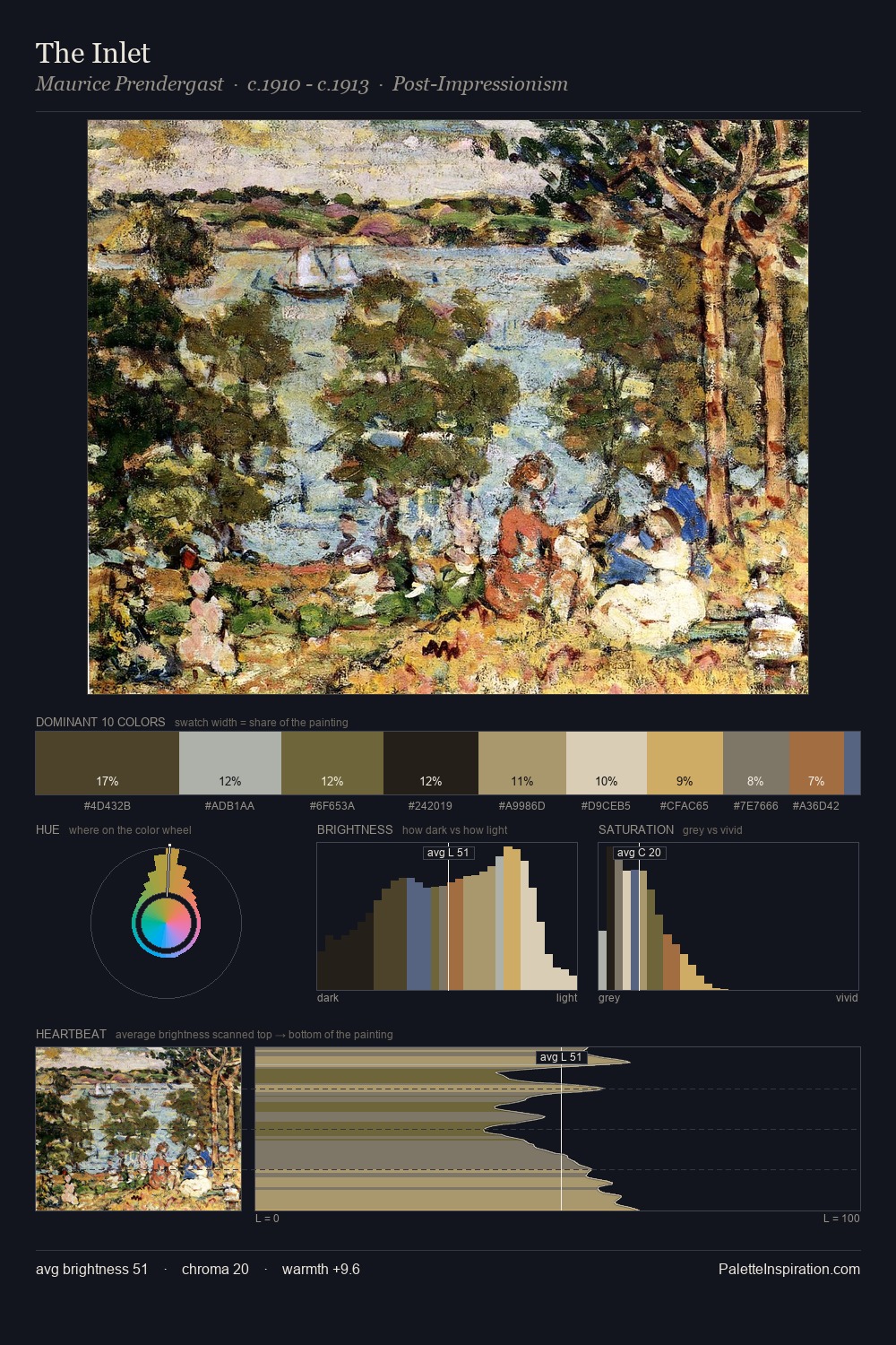
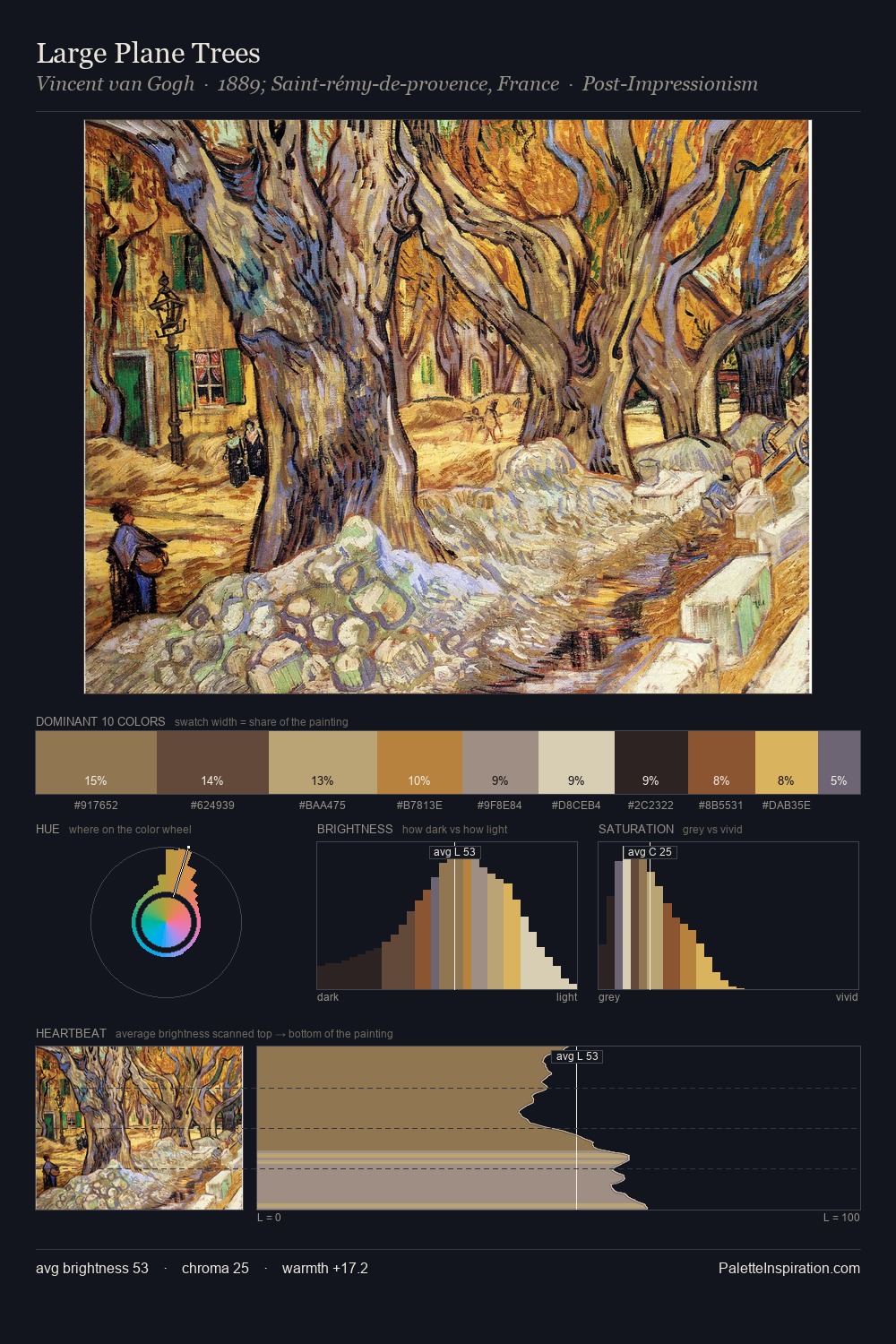
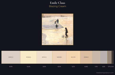
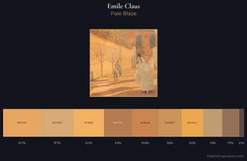
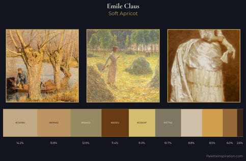
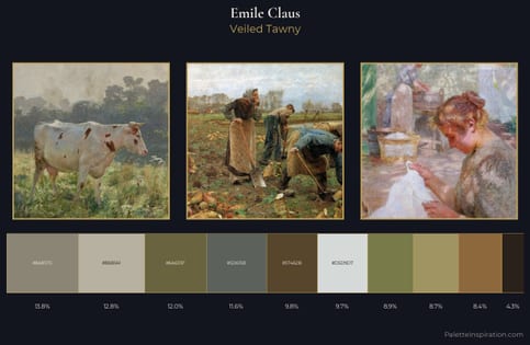
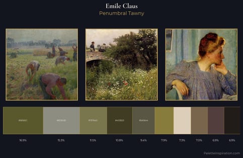
Emile Claus distributes its values across the middle register, creating harmony without high contrast. Temperature reads distinctly warm: the reds and earth tones from Emile Claus carry the compositional weight. All colours lean toward grey, building depth through value rather than colour punch. At 6.7%, #634529 carries the palette's sharpest chromatic charge: an accent that earns its place precisely because it is withheld. From deepest dark to palest light, the palette traverses 58 units of the value scale - a span that creates natural depth. This is the light Emile Claus preferred, made measurable.
Example use cases
- ceramics & pottery
- boutique hospitality
- menswear
- heritage food brands
- craft & artisan brands
I Love This!
Use This Palette
Copy, export, or download for your project
Copy, export, or download for your project
Copy:
Download:
Share: