Emile Claus Palette 3

Palette Analysis
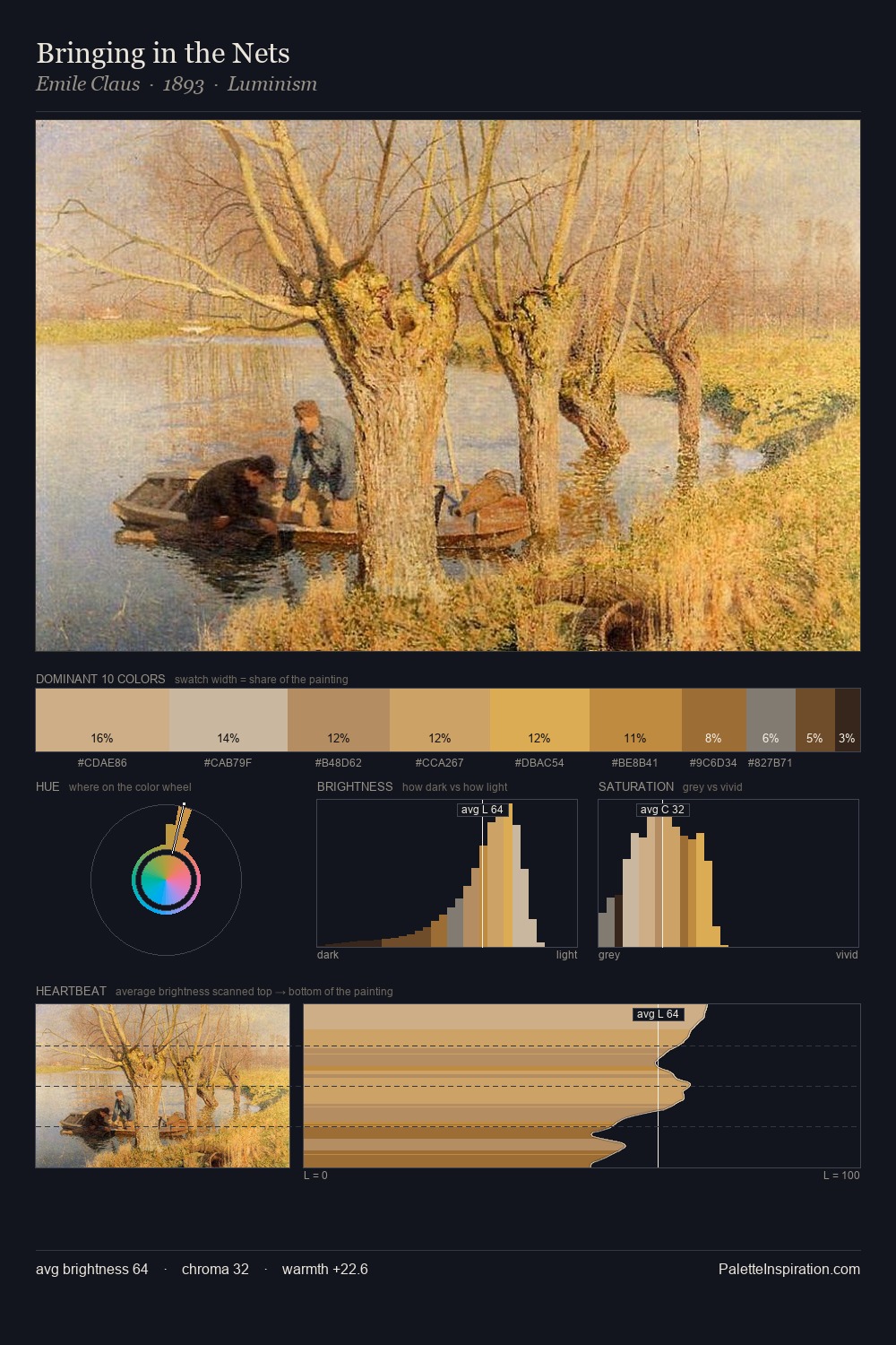
Values in Emile Claus tilt decisively toward white, giving the palette its luminous character. Cool hues prevail: blues, greens, and greys anchor the palette's emotional temperature. Chroma is moderate: colours carry enough saturation to be read as colour, but the palette stops well short of garish intensity. At 11.0%, #D5BD6F carries the palette's sharpest chromatic charge: an accent that earns its place precisely because it is withheld. The value range of 52 units sits in the comfortable middle: enough depth, enough light, neither extreme. The mid-to-high key, cool bias, and moderate chroma point to outdoor observation - sky and diffused daylight as the dominant light source. In the context of Emile Claus's full range of palettes, group 3 represents one movement in an ongoing chromatic dialogue.
Example use cases
- craft & artisan brands
- specialty coffee
- home goods
- lifestyle retail
- ceramics & pottery
I Love This!
Copy, export, or download for your project