Emil Carlsen Palette 4
Soft Sage
Soft Low-contrast, gentle chroma - mid-key values and low saturation, approachable and calm.
Sage Muted gray-green - the color of dried sage leaf, low-chroma and herbal.

Palette Analysis
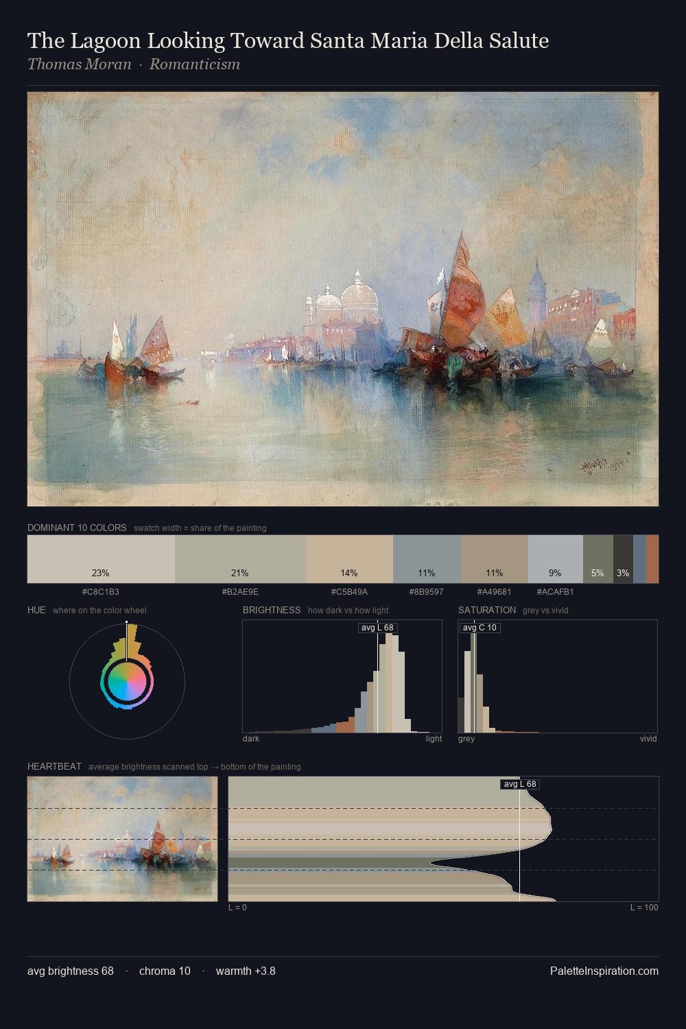
Mid-key values give Emil Carlsen its characteristic quietness - nothing blazes, nothing disappears. Emil Carlsen tilts toward cool - blues and silver-greys carry the structural weight. Chroma hovers near zero; colour declares itself through subtle shifts in hue rather than outright saturation. #A97F5C functions as the palette's exclamation mark: highest chroma, lowest percentage (4.3%). 42 units of value spread create a palette that is varied but unified - contrast in the service of harmony. High luminosity and cool temperature suggest the plein-air condition: unfiltered daylight and open sky. Emil Carlsen's palette 4 carries its own internal logic while remaining in conversation with the artist's broader colour intelligence.
Example use cases
- exhibition design
- foundation branding
- estate management
- art education
- museums & galleries
I Love This!
Use This Palette
Copy, export, or download for your project
Copy, export, or download for your project
Copy:
Download:
Share: