Emil Carlsen Palette 1

Palette Analysis
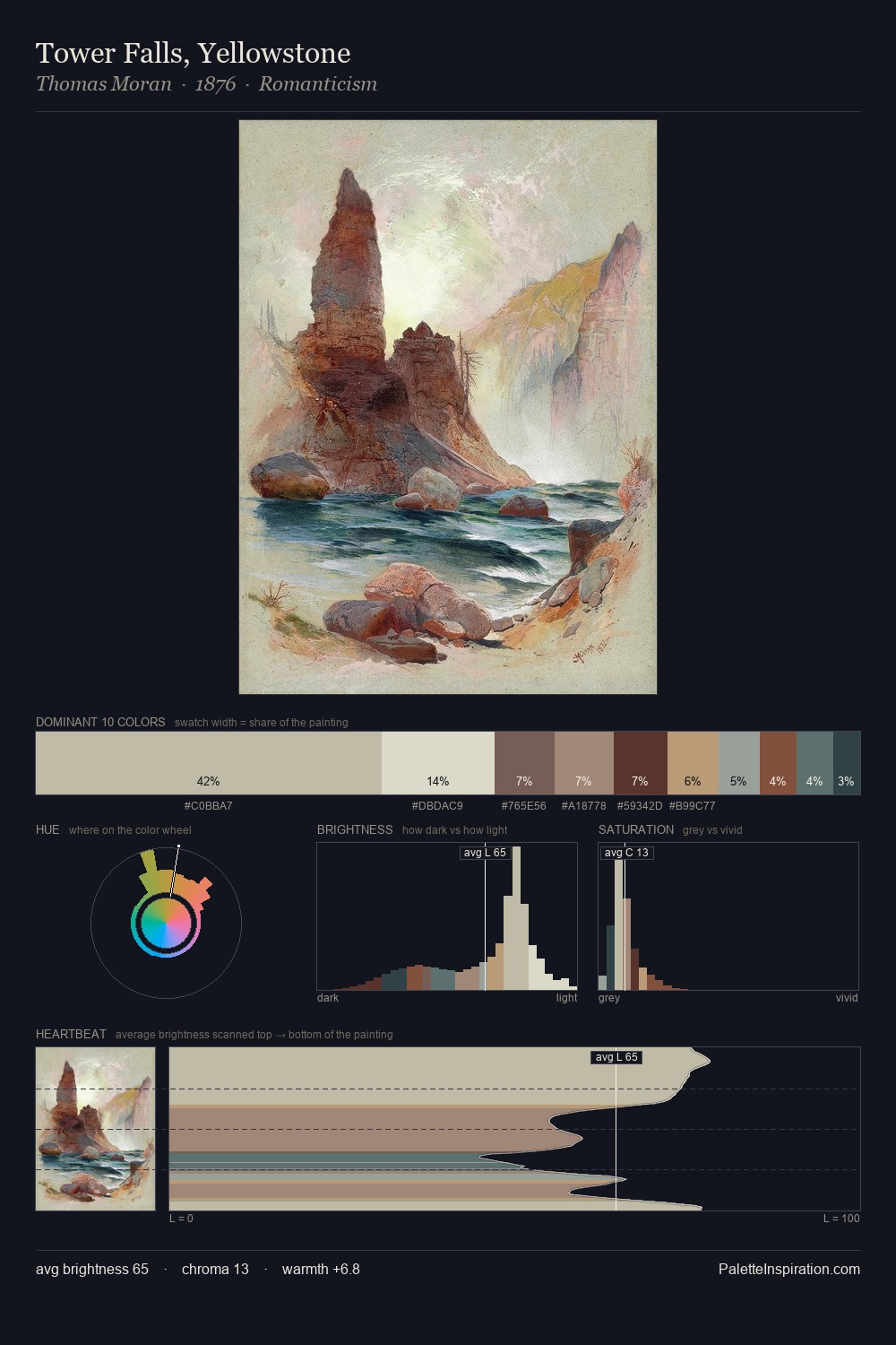
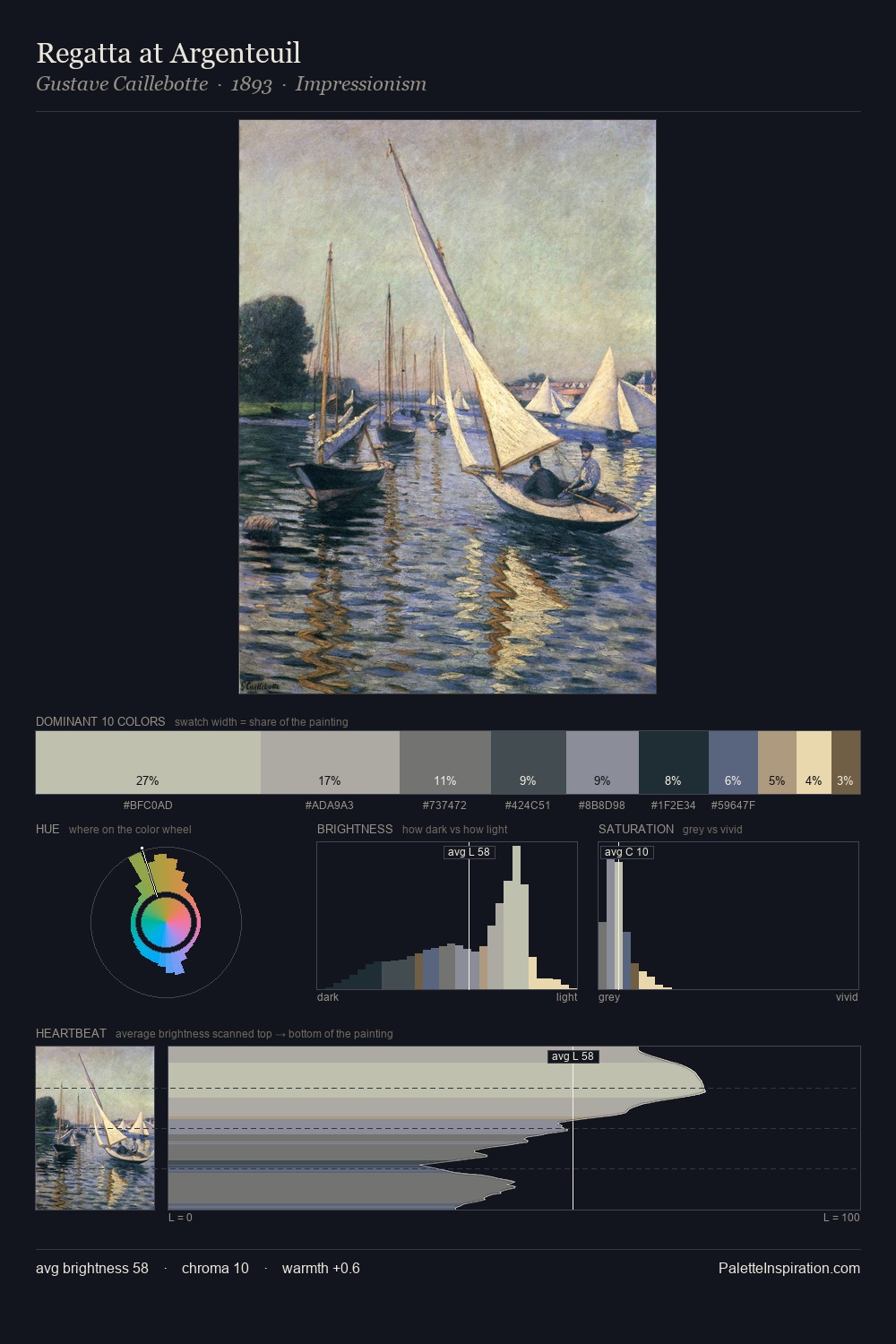
Values in Emil Carlsen tilt decisively toward white, giving the palette its luminous character. Cool tones set the register here - the blues and greens easily outweigh any warm accents. Chroma hovers near zero; colour declares itself through subtle shifts in hue rather than outright saturation. #D8CCB0 delivers the chromatic peak at only 12.0% - a small shot of colour with outsized visual impact. The 16-unit value range keeps all colours in close tonal proximity, creating the unity of a single-light-source interior. The mid-to-high key, cool bias, and moderate chroma point to outdoor observation - sky and diffused daylight as the dominant light source. Palette 1 sits within the larger chromatic argument that Emil Carlsen's complete body of work advances.
Example use cases
- florist branding
- event design
- real estate
- jewelry retail
- hospitality branding
I Love This!
Copy, export, or download for your project