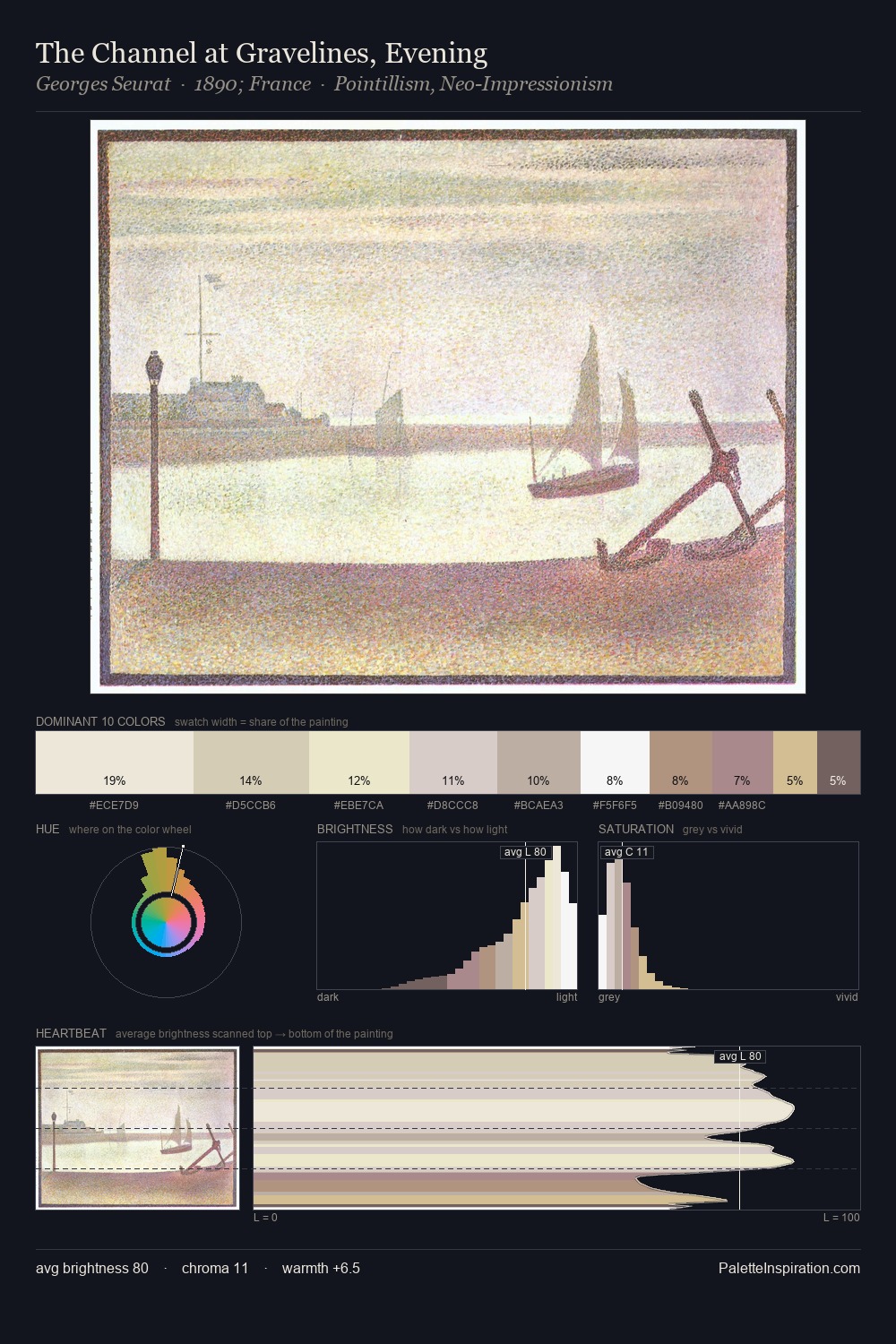
Emil Carlsen Palette 2
Gleaming Cream
Gleaming Bright and polished - high-key, often warm, suggesting reflective or luminous surfaces.
Cream Warm white - slightly yellowed, rich, the color of heavy dairy.

Palette Analysis
Light floods Emil Carlsen; the palette keeps values pale and airy across its range. Warm and cool tones are held in careful balance - neither family dominates, creating tension and resolution simultaneously. Chroma hovers near zero; colour declares itself through subtle shifts in hue rather than outright saturation. #CFC6C2 at 29.8% of the palette: an overwhelming presence that pulls all other colours into its gravitational field. #B99F88 functions as the palette's exclamation mark: highest chroma, lowest percentage (5.7%). At 42 units across the value scale, the palette keeps contrast readable without letting it dominate. This is palette 2 of Emil Carlsen's sequence - a single chapter in a chromatic story told across many works.
Example use cases
- ceramics & pottery
- boutique hospitality
- menswear
- heritage food brands
- craft & artisan brands
I Love This!
Use This Palette
Copy, export, or download for your project
Copy, export, or download for your project
Copy:
Download:
Share: