Jacob van Strij Palette 3

Palette Analysis
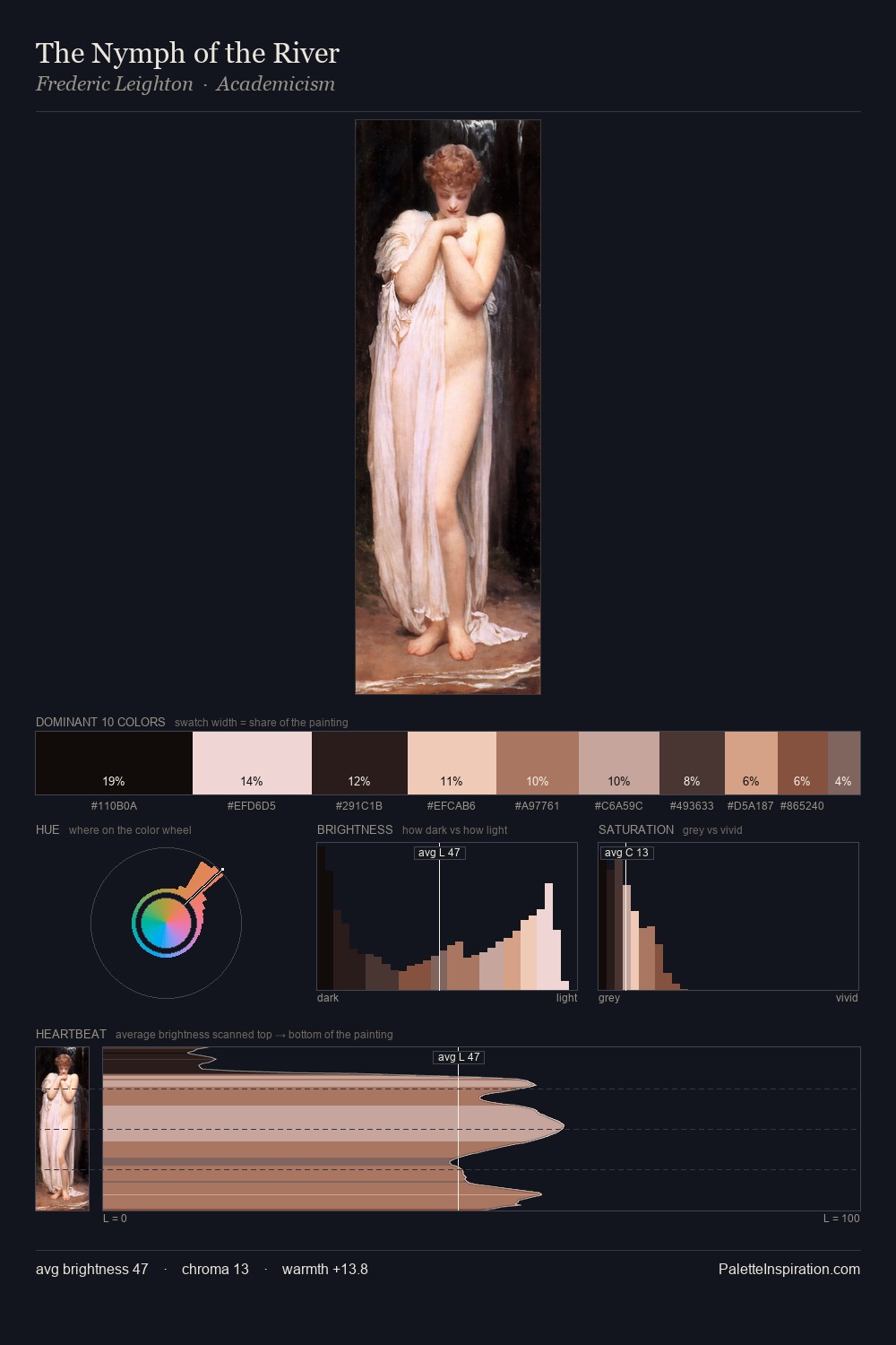
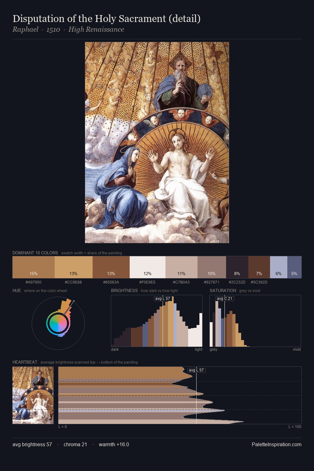
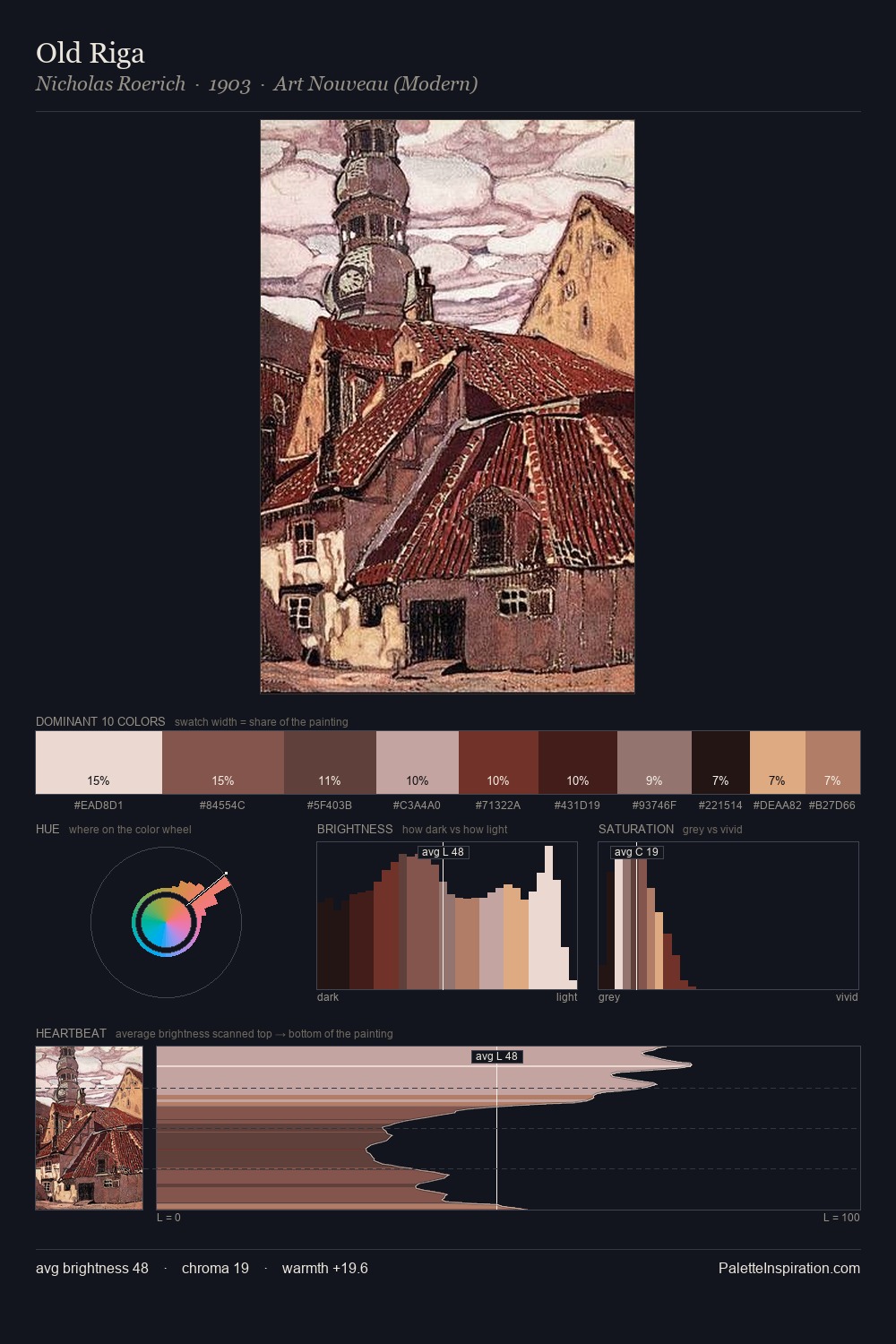
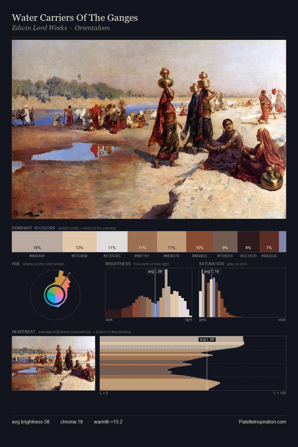
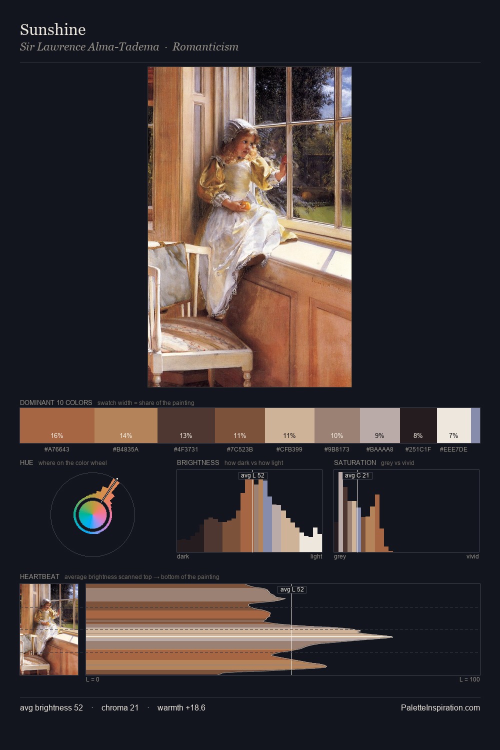
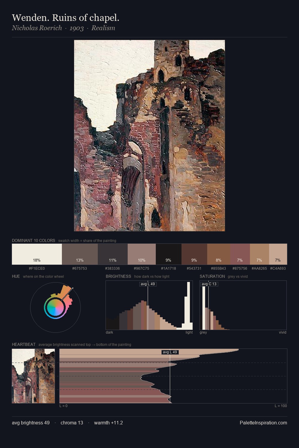
Values in Jacob van Strij tilt decisively toward white, giving the palette its luminous character. Temperature reads distinctly warm: the reds and earth tones from Jacob van Strij carry the compositional weight. Saturation is deliberately withheld - the beauty here lies in the near-monochromatic gradations rather than colour difference. #F5E7EC claims 25.8% of the surface, functioning as the work's tonal foundation. Only 6.6% is devoted to #AC7F61, yet that small allocation delivers the palette's entire chromatic tension. 69 units of value range underpin the palette's structural clarity: the eye always knows where light falls. In the context of Jacob van Strij's full range of palettes, group 3 represents one movement in an ongoing chromatic dialogue.
Example use cases
- ceramics & pottery
- boutique hospitality
- menswear
- heritage food brands
- craft & artisan brands
I Love This!
Copy, export, or download for your project