Jacob van Strij Palette 4

Palette Analysis
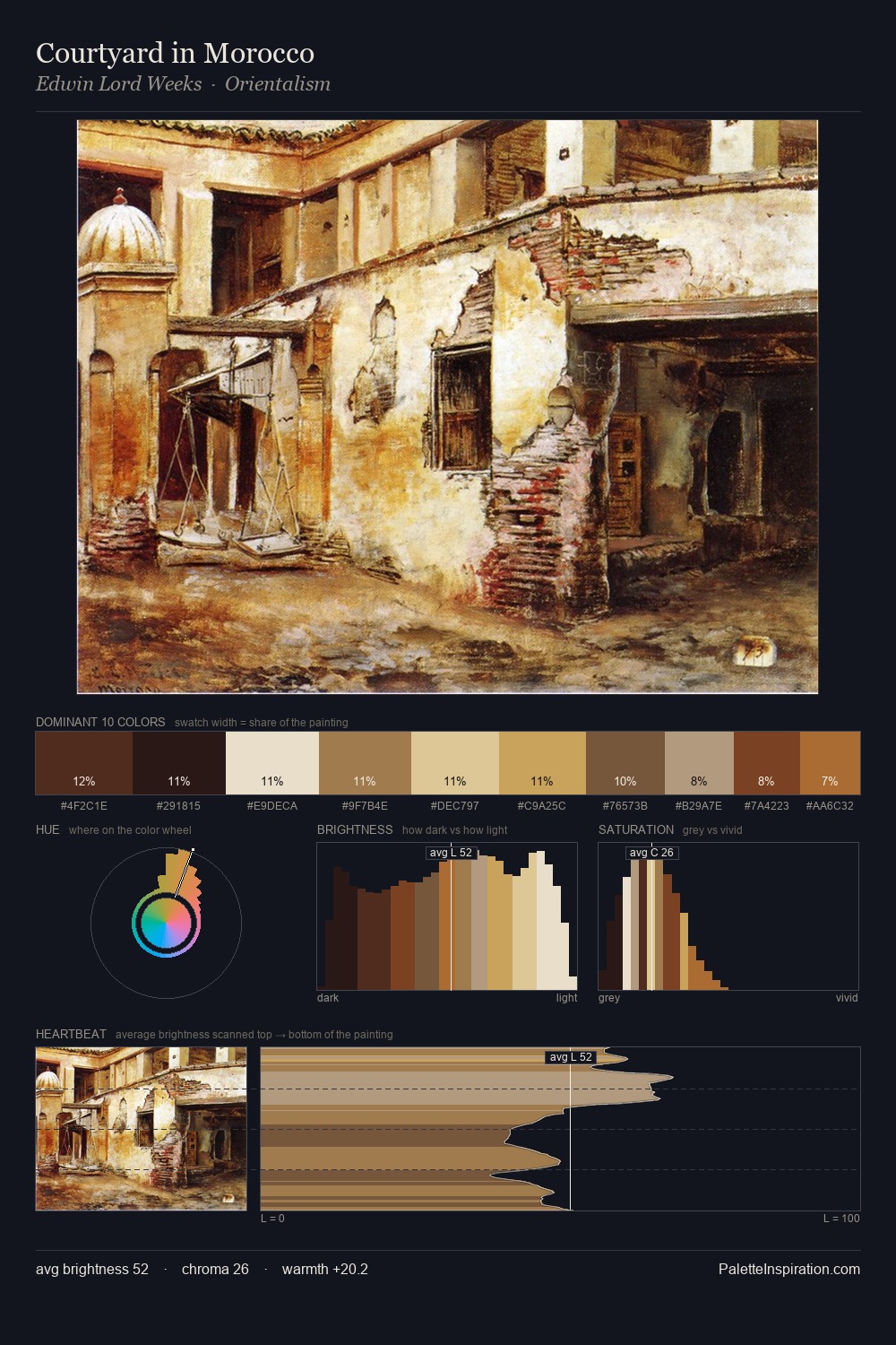
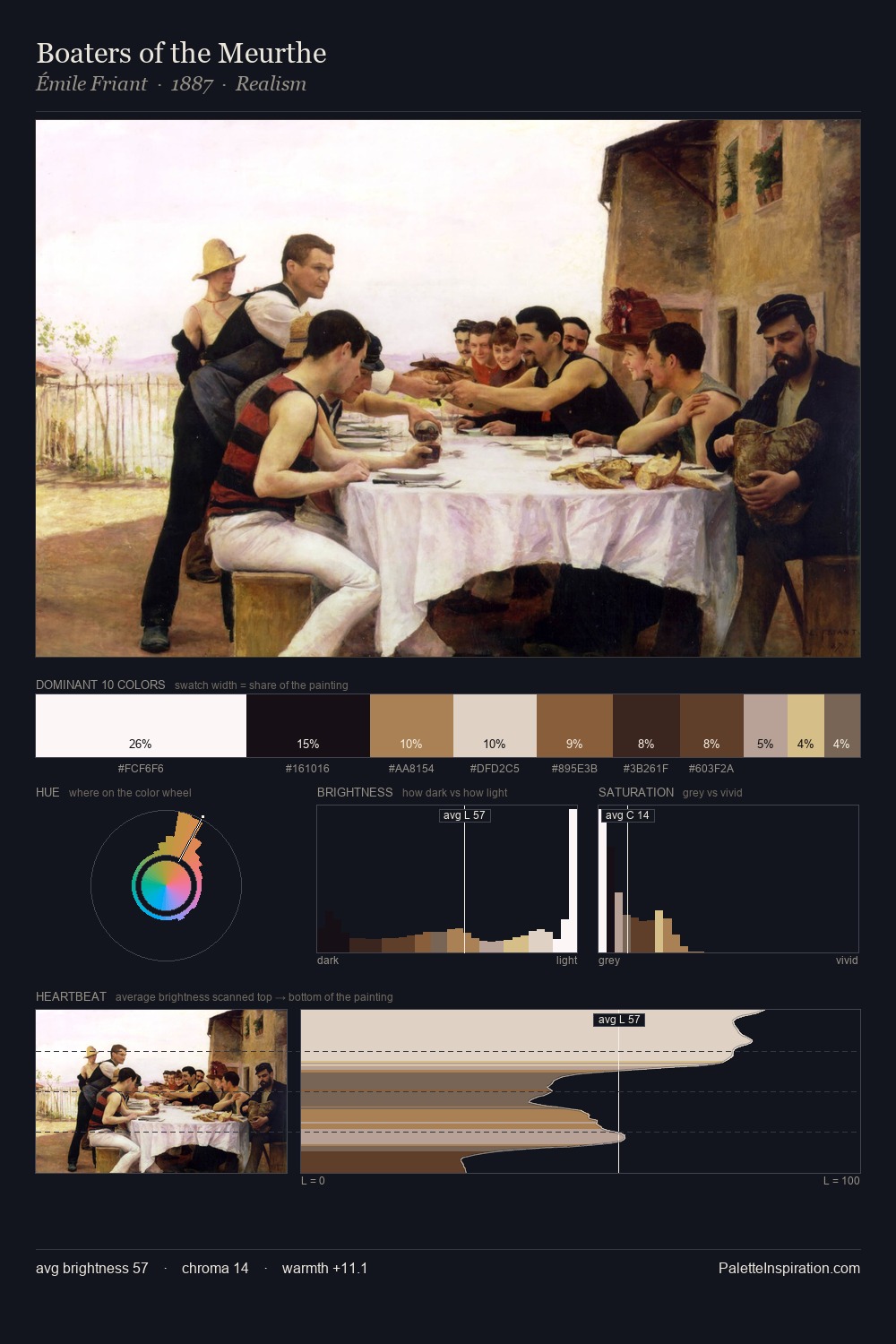
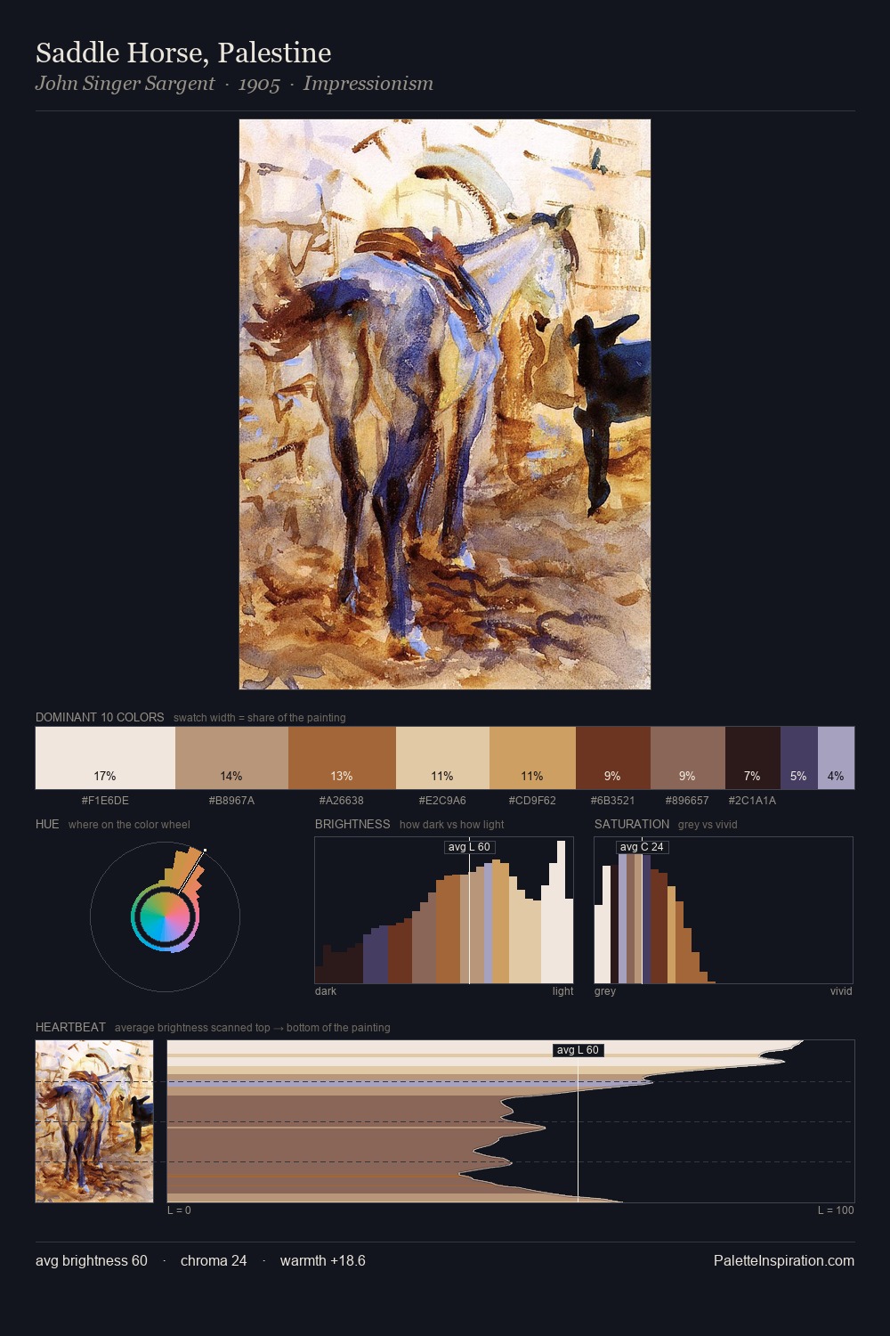
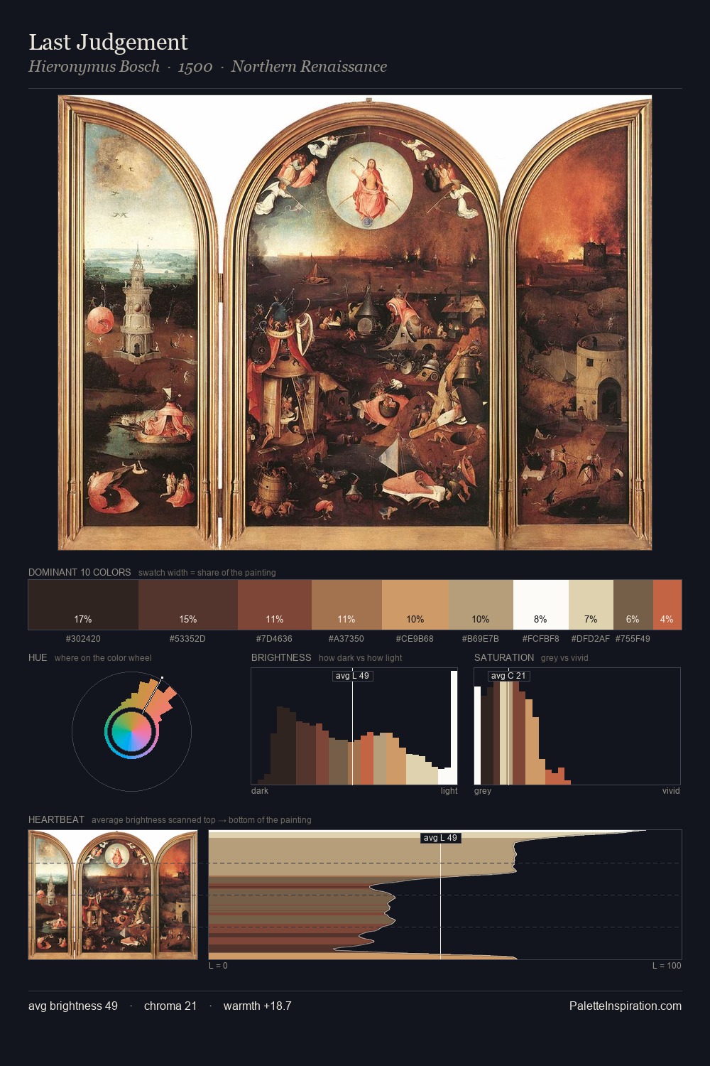
Values in Jacob van Strij tilt decisively toward white, giving the palette its luminous character. Yellow, ochre, sienna: warm hues that Jacob van Strij deploys as the palette's primary energy. Chroma hovers near zero; colour declares itself through subtle shifts in hue rather than outright saturation. #F2EEEB at 70.1% of the palette: an overwhelming presence that pulls all other colours into its gravitational field. The saturated accent, #9B6532, registers at 3.1% - sparse enough to feel like a deliberate surprise. 68 units of value range underpin the palette's structural clarity: the eye always knows where light falls. Jacob van Strij's palette 4 carries its own internal logic while remaining in conversation with the artist's broader colour intelligence.
Example use cases
- ceramics & pottery
- boutique hospitality
- menswear
- heritage food brands
- craft & artisan brands
I Love This!
Copy, export, or download for your project