Currier and Ives Palette 6
Veiled Tawny
Veiled Partially obscured light - mid-dark with a hazy, scrim-filtered quality.
Tawny Warm orange-brown - a traditional term for the color of tanned leather or lion fur.

Palette Analysis
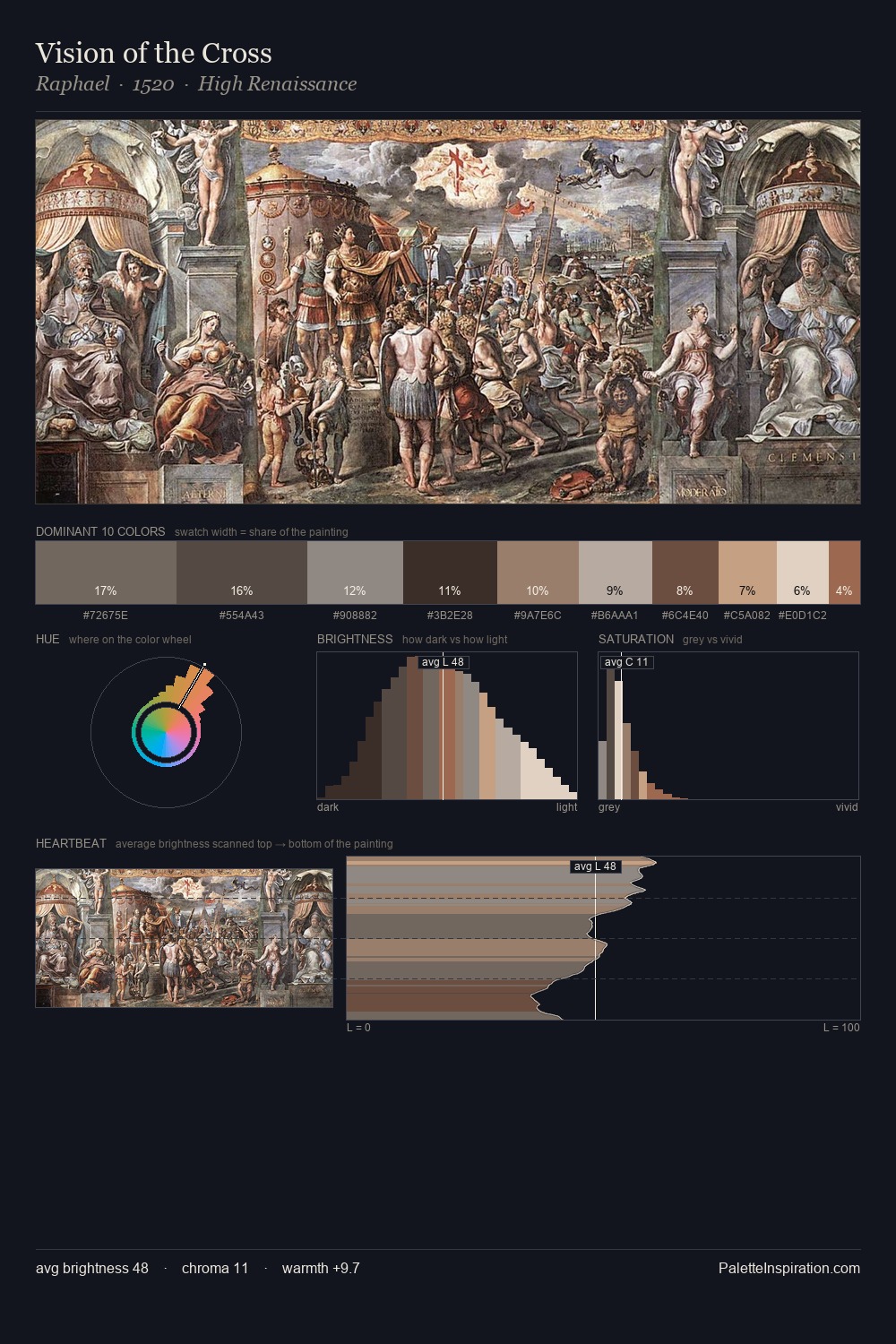
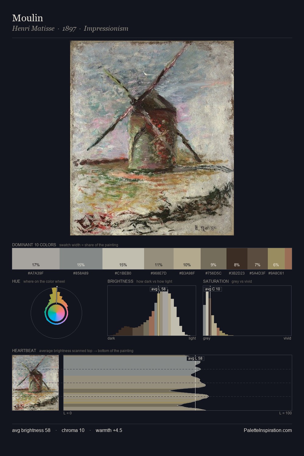
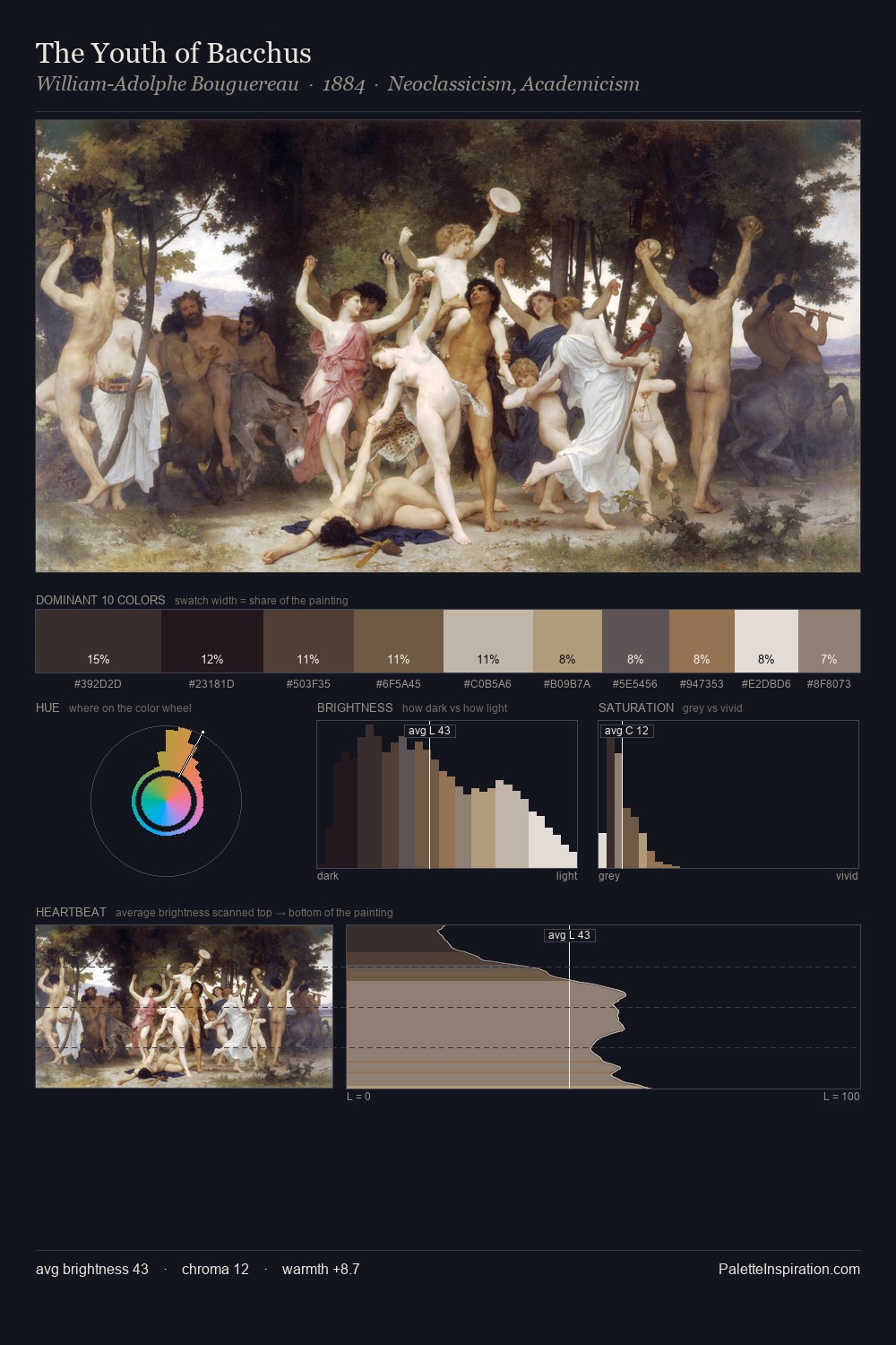
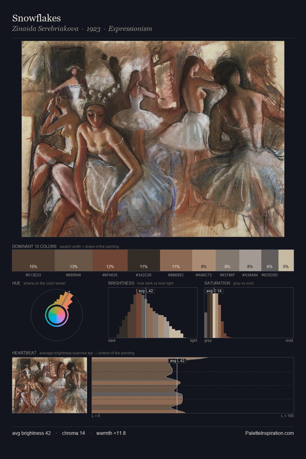
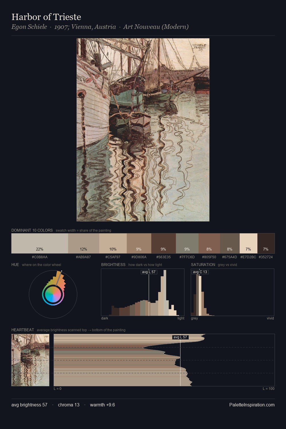
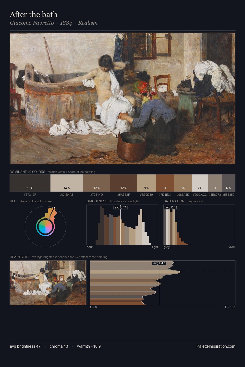
Currier and Ives distributes its values across the middle register, creating harmony without high contrast. Currier and Ives tilts toward cool - blues and silver-greys carry the structural weight. All colours lean toward grey, building depth through value rather than colour punch. The highest-chroma note - #9A6B56 - appears at just 4.0%, deployed as a precision accent against the quieter ground. 53 units of value spread create a palette that is varied but unified - contrast in the service of harmony. High luminosity and cool temperature suggest the plein-air condition: unfiltered daylight and open sky. Currier and Ives's palette 6 carries its own internal logic while remaining in conversation with the artist's broader colour intelligence.
Example use cases
- exhibition design
- foundation branding
- estate management
- art education
- museums & galleries
I Love This!
Use This Palette
Copy, export, or download for your project
Copy, export, or download for your project
Copy:
Download:
Share: