Currier and Ives Palette 2

Palette Analysis
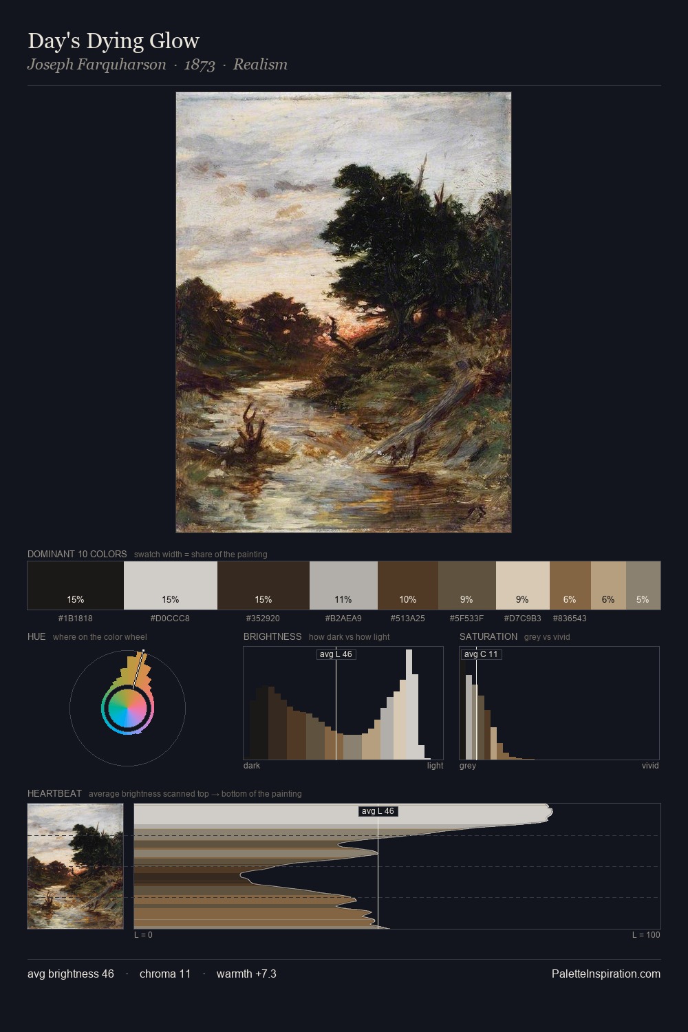
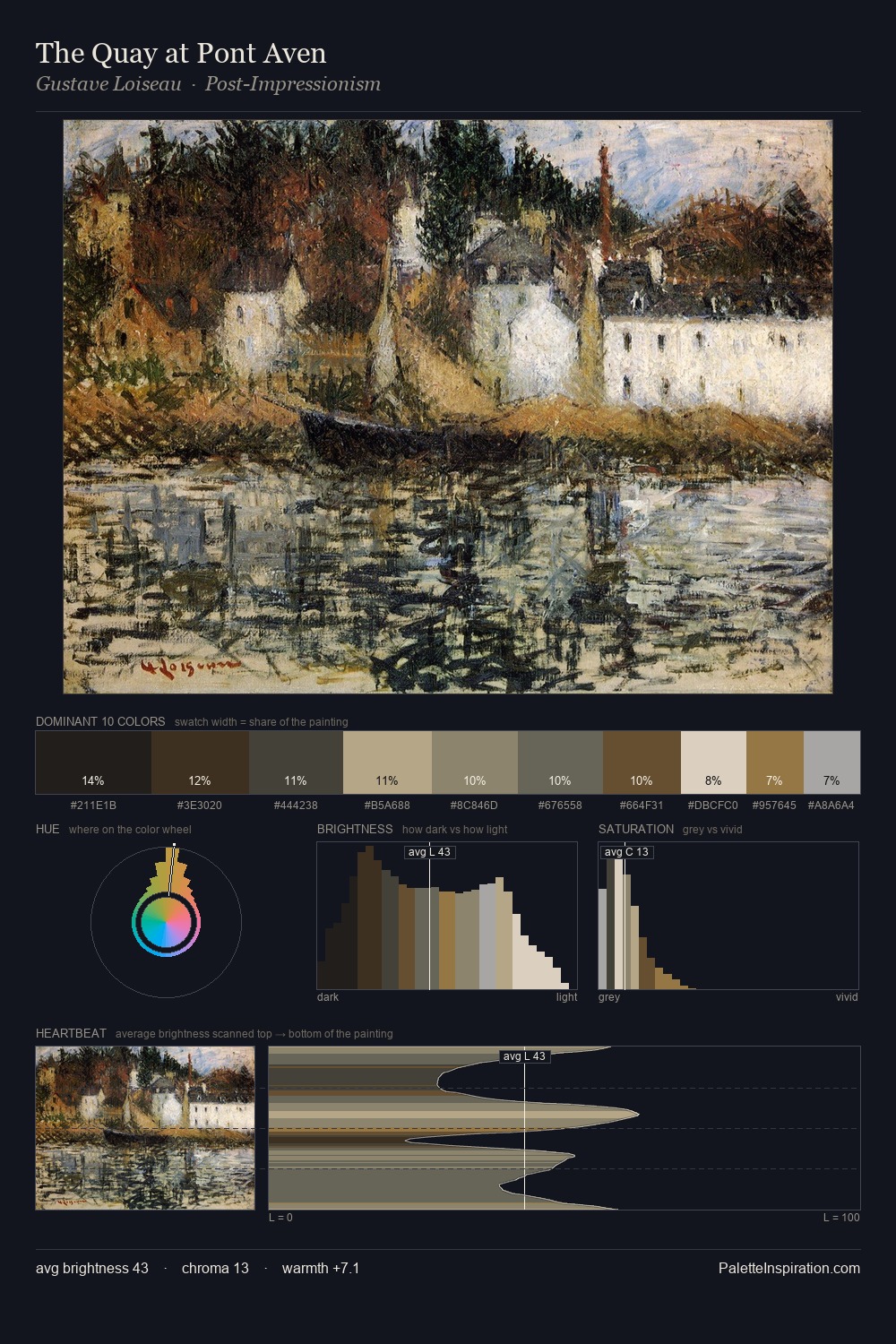
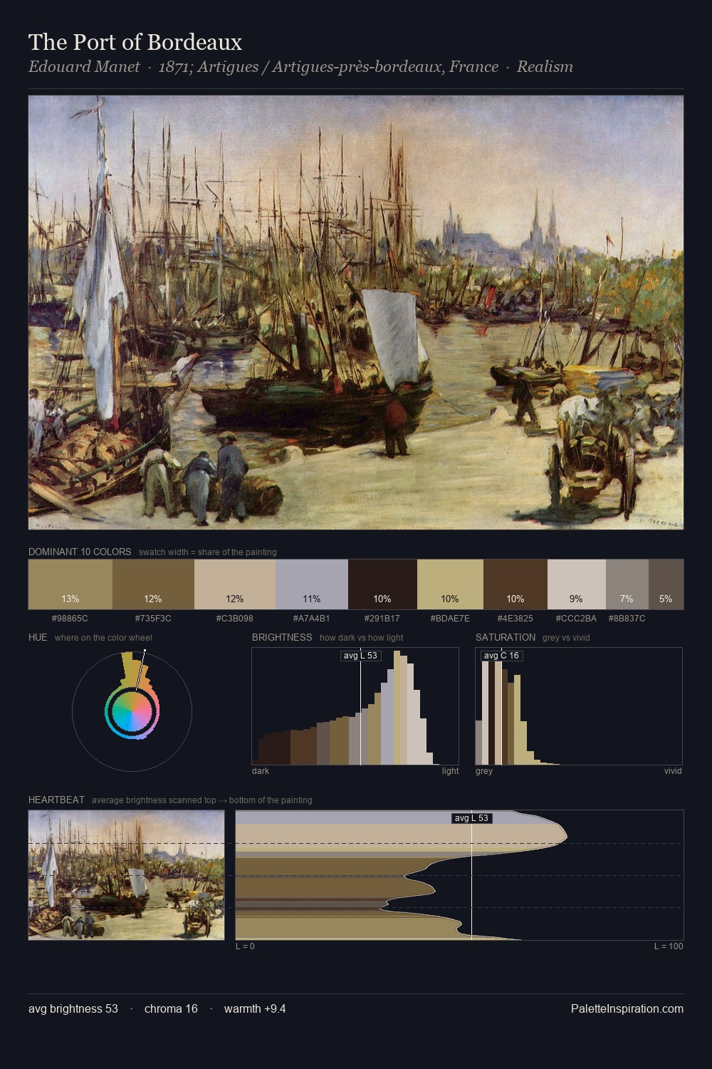
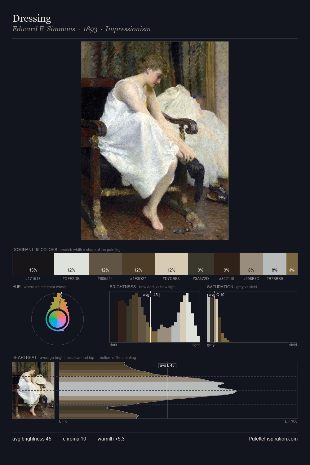
Currier and Ives works in the upper reaches of the value scale, creating an atmosphere of brightness and expansiveness. Blues and teal-greys govern the palette, lending it an aquatic or atmospheric quality. Muted throughout, the palette achieves its effects through value and temperature rather than chromatic force. The highest-chroma note - #4E311D - appears at just 4.1%, deployed as a precision accent against the quieter ground. From deepest dark to palest light, the palette traverses 62 units of the value scale - a span that creates natural depth. High luminosity and cool temperature suggest the plein-air condition: unfiltered daylight and open sky. In the context of Currier and Ives's full range of palettes, group 2 represents one movement in an ongoing chromatic dialogue.
Example use cases
- exhibition design
- foundation branding
- estate management
- art education
- museums & galleries
I Love This!
Copy, export, or download for your project