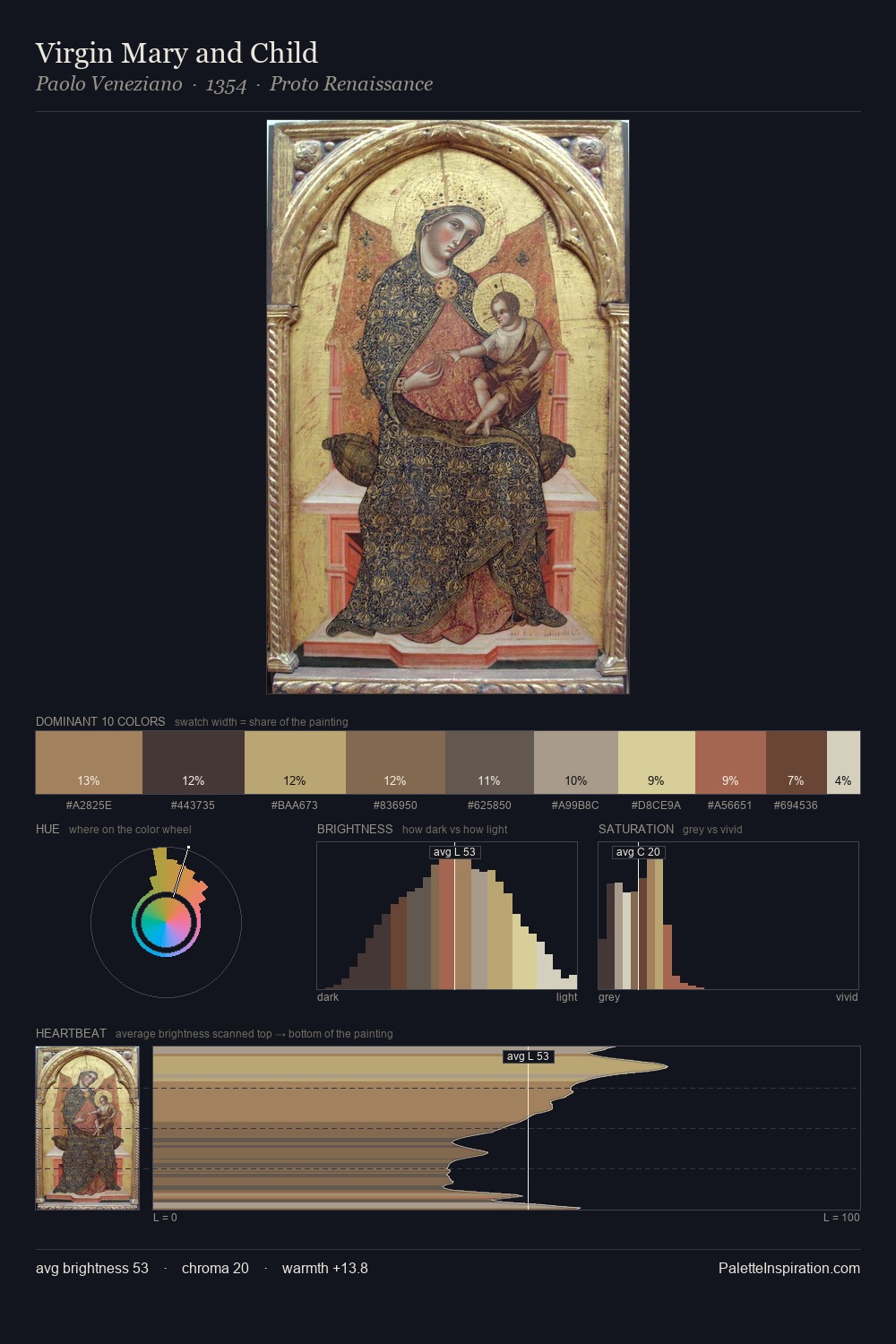
Early Renaissance Palette 10
Pale Ecru
Pale High-key and low-chroma - delicate, bleached, washed with light.
Ecru Unbleached linen - warm mid-neutral, slightly grayed, raw and natural.

Palette Analysis
Mid-key values give Early Renaissance its characteristic quietness - nothing blazes, nothing disappears. Yellow, ochre, sienna: warm hues deployed as the palette's primary energy. All colours lean toward grey, building depth through value rather than colour punch. Only 7.3% is devoted to #794C3C, yet that small allocation delivers the palette's entire chromatic tension. At 56 units of value range, the palette has the tonal breadth to sustain complex spatial readings.
Example use cases
- ceramics & pottery
- boutique hospitality
- menswear
- heritage food brands
- craft & artisan brands
I Love This!
Use This Palette
Copy, export, or download for your project
Copy, export, or download for your project
Copy:
Download:
Share: