Divisionism Master Palette
Palette Analysis
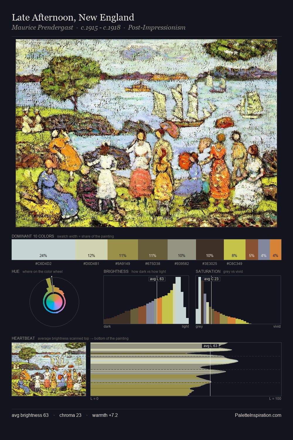
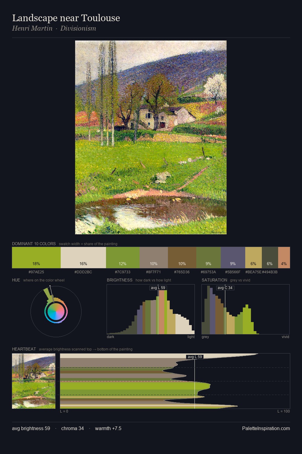
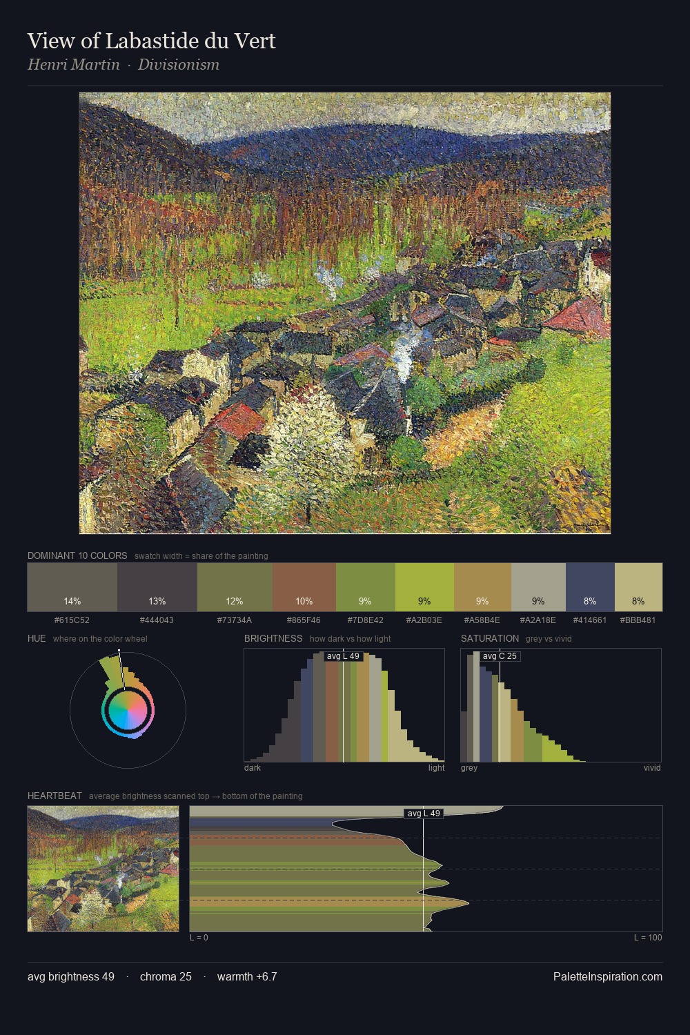
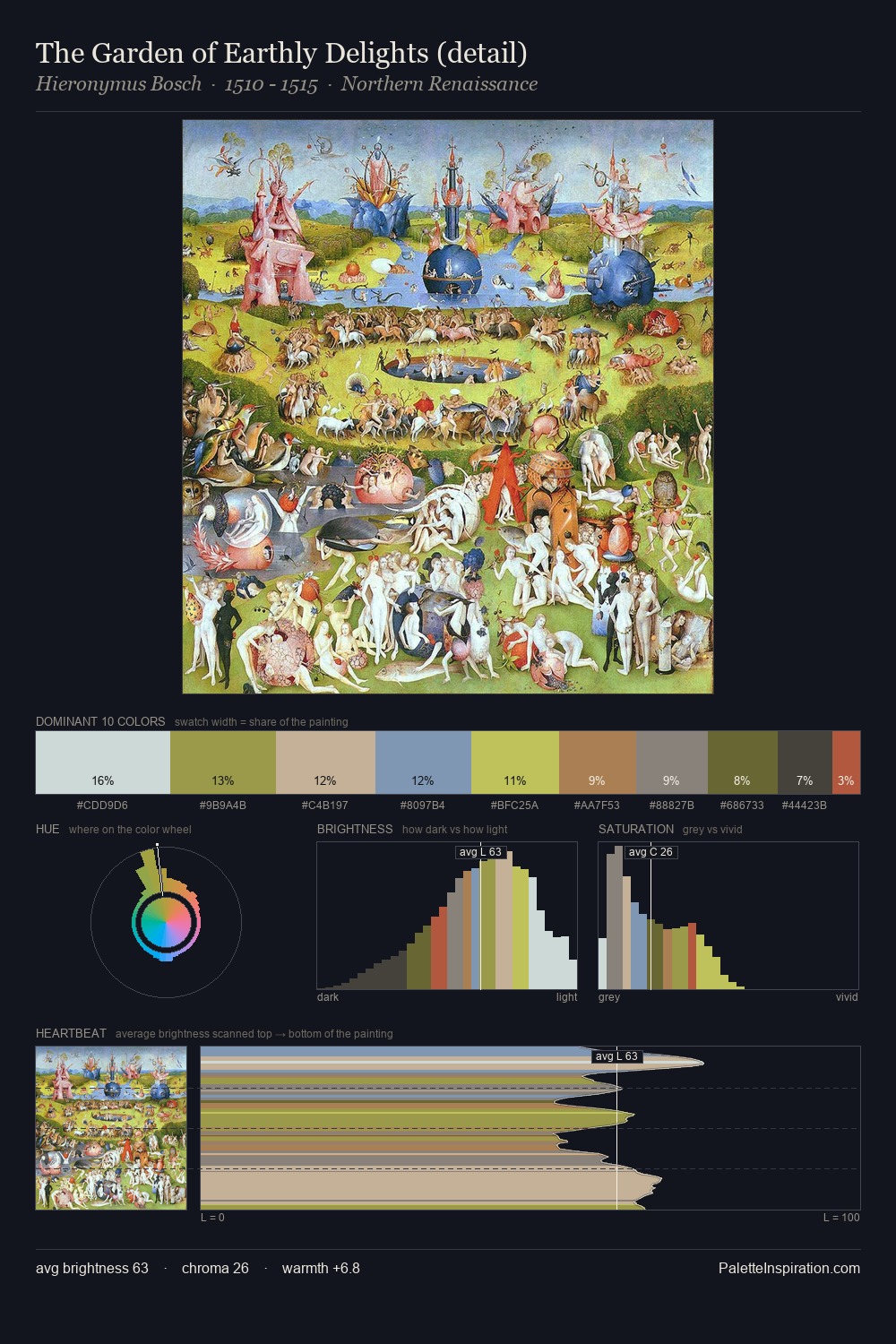
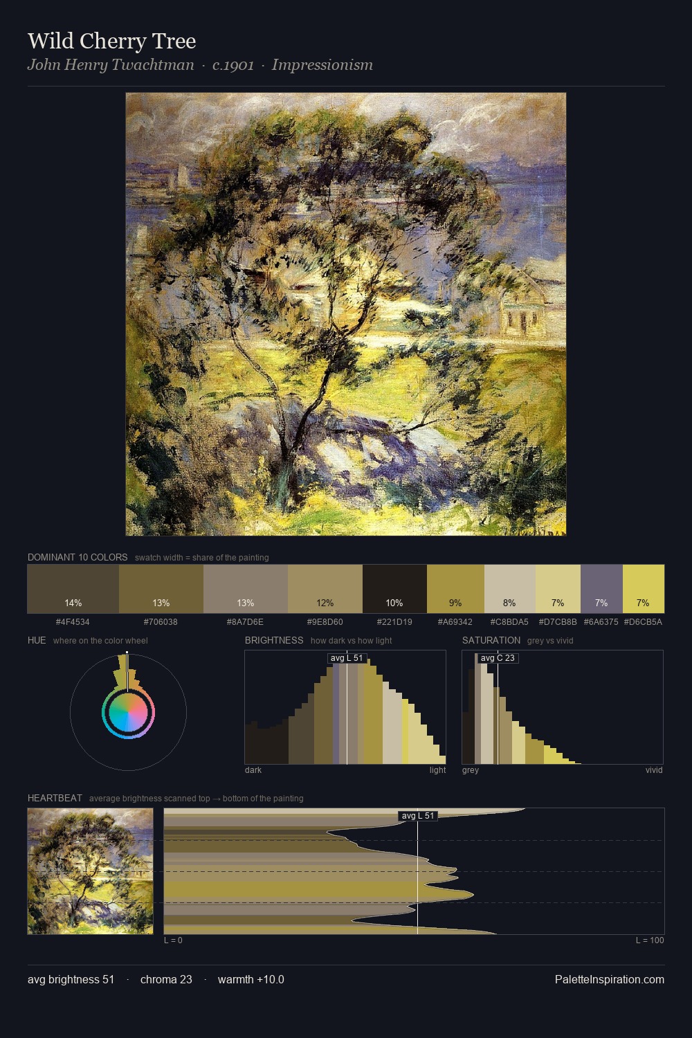
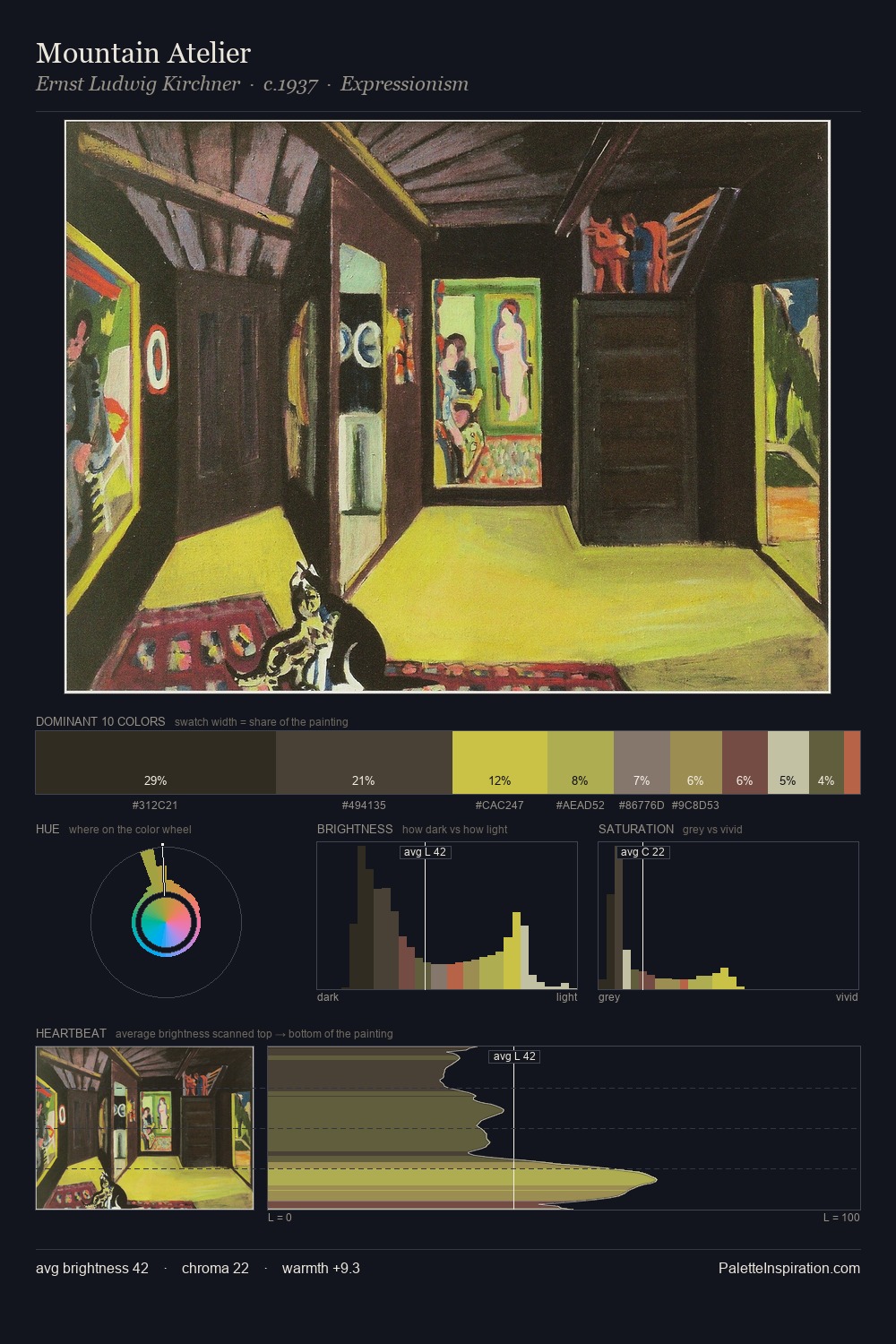
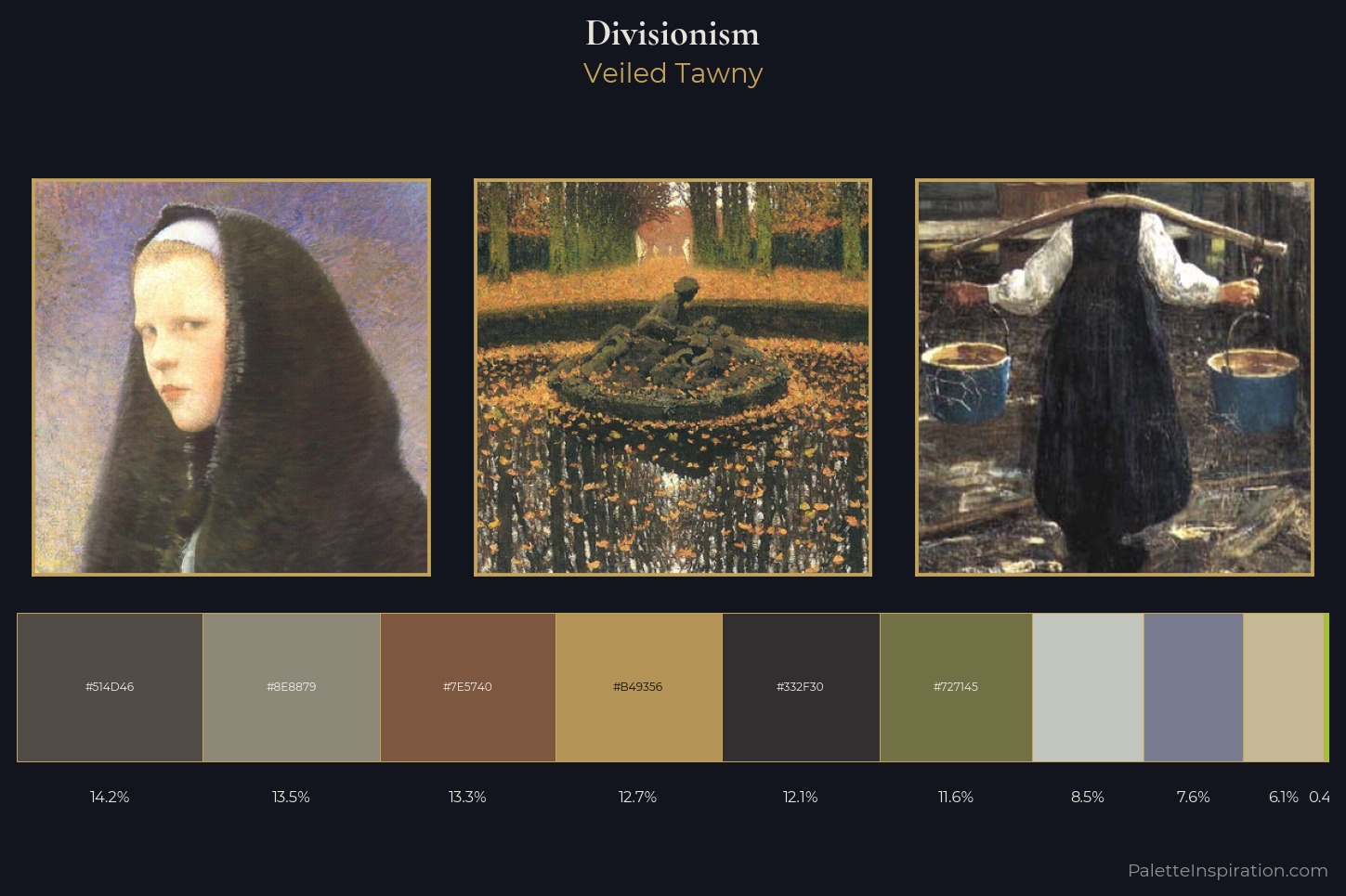
The Divisionism tradition carries a consistent chromatic signature, and this master palette captures its essence. Mid-key values give Divisionism its characteristic quietness - nothing blazes, nothing disappears. Blues and teal-greys govern the palette, lending it an aquatic or atmospheric quality. Every colour is desaturated; the palette proceeds through near-neutrals and gently-coloured greys. The highest-chroma note - #B49356 - appears at just 12.7%, deployed as a precision accent against the quieter ground. At 51 units across the value scale, the palette keeps contrast readable without letting it dominate. The palette has the character of outdoor light: cool, mid-bright, with colour rendered faithfully rather than expressively. Applied to contemporary work, these proportions immediately evoke the Divisionism register.
Example use cases
- museums & galleries
- academic publishing
- heritage brands
- auction houses
- exhibition design
I Love This!
Copy, export, or download for your project