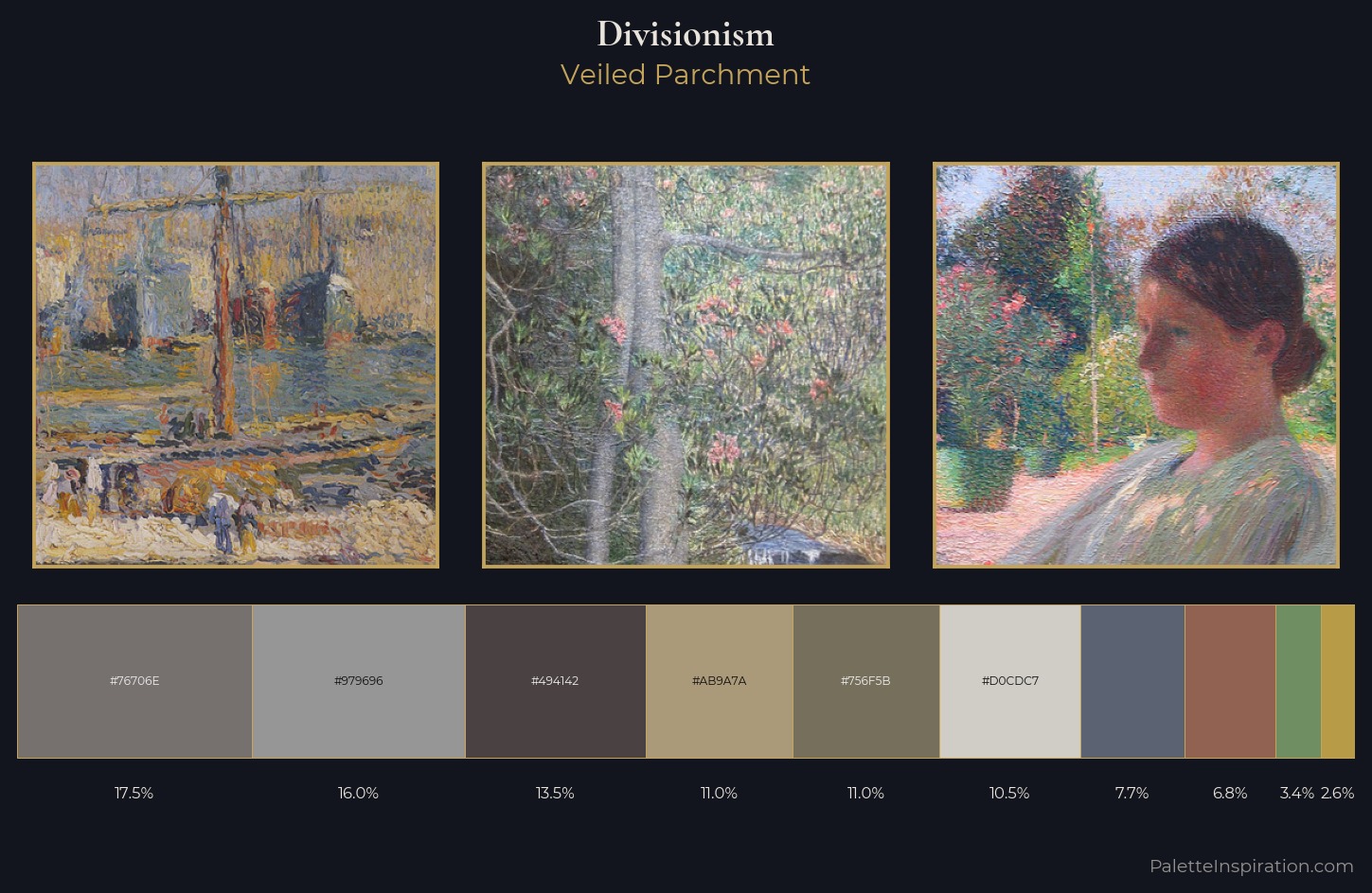
Divisionism Palette 9
Veiled Parchment
Veiled Partially obscured light - mid-dark with a hazy, scrim-filtered quality.
Parchment Aged warm neutral - the color of old manuscript parchment, tan and slightly yellowed.
Palette Analysis
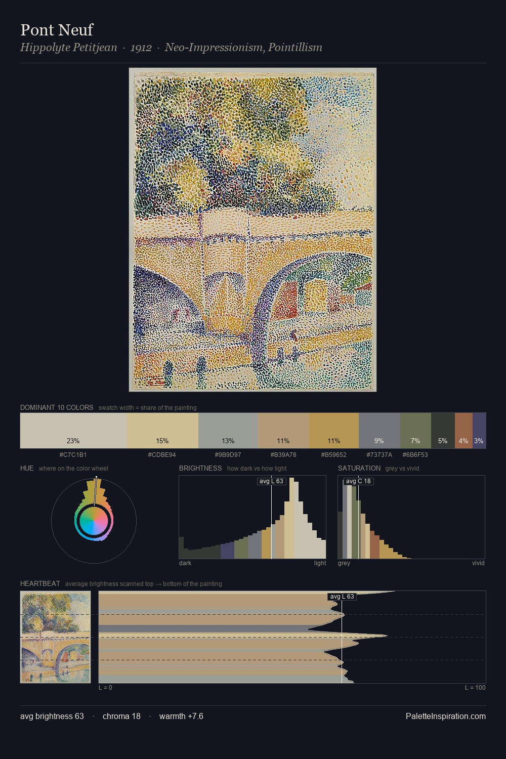
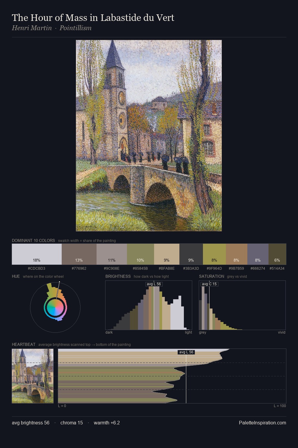
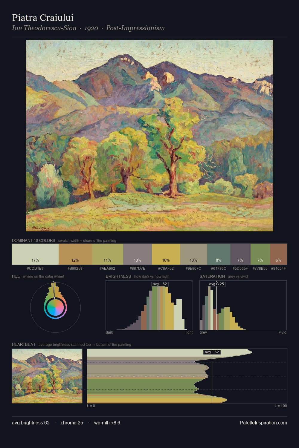
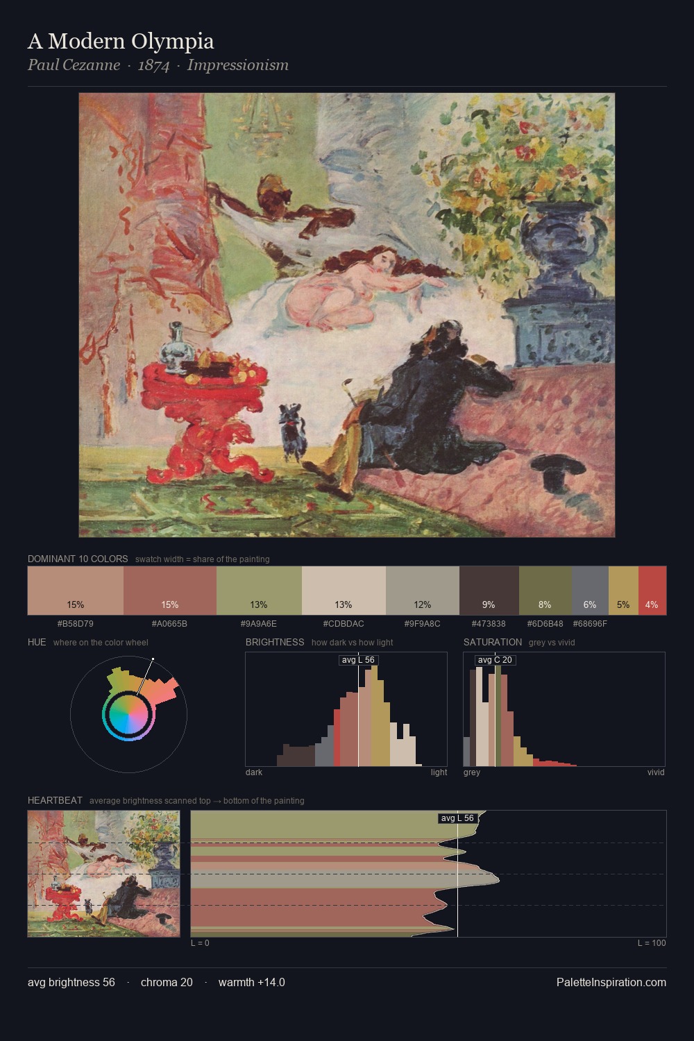
The value structure of Divisionism is mid-key: quiet, controlled, and cohesive. Warm and cool tones are held in careful balance - neither family dominates, creating tension and resolution simultaneously. Chroma hovers near zero; colour declares itself through subtle shifts in hue rather than outright saturation. The highest-chroma note - #AB9A7A - appears at just 11.0%, deployed as a precision accent against the quieter ground. Spanning 47 units on the value axis, the palette achieves the balance between tonal flatness and fragmentation.
Example use cases
- exhibition design
- foundation branding
- estate management
- art education
- museums & galleries
I Love This!
Use This Palette
Copy, export, or download for your project
Copy, export, or download for your project
Copy:
Download:
Share: