Divisionism Palette 18
Veiled Parchment
Veiled Partially obscured light - mid-dark with a hazy, scrim-filtered quality.
Parchment Aged warm neutral - the color of old manuscript parchment, tan and slightly yellowed.

Palette Analysis
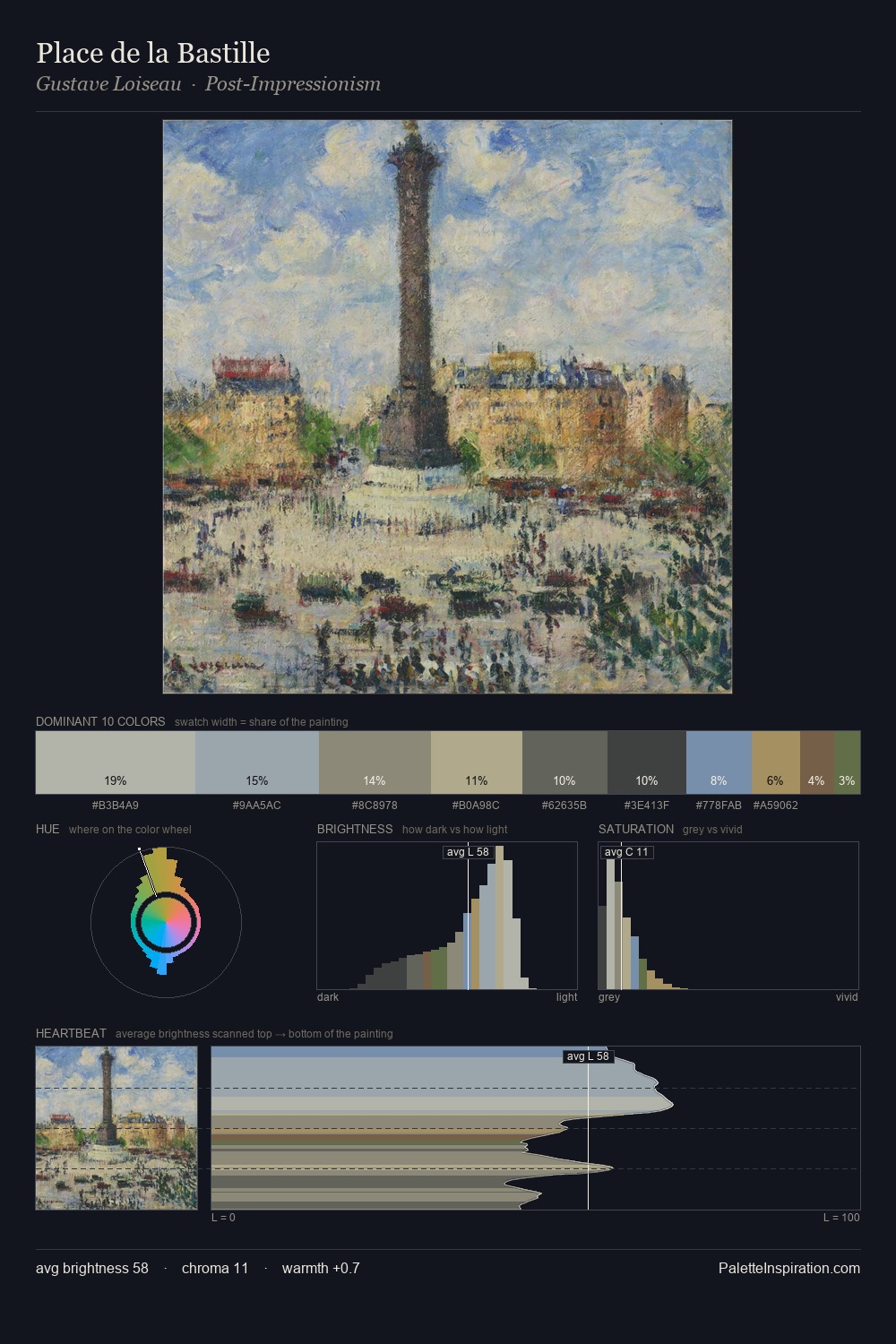
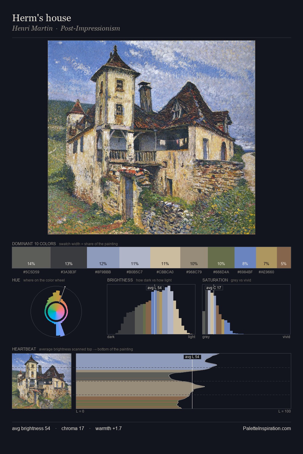
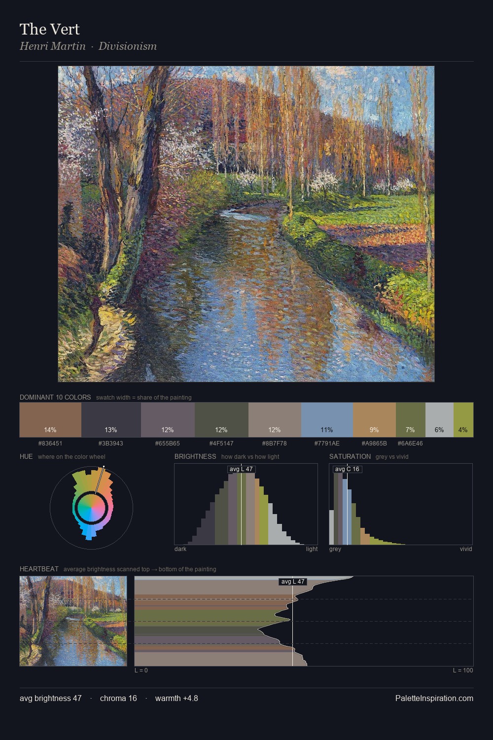
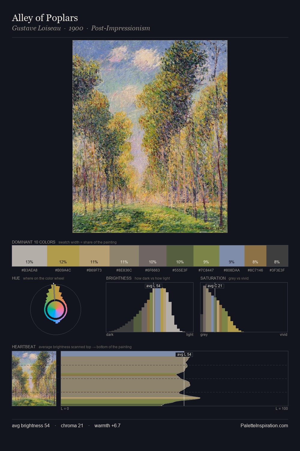
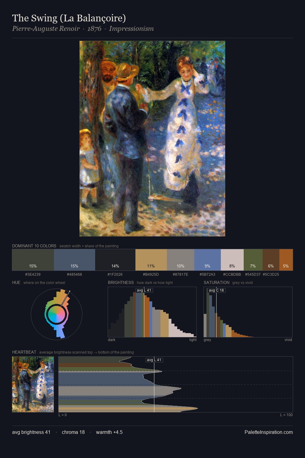
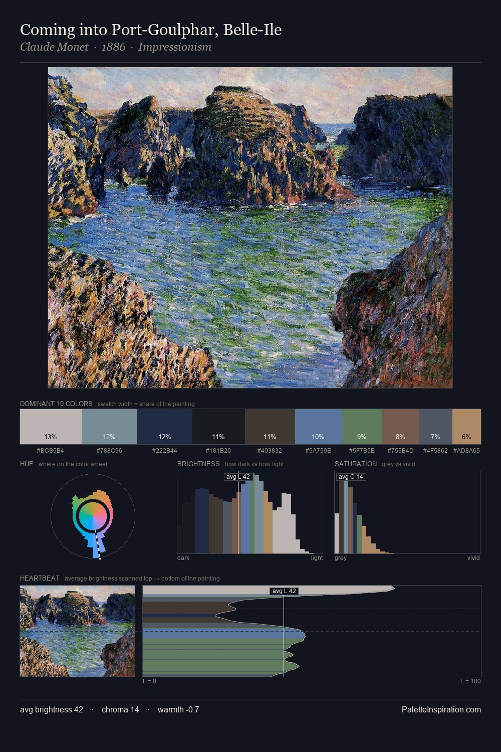
Divisionism distributes its values across the middle register, creating harmony without high contrast. Temperature is cool-dominant, with blue and green families claiming the largest areas. Every colour is desaturated; the palette proceeds through near-neutrals and gently-coloured greys. The most saturated colour, #667EA7, is reserved to 5.1% of the surface, where it acts as a focal punctuation. At 51 units across the value scale, the palette keeps contrast readable without letting it dominate. The mid-to-high key, cool bias, and moderate chroma point to outdoor observation - sky and diffused daylight as the dominant light source.
Example use cases
- exhibition design
- foundation branding
- estate management
- art education
- museums & galleries
I Love This!
Use This Palette
Copy, export, or download for your project
Copy, export, or download for your project
Copy:
Download:
Share: