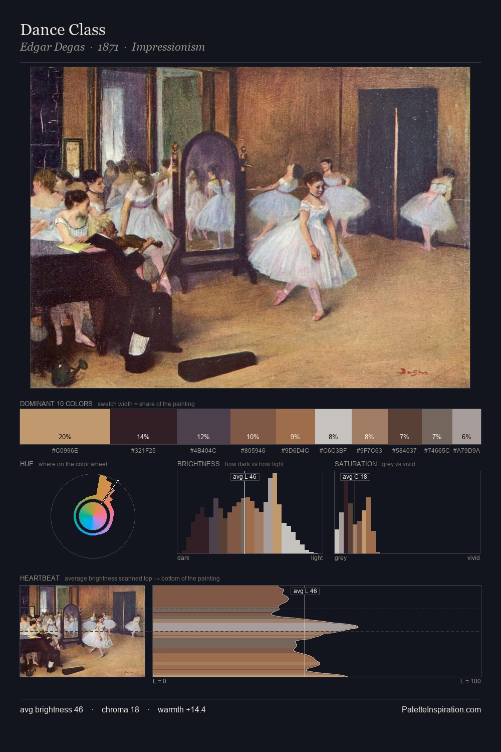
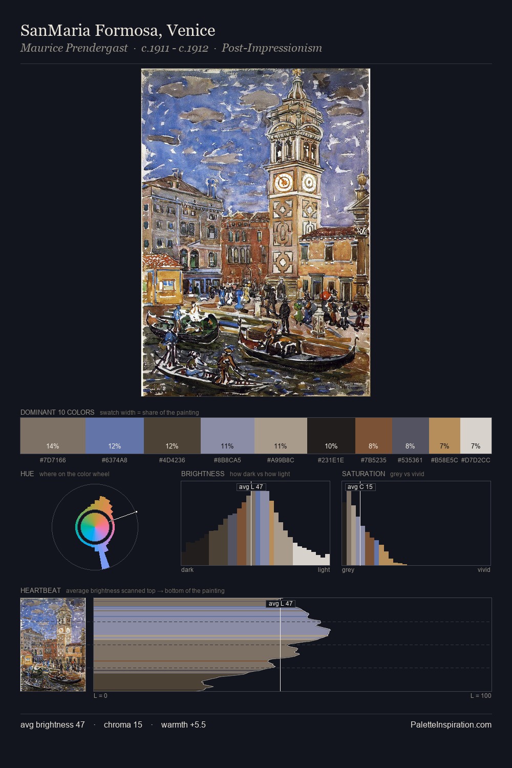
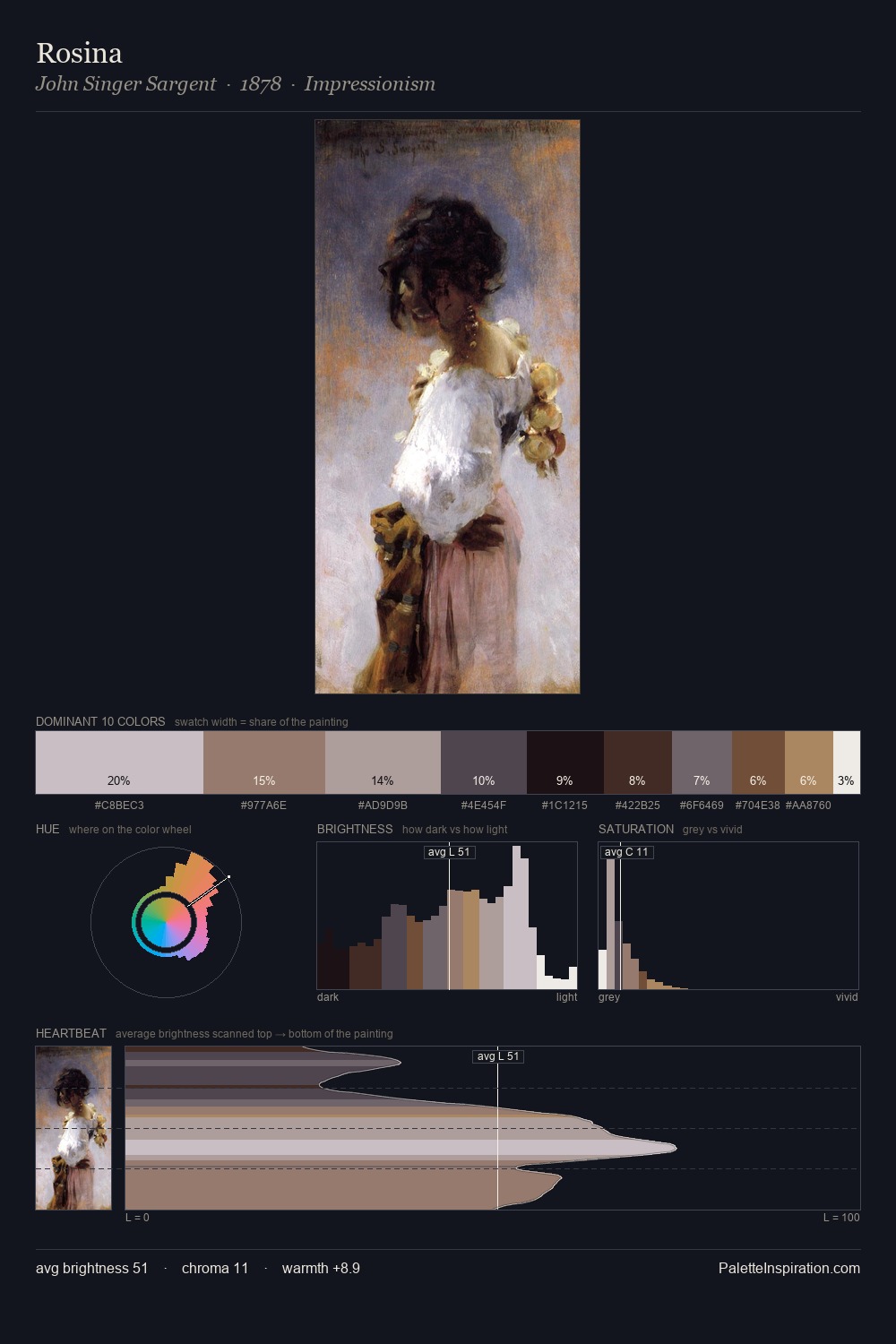
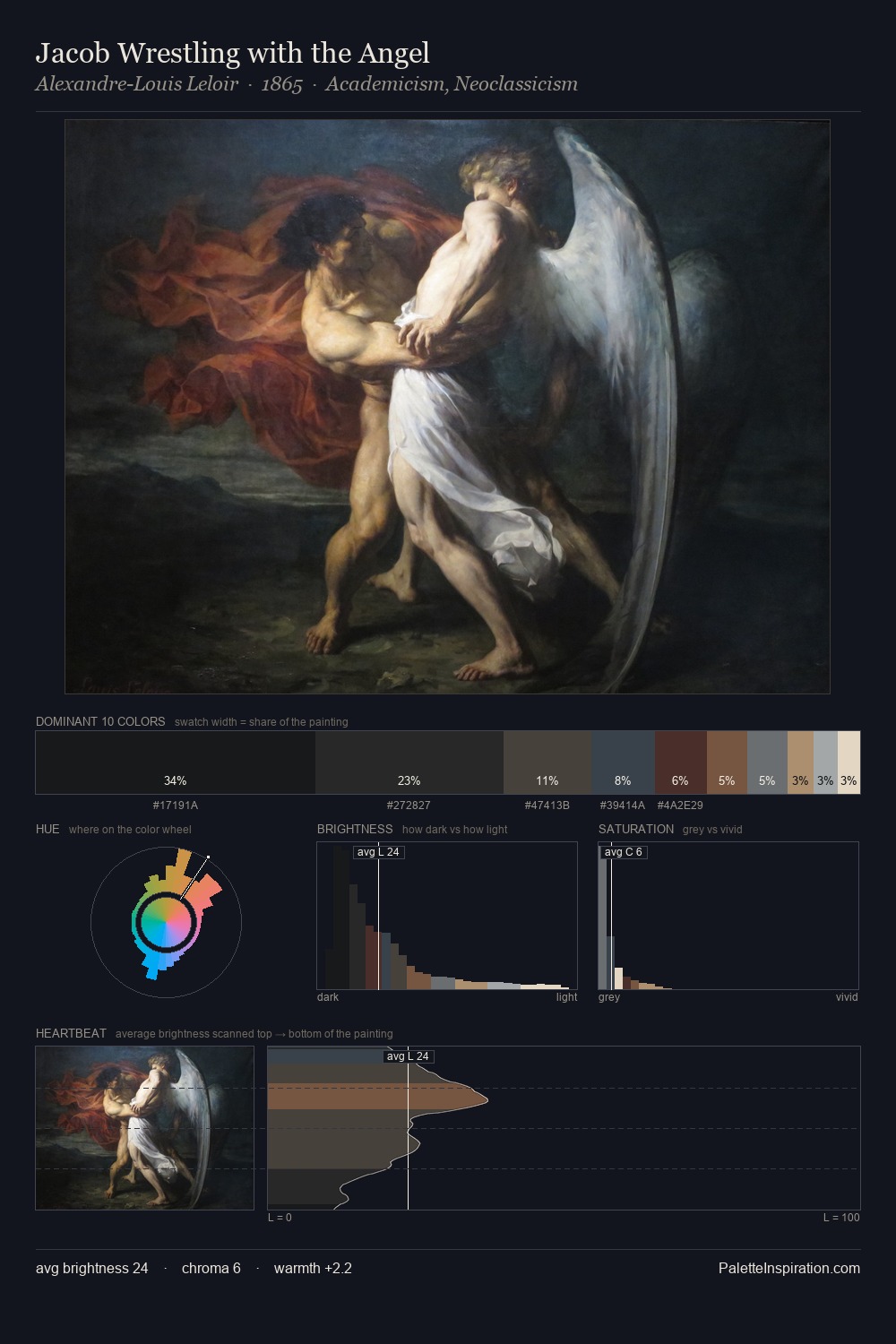
Divisionism Palette 8
Soft Ivory
Soft Low-contrast, gentle chroma - mid-key values and low saturation, approachable and calm.
Ivory Warm creamy white - the color of natural ivory, warmer than pure white.

Palette Analysis
Values in Divisionism tilt decisively toward white, giving the palette its luminous character. The dominant temperature is warm, with earth tones and fire-hues setting the emotional key. Every colour is desaturated; the palette proceeds through near-neutrals and gently-coloured greys. The highest-chroma note - #3F2B23 - appears at just 8.8%, deployed as a precision accent against the quieter ground. At 58 units of value range, the palette has the tonal breadth to sustain complex spatial readings.
Example use cases
- exhibition design
- foundation branding
- estate management
- art education
- museums & galleries
I Love This!
Use This Palette
Copy, export, or download for your project
Copy, export, or download for your project
Copy:
Download:
Share: