David Kakabadze Palette 9

Palette Analysis
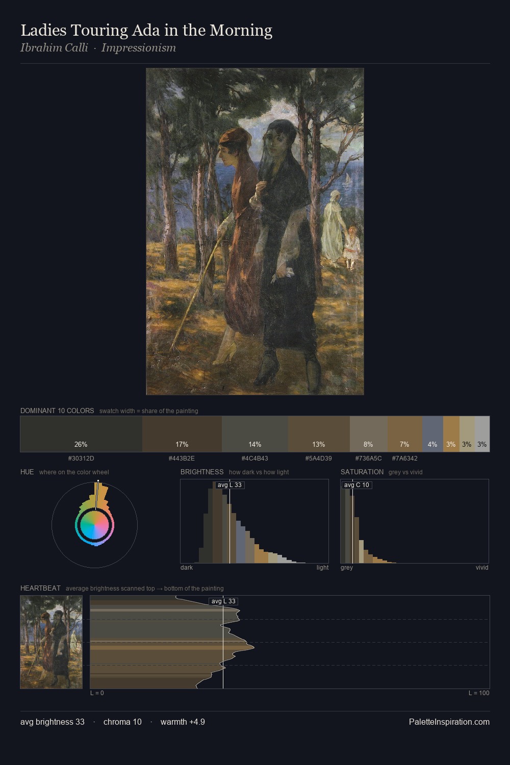
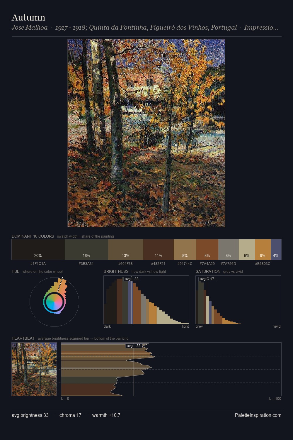
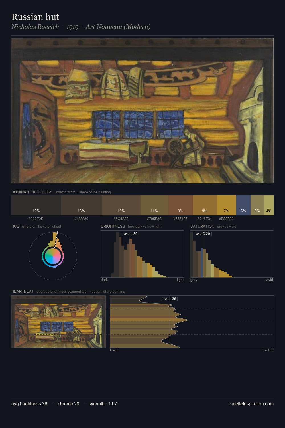
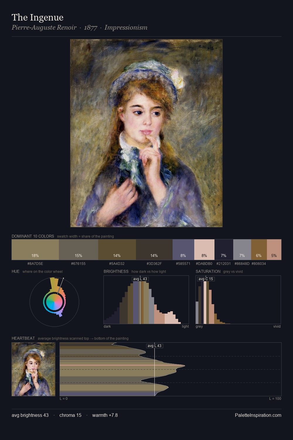
David Kakabadze occupies the comfortable middle of the value scale, avoiding both extremes to hold the eye in a sustained middle grey. Temperature is cool-dominant, with blue and green families claiming the largest areas. Chroma hovers near zero; colour declares itself through subtle shifts in hue rather than outright saturation. #463022 functions as the palette's exclamation mark: highest chroma, lowest percentage (9.9%). The value range of 42 units sits in the comfortable middle: enough depth, enough light, neither extreme. The palette has the character of outdoor light: cool, mid-bright, with colour rendered faithfully rather than expressively. David Kakabadze's palette 9 carries its own internal logic while remaining in conversation with the artist's broader colour intelligence.
Example use cases
- theater design
- jewelry brands
- tobacco-adjacent retail
- event branding
- film & entertainment
I Love This!
Copy, export, or download for your project