David Kakabadze Palette 1
Muted Parchment
Muted Deliberately desaturated - chroma pulled toward gray, the restraint of tonal painting.
Parchment Aged warm neutral - the color of old manuscript parchment, tan and slightly yellowed.

Palette Analysis
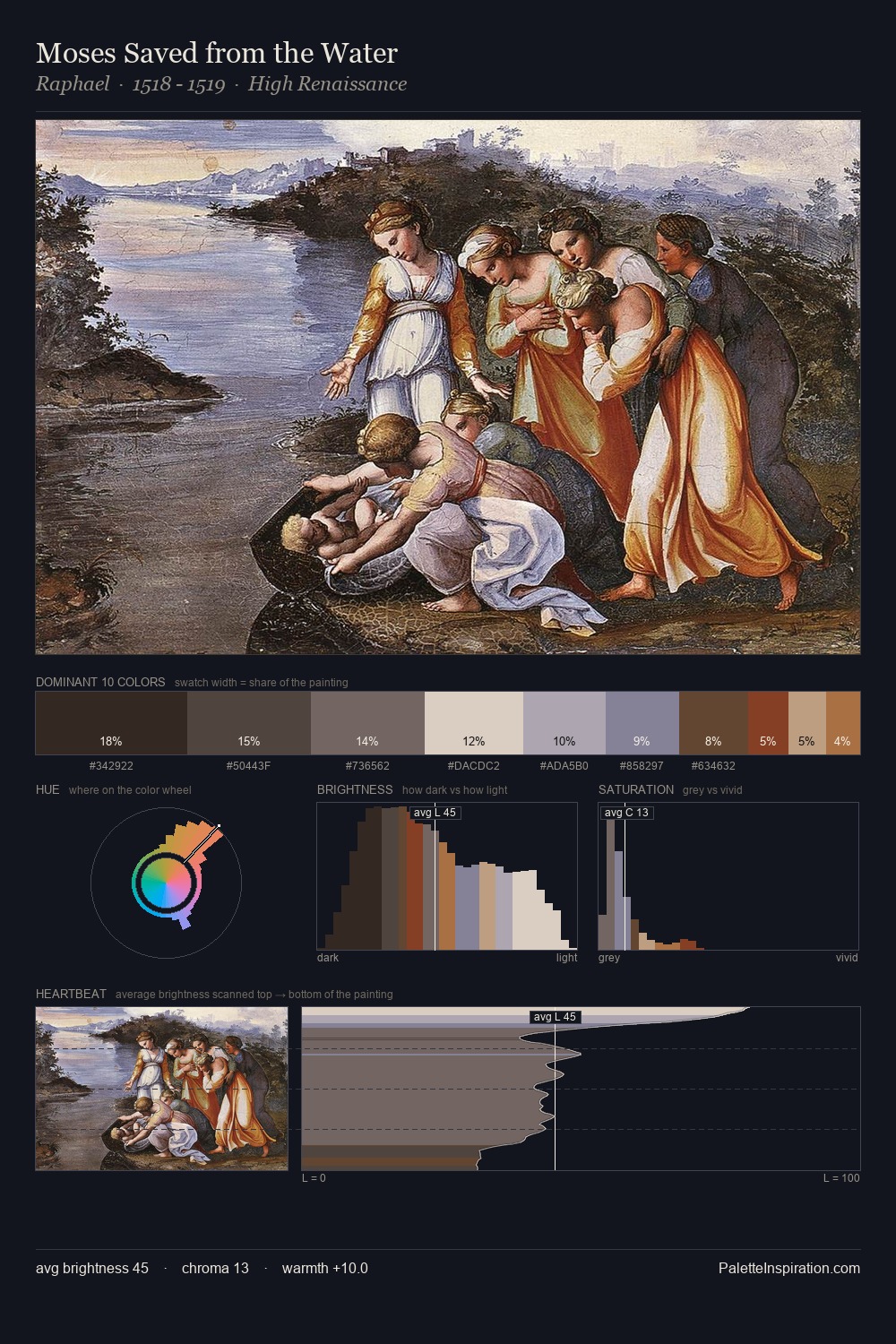
The value structure of David Kakabadze is mid-key: quiet, controlled, and cohesive. Neither warm nor cool has the upper hand here; the equilibrium between the two generates the palette's visual energy. All colours lean toward grey, building depth through value rather than colour punch. Only 3.5% is devoted to #BBA486, yet that small allocation delivers the palette's entire chromatic tension. 62 units of value range underpin the palette's structural clarity: the eye always knows where light falls. David Kakabadze's palette 1 carries its own internal logic while remaining in conversation with the artist's broader colour intelligence.
Example use cases
- archival print
- university identity
- rare books
- cultural institutions
- nonprofit identity
I Love This!
Use This Palette
Copy, export, or download for your project
Copy, export, or download for your project
Copy:
Download:
Share: