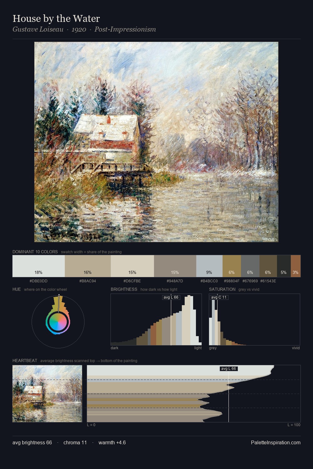
David Kakabadze Palette 3
Veiled Parchment
Veiled Partially obscured light - mid-dark with a hazy, scrim-filtered quality.
Parchment Aged warm neutral - the color of old manuscript parchment, tan and slightly yellowed.

Palette Analysis
Values in David Kakabadze rest in the mid-range - neither dramatically lit nor steeped in shadow. Warm and cool are kept in productive tension, creating the kind of chromatic harmony that sustains the eye. The absence of saturated colour is itself an expressive choice: this is a palette of restraint and atmosphere. The most saturated colour, #8C7B50, is reserved to 4.8% of the surface, where it acts as a focal punctuation. The value range of 44 units sits in the comfortable middle: enough depth, enough light, neither extreme. David Kakabadze's palette 3 carries its own internal logic while remaining in conversation with the artist's broader colour intelligence.
Example use cases
- exhibition design
- foundation branding
- estate management
- art education
- museums & galleries
I Love This!
Use This Palette
Copy, export, or download for your project
Copy, export, or download for your project
Copy:
Download:
Share: