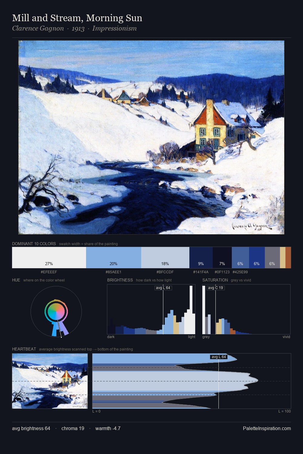
David Kakabadze Palette 4

Palette Analysis
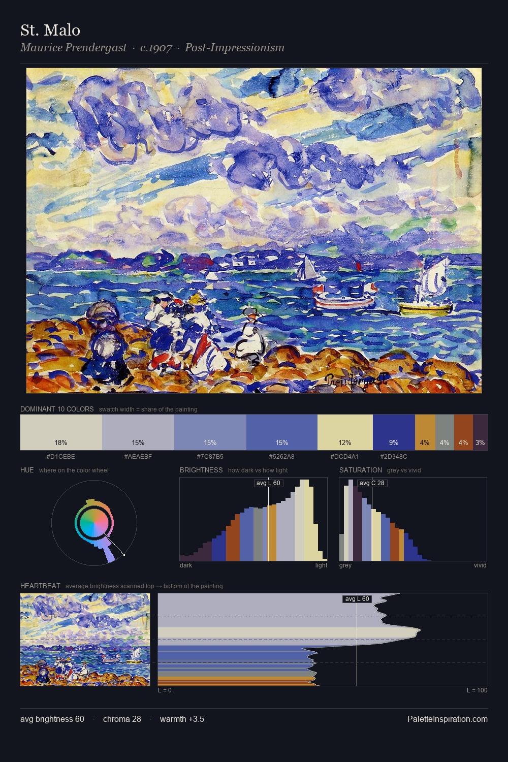
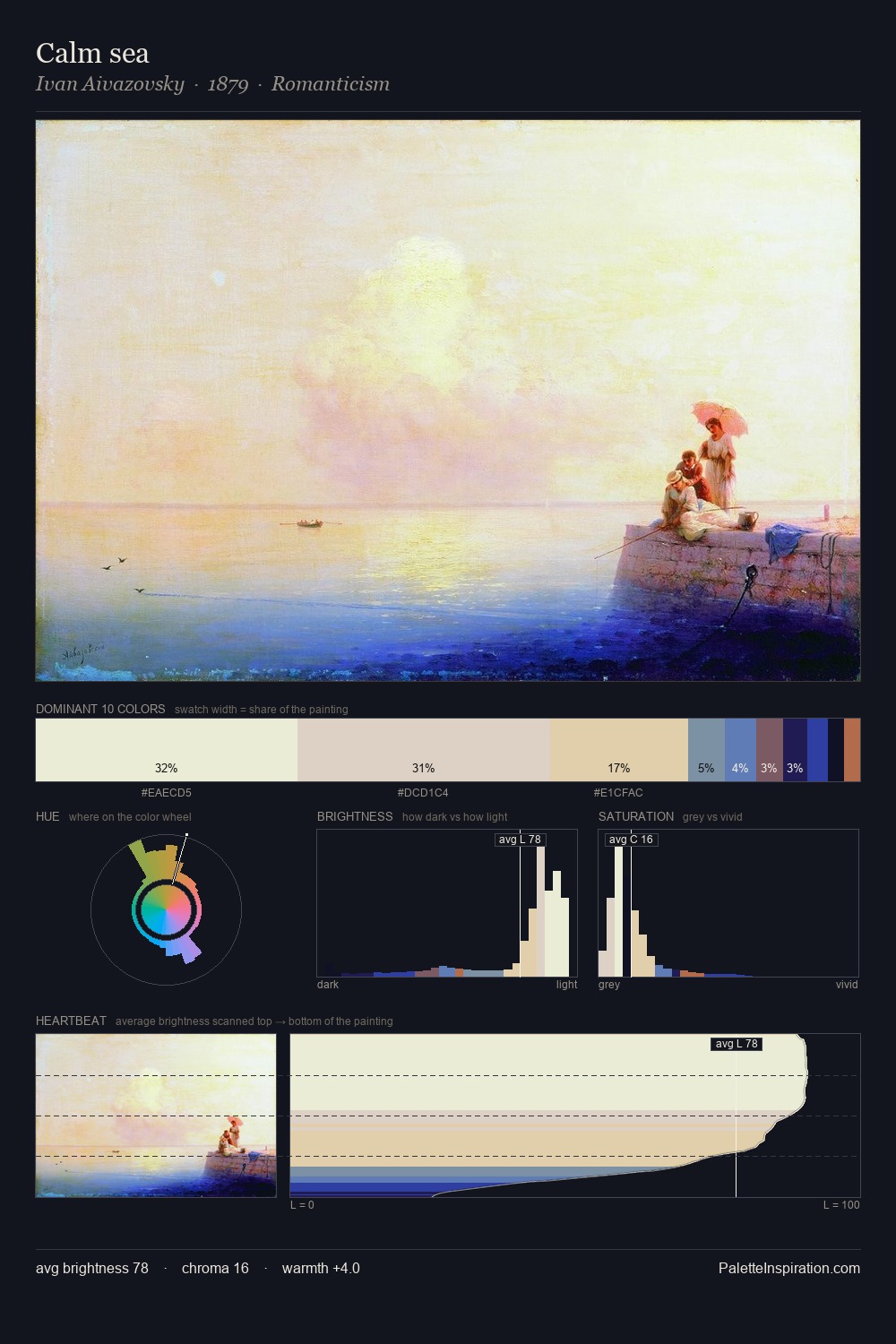
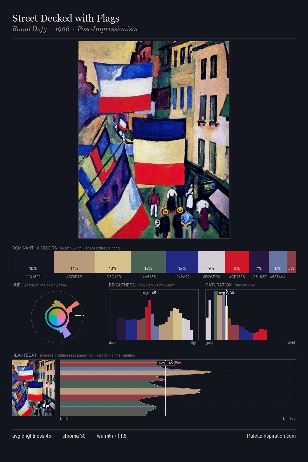
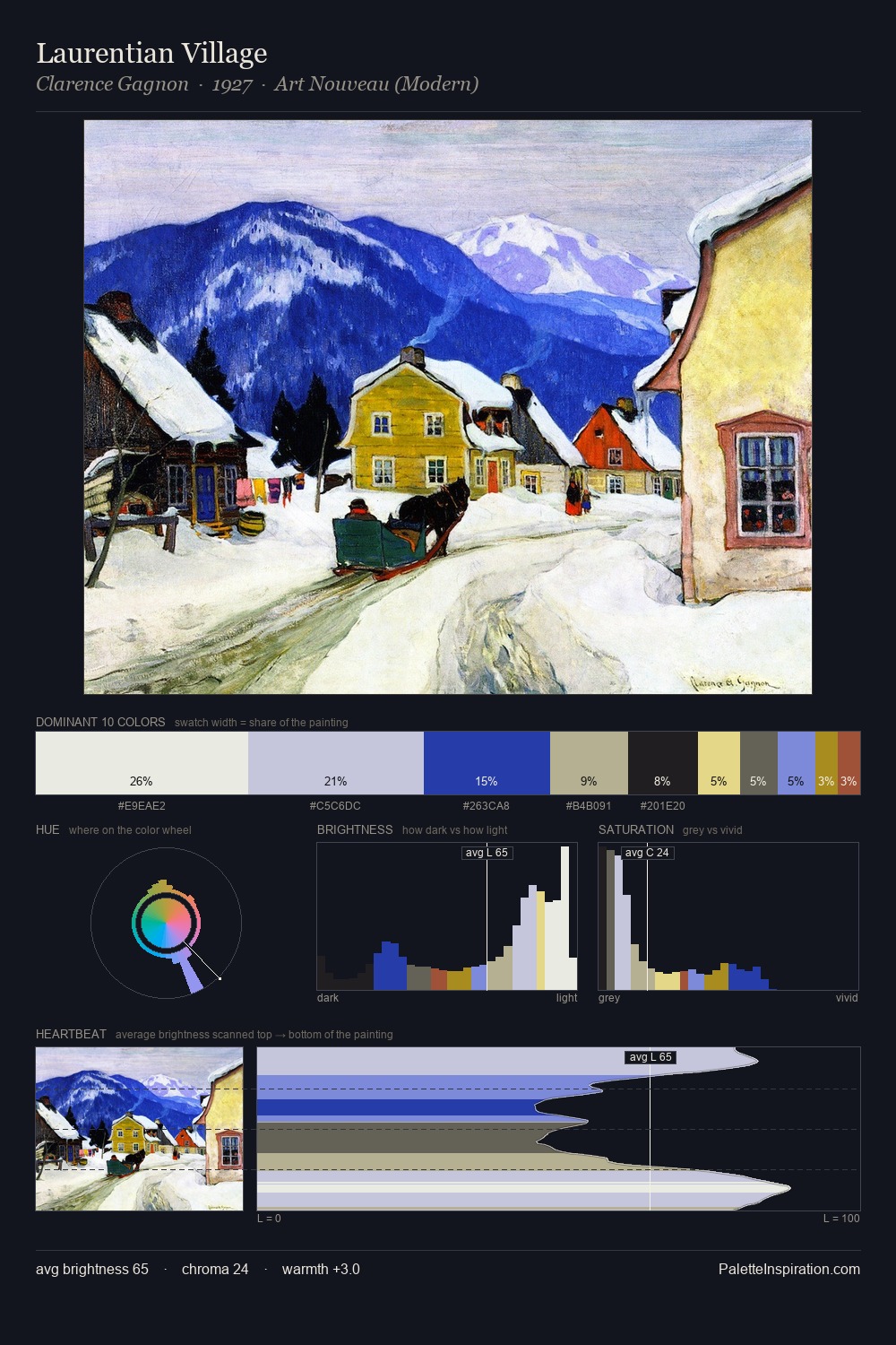
David Kakabadze is high-key - luminous, open, and weighted toward light. A distinctly cool atmosphere runs through this palette: sky, water, and mist given colour form. All colours lean toward grey, building depth through value rather than colour punch. 35.7% of the palette belongs to #E9E9E4, a concentration that makes it the unmistakable visual centre. The highest-chroma note - #111255 - appears at just 1.5%, deployed as a precision accent against the quieter ground. The value range spans 70 units across the palette, providing the full gamut from deep shadow to near-white and ensuring clear tonal hierarchy. The palette has the character of outdoor light: cool, mid-bright, with colour rendered faithfully rather than expressively. In the context of David Kakabadze's full range of palettes, group 4 represents one movement in an ongoing chromatic dialogue.
Example use cases
- publishing
- corporate identity
- consumer apps
- hospitality
- design agencies
I Love This!
Copy, export, or download for your project