Carl Haag Master Palette
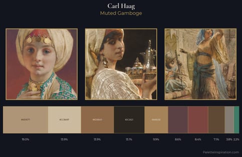
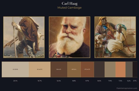
Muted Gamboge
Muted Deliberately desaturated - chroma pulled toward gray, the restraint of tonal painting.
Gamboge Deep golden yellow - a traditional warm pigment, rich amber-gold.
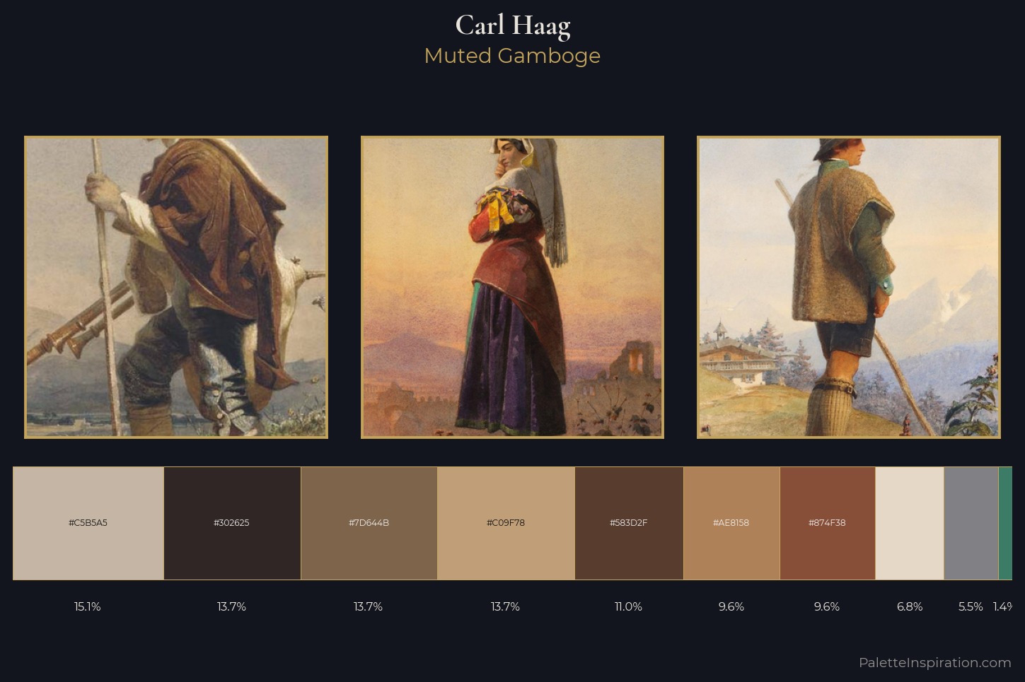
Palette Analysis
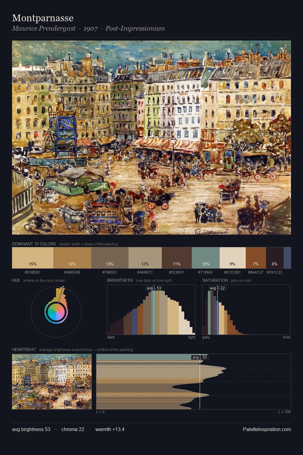
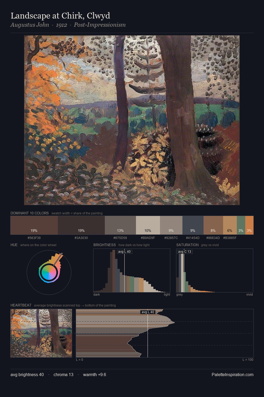
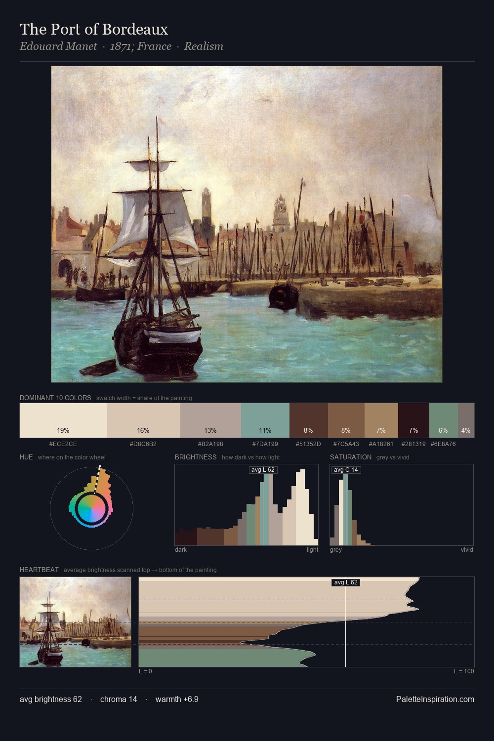
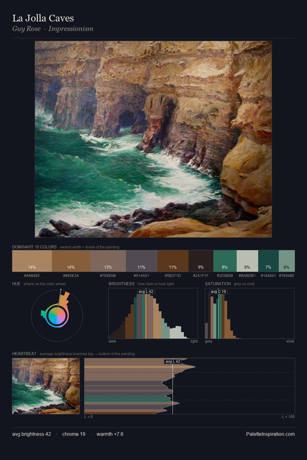
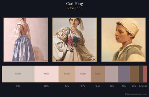
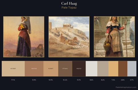
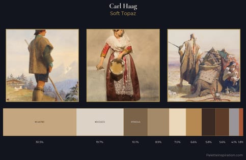
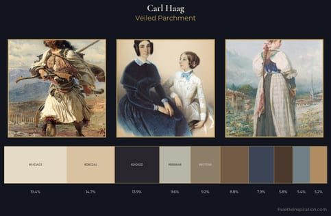
Carl Haag sits in the centre of the value range, lending the palette a sense of even, sustained light. Warm hues command this palette; Carl Haag favours the reds, oranges, and yellows of firelight and earth. Saturation is deliberately withheld - the beauty here lies in the near-monochromatic gradations rather than colour difference. The highest-chroma note - #E6D8C7 - appears at just 6.9%, deployed as a precision accent against the quieter ground. At 61 units of value range, the palette has the tonal breadth to sustain complex spatial readings. Taken together, these qualities constitute Carl Haag's chromatic voice - distinctive enough to be read across an entire body of work.
Example use cases
- ceramics & pottery
- boutique hospitality
- menswear
- heritage food brands
- craft & artisan brands
I Love This!
Use This Palette
Copy, export, or download for your project
Copy, export, or download for your project
Copy:
Download:
Share: