Carl Haag Palette 1
Pale Ecru
Pale High-key and low-chroma - delicate, bleached, washed with light.
Ecru Unbleached linen - warm mid-neutral, slightly grayed, raw and natural.

Palette Analysis
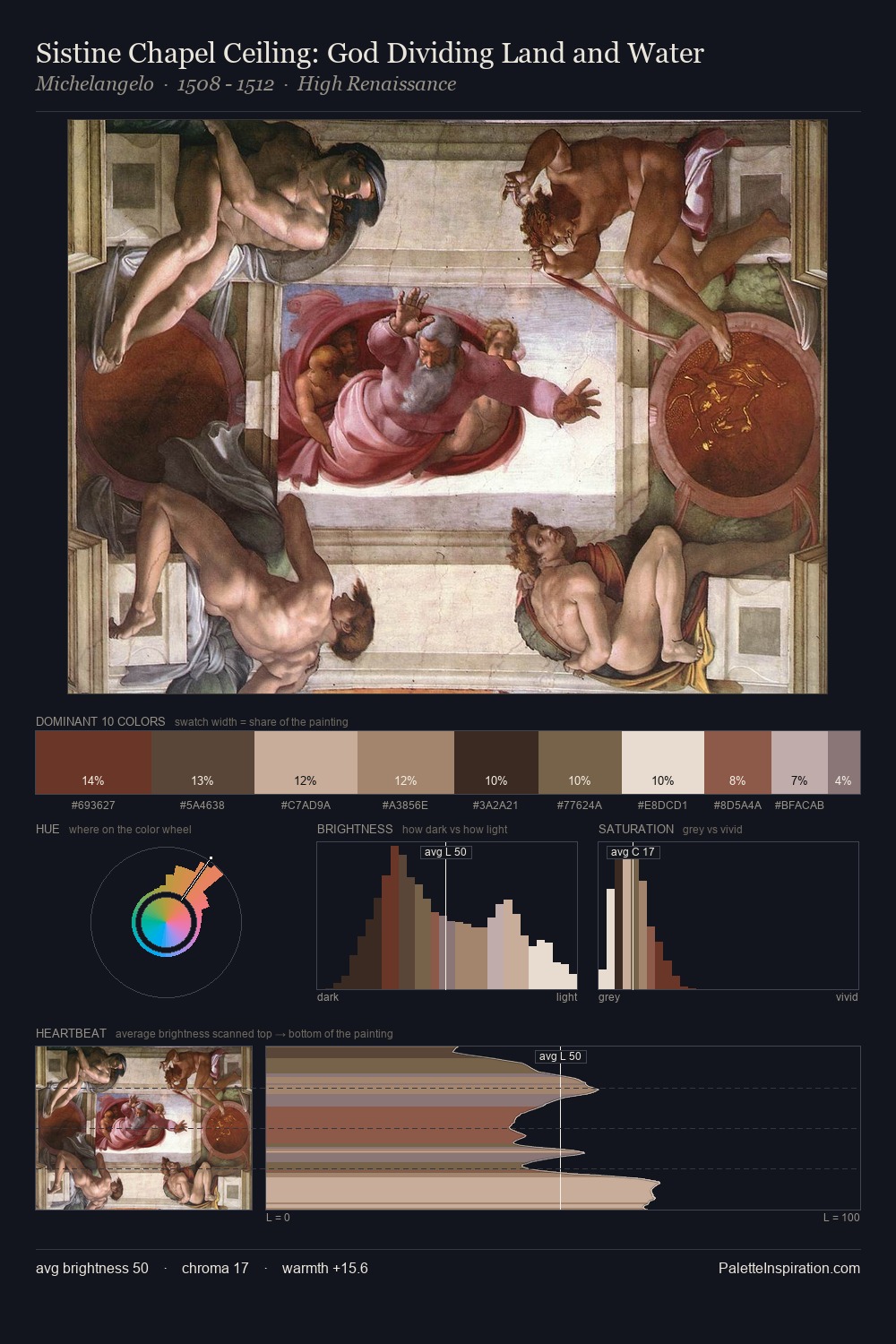
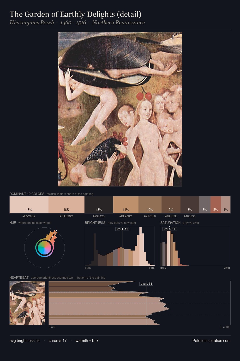
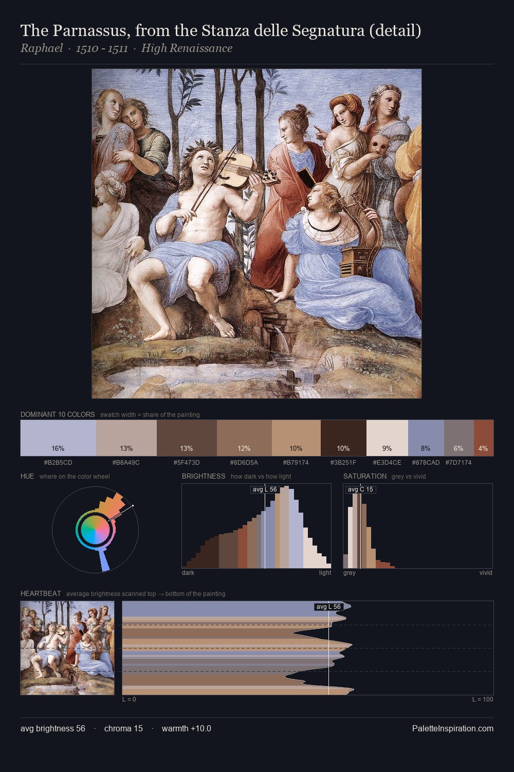
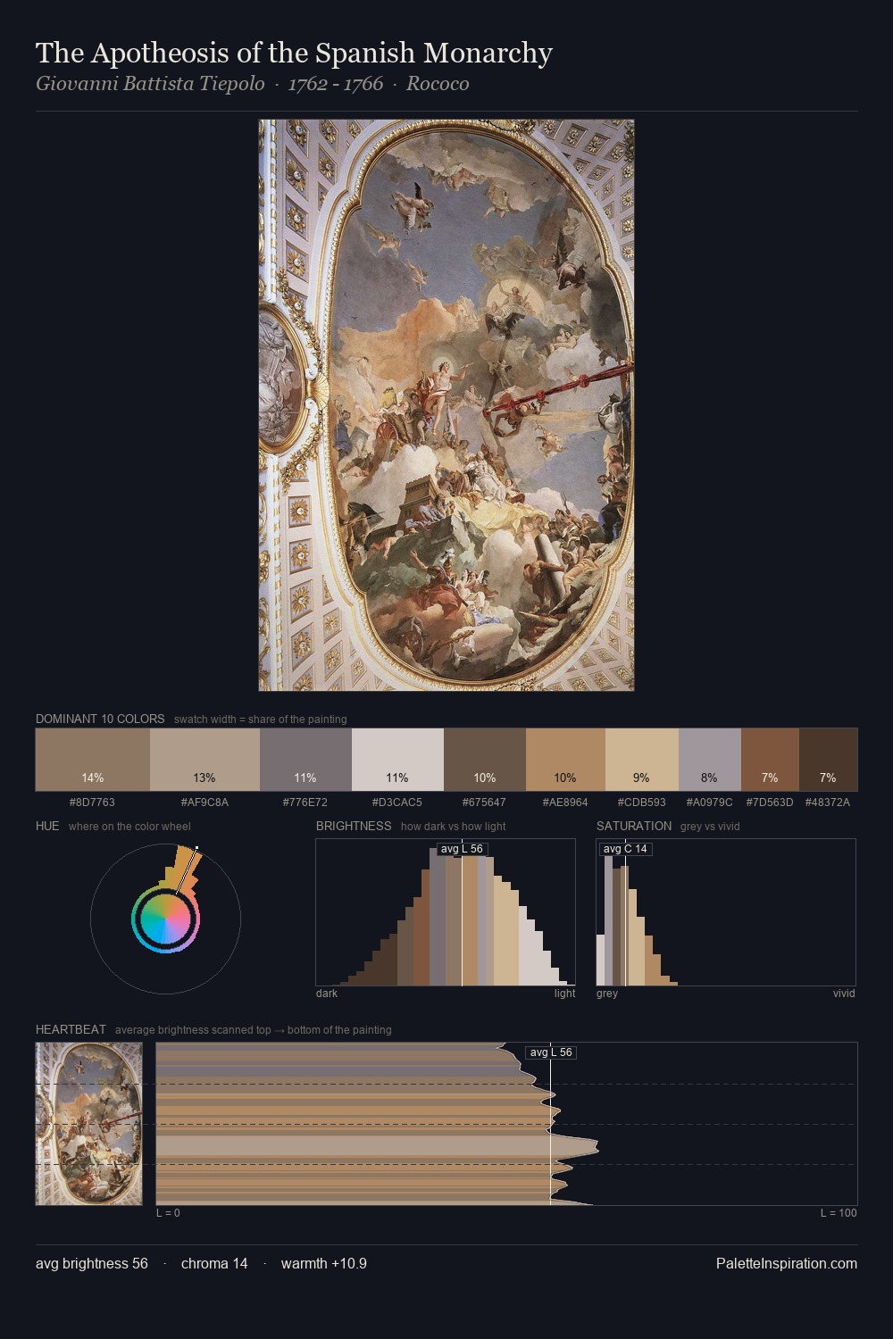
Carl Haag is strongly light-biased - shadow is suggested rather than declared. Heat pervades this palette; warm chromatic identities outweigh cool ones at almost every weight. Muted throughout, the palette achieves its effects through value and temperature rather than chromatic force. The highest-chroma note - #7C5D42 - appears at just 6.2%, deployed as a precision accent against the quieter ground. The palette spans 54 value units: a measured range that delivers coherence over drama. In the context of Carl Haag's full range of palettes, group 1 represents one movement in an ongoing chromatic dialogue.
Example use cases
- publishing
- corporate identity
- consumer apps
- hospitality
- design agencies
I Love This!
Use This Palette
Copy, export, or download for your project
Copy, export, or download for your project
Copy:
Download:
Share: