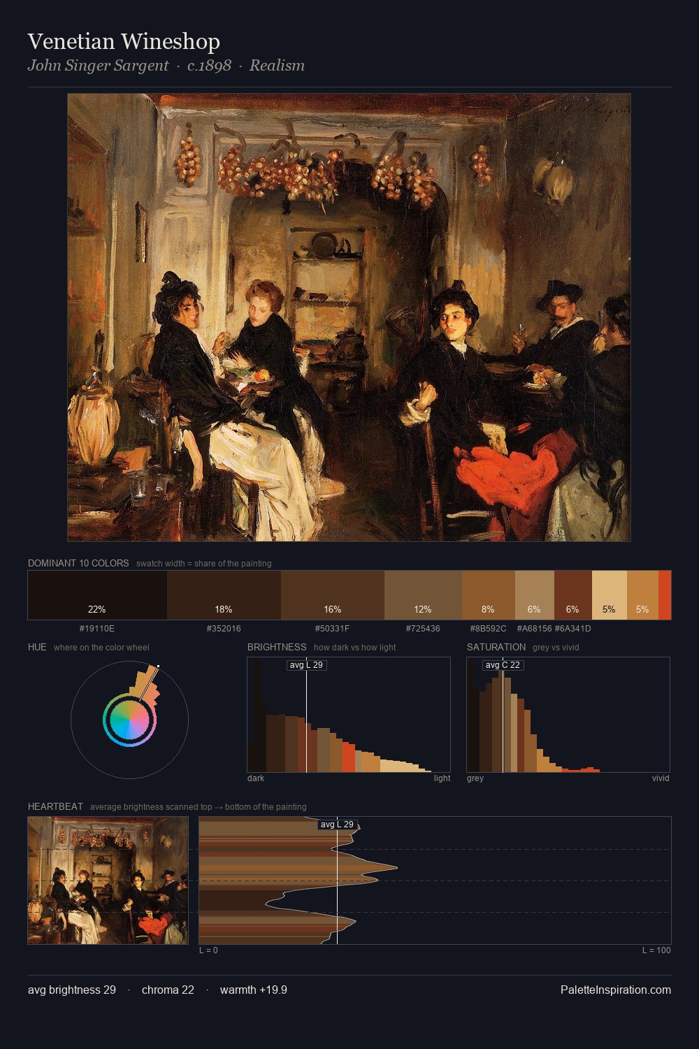
Carl Haag Palette 7

Palette Analysis
The palette of Carl Haag sits in the lower register of the value scale - dense, contained, and weighted. Temperature reads distinctly warm: the reds and earth tones from Carl Haag carry the compositional weight. All colours lean toward grey, building depth through value rather than colour punch. A single dominant - #110C0A at 30.1% - sets the character of the whole composition. The highest-chroma note - #935132 - appears at just 1.5%, deployed as a precision accent against the quieter ground. A value spread of 62 units gives the palette both depth and air - shadows are genuinely dark, lights genuinely light. Together these qualities place Carl Haag firmly in the tonal tradition - concerned with mood and atmosphere rather than chromatic display. Carl Haag's palette 7 carries its own internal logic while remaining in conversation with the artist's broader colour intelligence.
Example use cases
- theater design
- jewelry brands
- tobacco-adjacent retail
- event branding
- film & entertainment
I Love This!
Copy, export, or download for your project