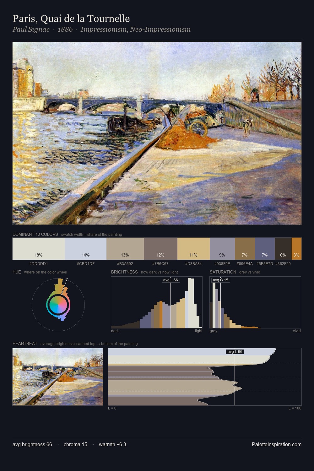
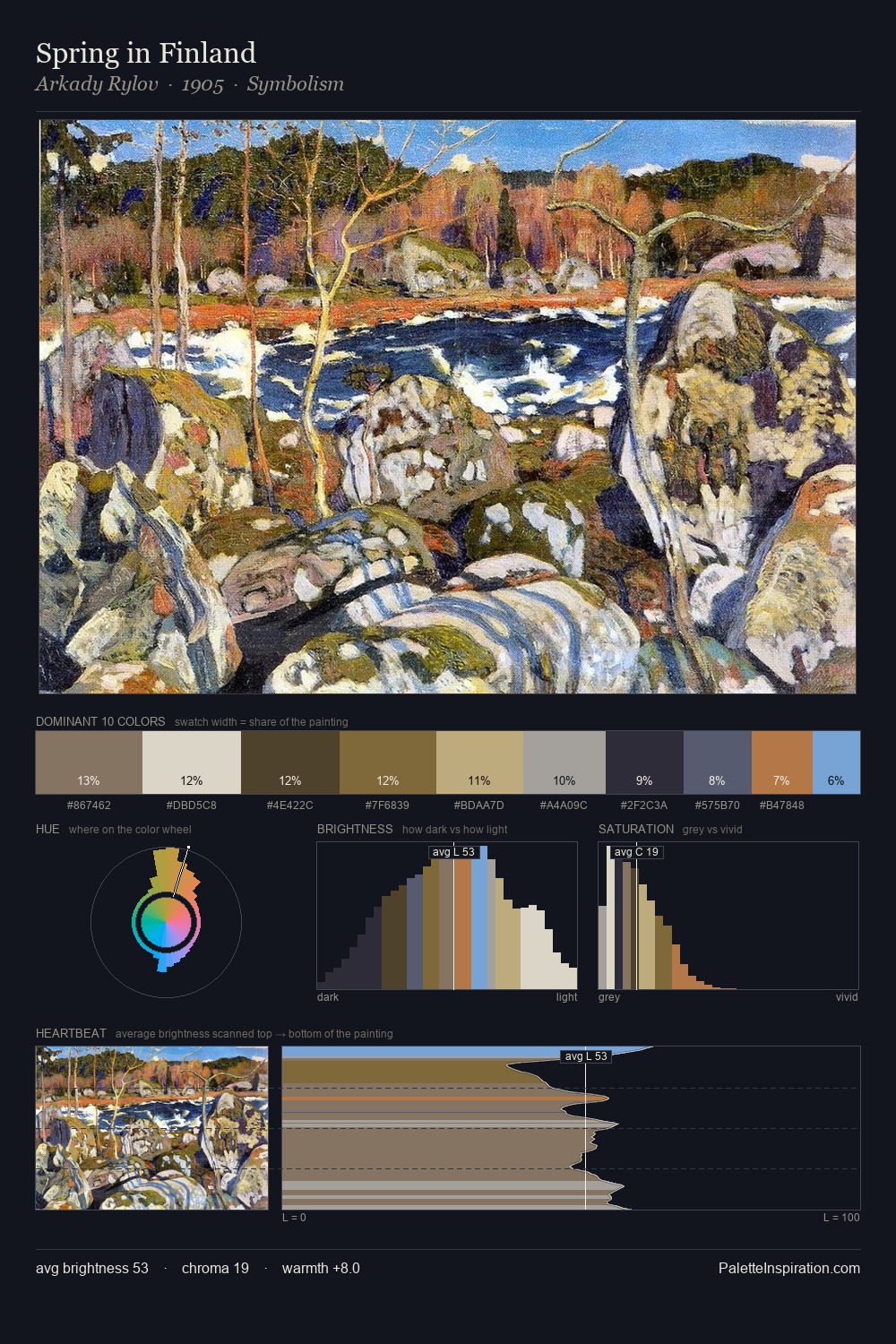
Camille Pissarro Palette 5
Soft Ecru
Soft Low-contrast, gentle chroma - mid-key values and low saturation, approachable and calm.
Ecru Unbleached linen - warm mid-neutral, slightly grayed, raw and natural.

Palette Analysis
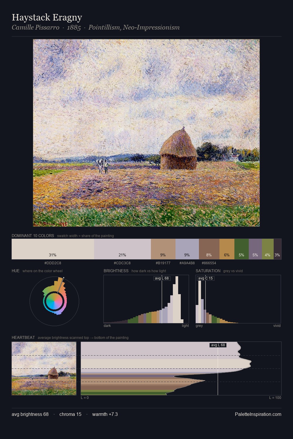
Light floods Camille Pissarro; the palette keeps values pale and airy across its range. The palette achieves thermal balance - reds and blues, ochres and greens, each holding the other in check. All colours lean toward grey, building depth through value rather than colour punch. 31.7% of the palette belongs to #E3DED1, a concentration that makes it the unmistakable visual centre. At 6.3%, #926A4E carries the palette's sharpest chromatic charge: an accent that earns its place precisely because it is withheld. 58 units of value range underpin the palette's structural clarity: the eye always knows where light falls. In the context of Camille Pissarro's full range of palettes, group 5 represents one movement in an ongoing chromatic dialogue.
Example use cases
- florist branding
- event design
- real estate
- jewelry retail
- hospitality branding
I Love This!
Use This Palette
Copy, export, or download for your project
Copy, export, or download for your project
Copy:
Download:
Share: