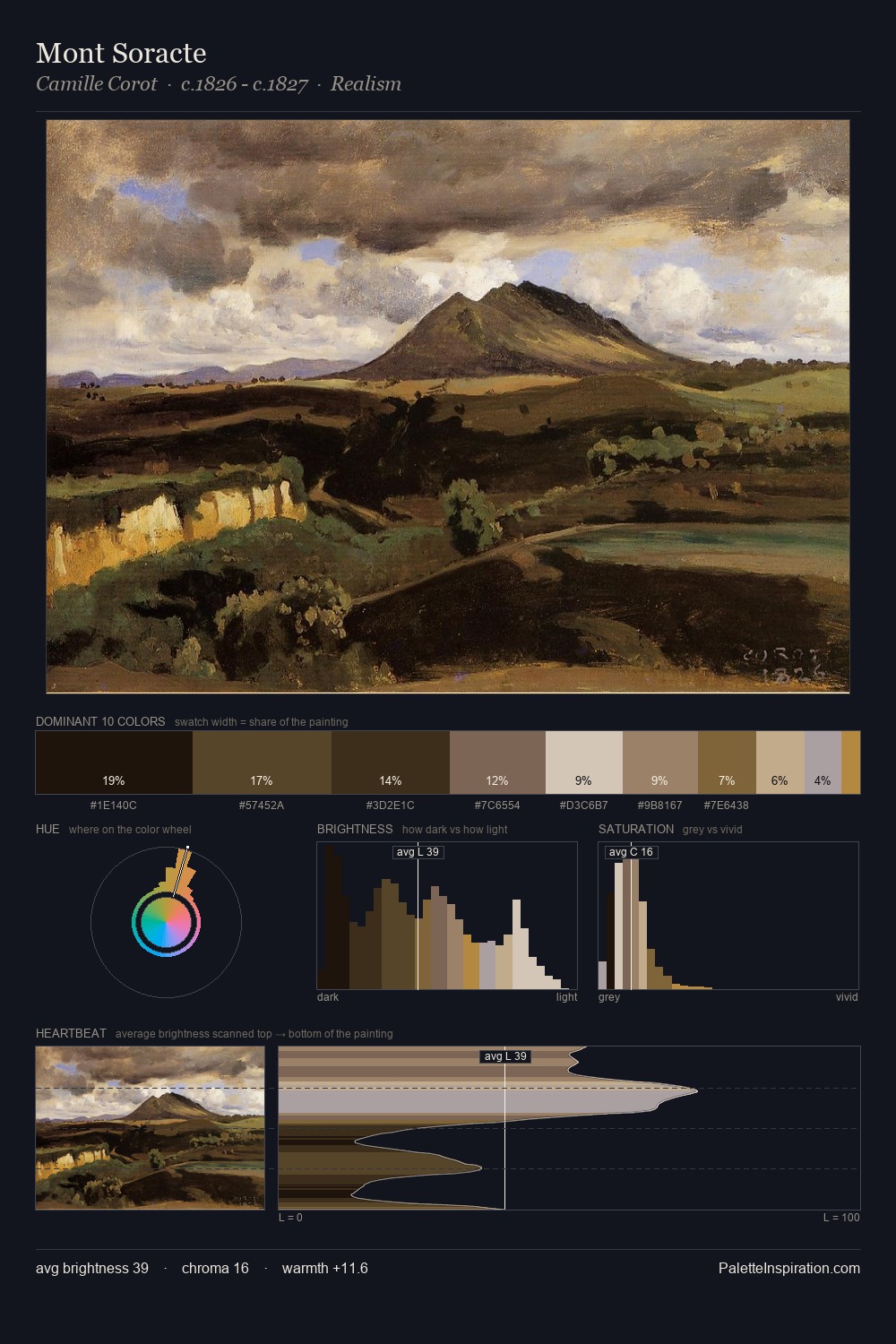
Camille Pissarro Palette 27
Penumbral Caramel
Penumbral Partial shadow - the transitional zone between light and full dark, soft-edged.
Caramel Warm mid-brown - the color of cooked sugar, smooth and amber-toned.

Palette Analysis
Camille Pissarro keeps values measured and balanced, a hallmark of tonal restraint. Warmth dominates - the palette of Camille Pissarro leans heavily on the yellow-orange-red arc of the colour wheel. Saturation is deliberately withheld - the beauty here lies in the near-monochromatic gradations rather than colour difference. The highest-chroma note - #B38A45 - appears at just 5.8%, deployed as a precision accent against the quieter ground. 51 units of value spread create a palette that is varied but unified - contrast in the service of harmony. This is palette 27 of Camille Pissarro's sequence - a single chapter in a chromatic story told across many works.
Example use cases
- theater design
- jewelry brands
- tobacco-adjacent retail
- event branding
- film & entertainment
I Love This!
Use This Palette
Copy, export, or download for your project
Copy, export, or download for your project
Copy:
Download:
Share: