C. R. W. Nevinson Palette 1

Palette Analysis
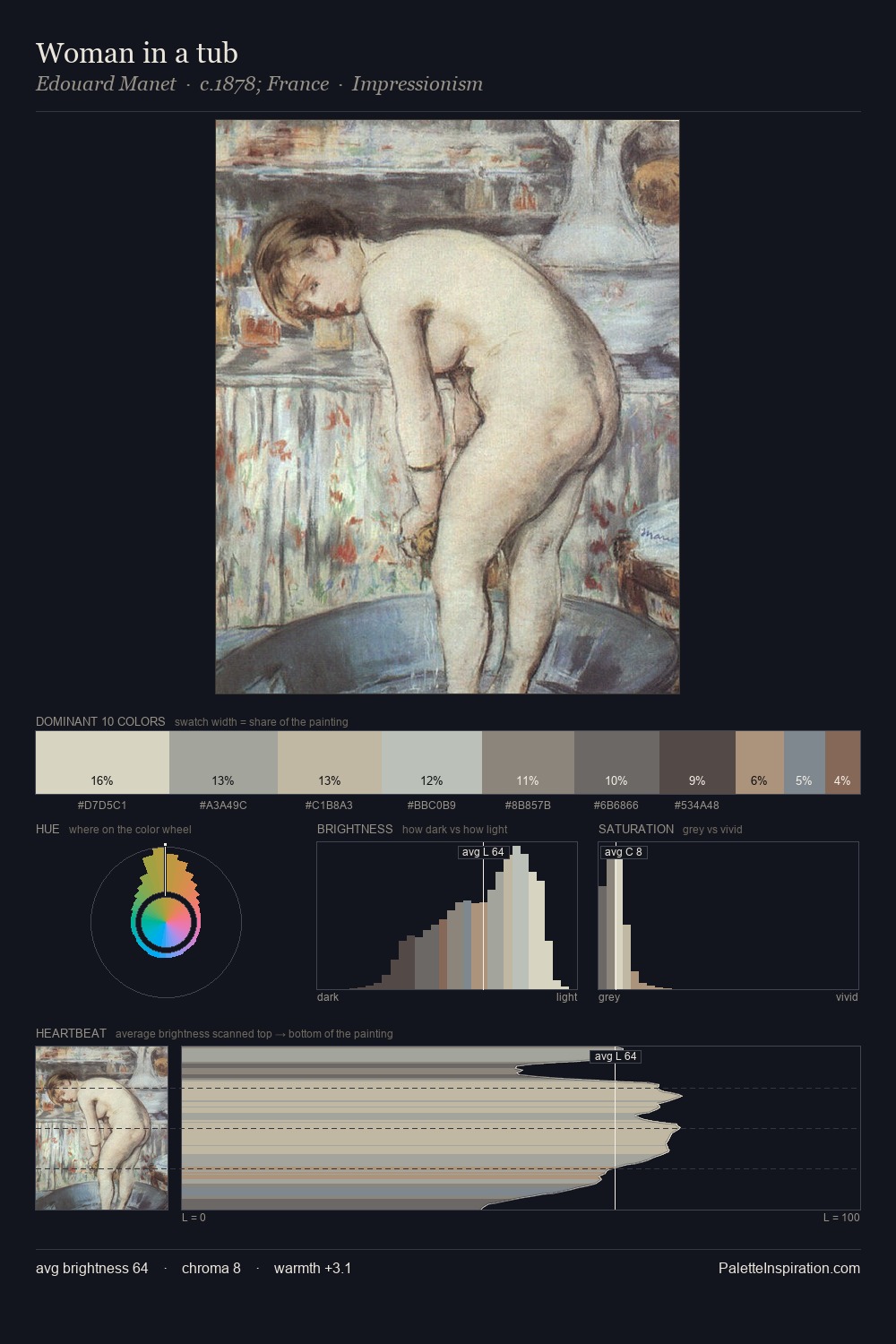
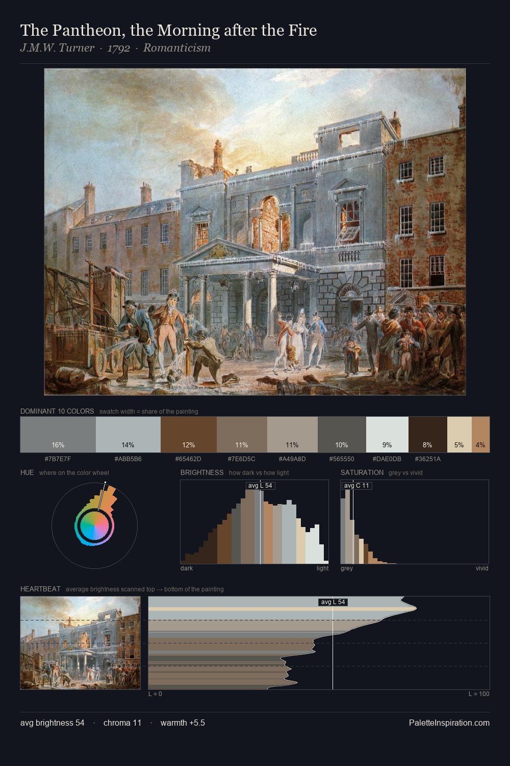
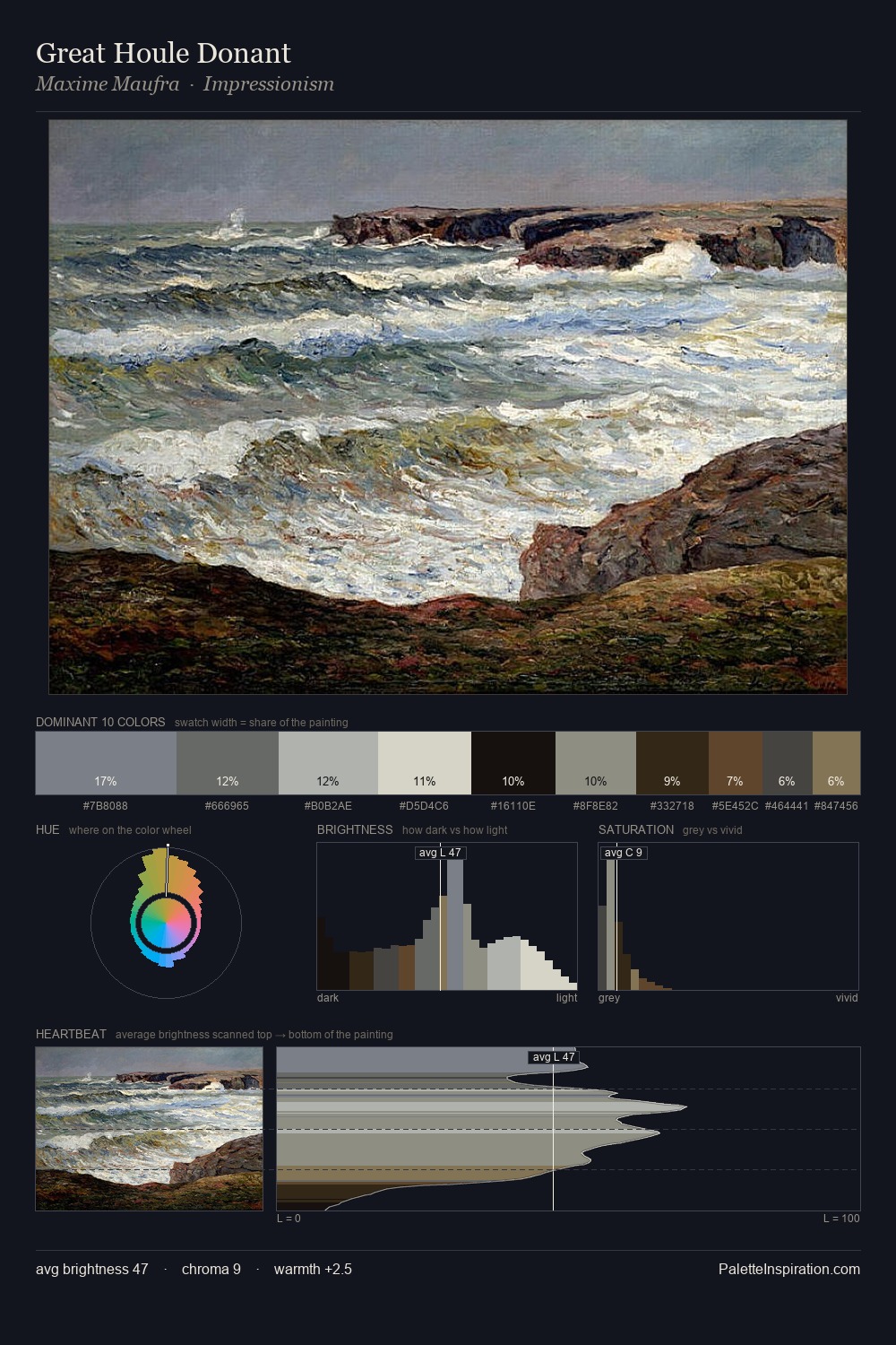
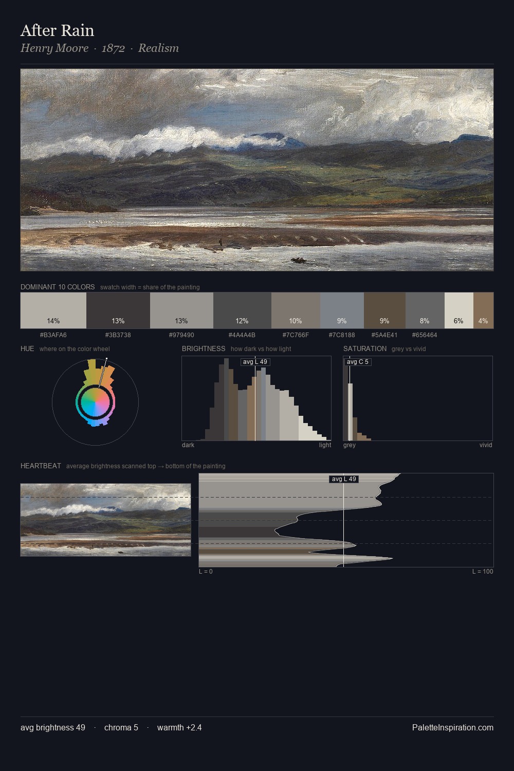
C. R. W. Nevinson works in the upper reaches of the value scale, creating an atmosphere of brightness and expansiveness. C. R. W. Nevinson tilts toward cool - blues and silver-greys carry the structural weight. All colours lean toward grey, building depth through value rather than colour punch. At 8.8%, #D6D5BF carries the palette's sharpest chromatic charge: an accent that earns its place precisely because it is withheld. 51 units of value spread create a palette that is varied but unified - contrast in the service of harmony. The mid-to-high key, cool bias, and moderate chroma point to outdoor observation - sky and diffused daylight as the dominant light source. In the context of C. R. W. Nevinson's full range of palettes, group 1 represents one movement in an ongoing chromatic dialogue.
Example use cases
- florist branding
- event design
- real estate
- jewelry retail
- hospitality branding
I Love This!
Copy, export, or download for your project