C. R. W. Nevinson Palette 8

Palette Analysis
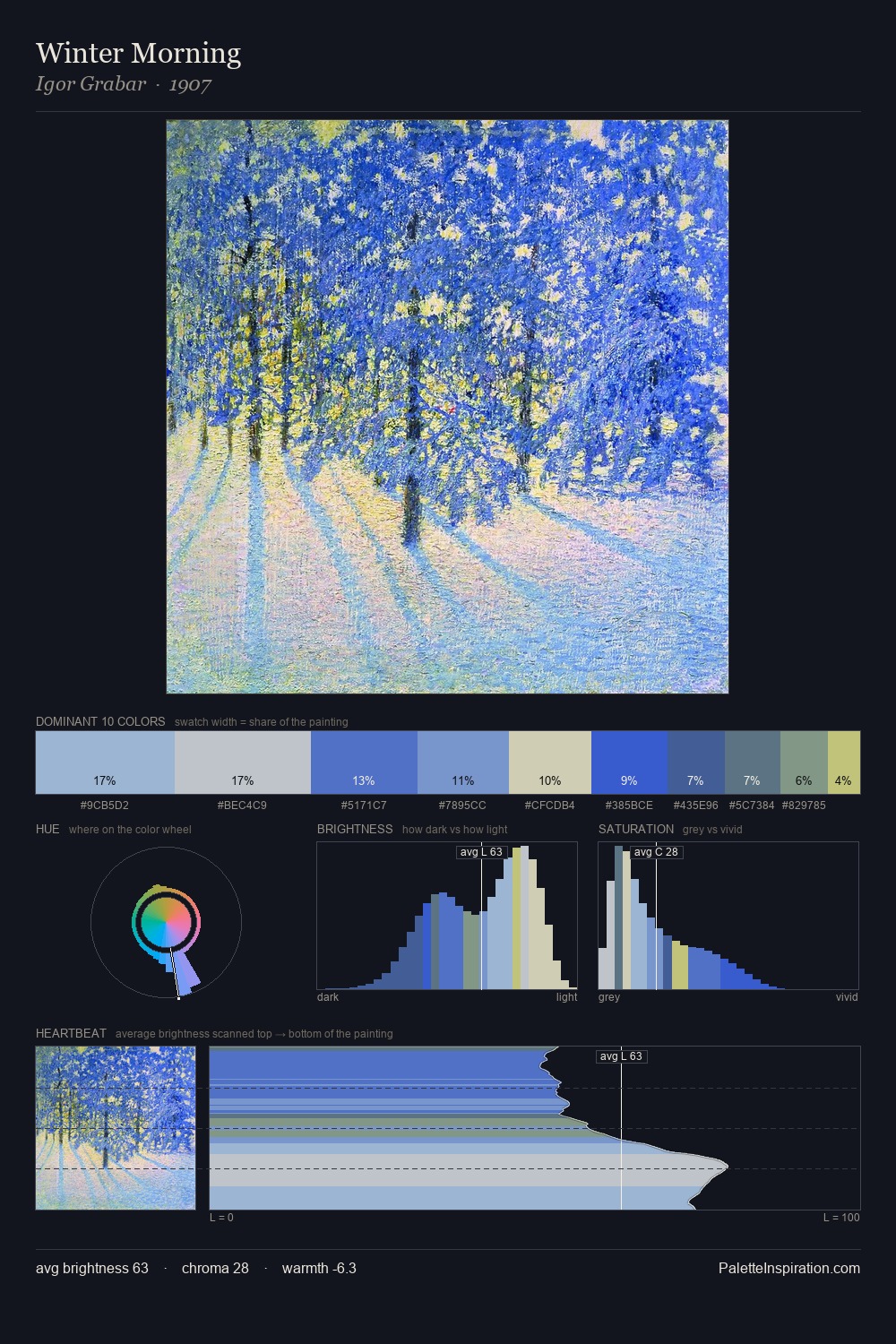
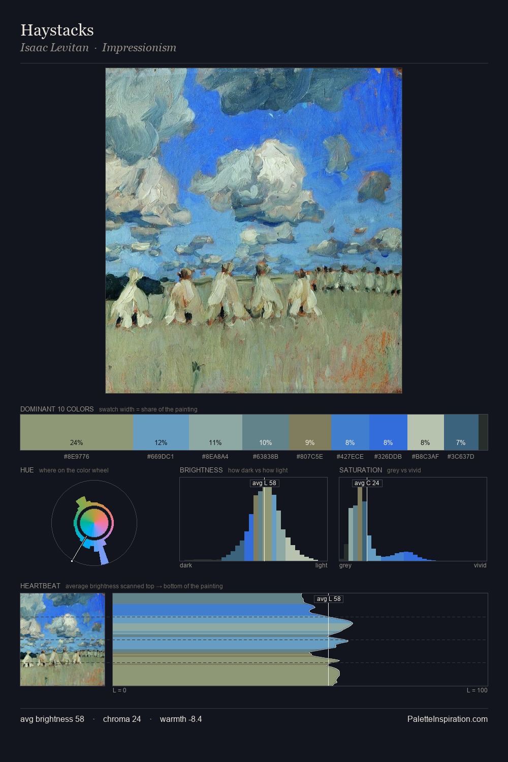
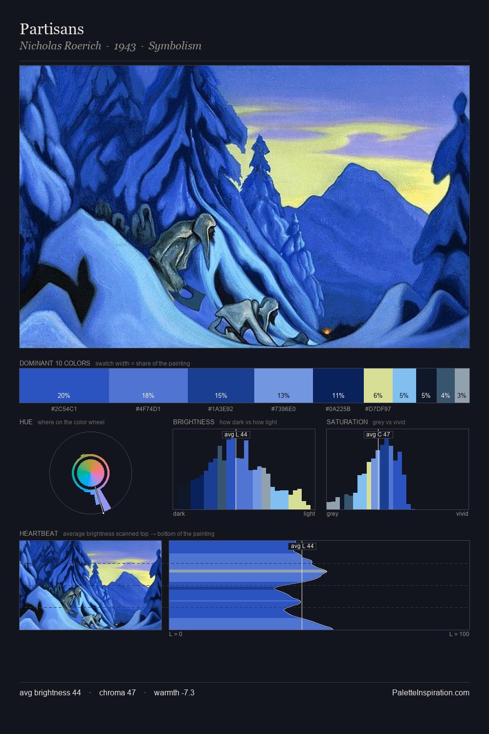
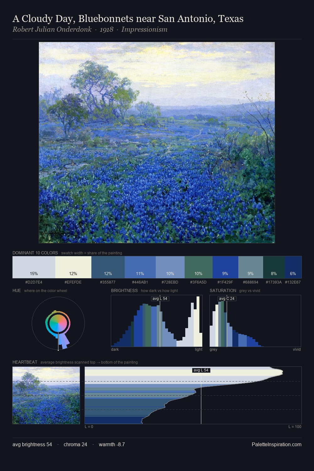
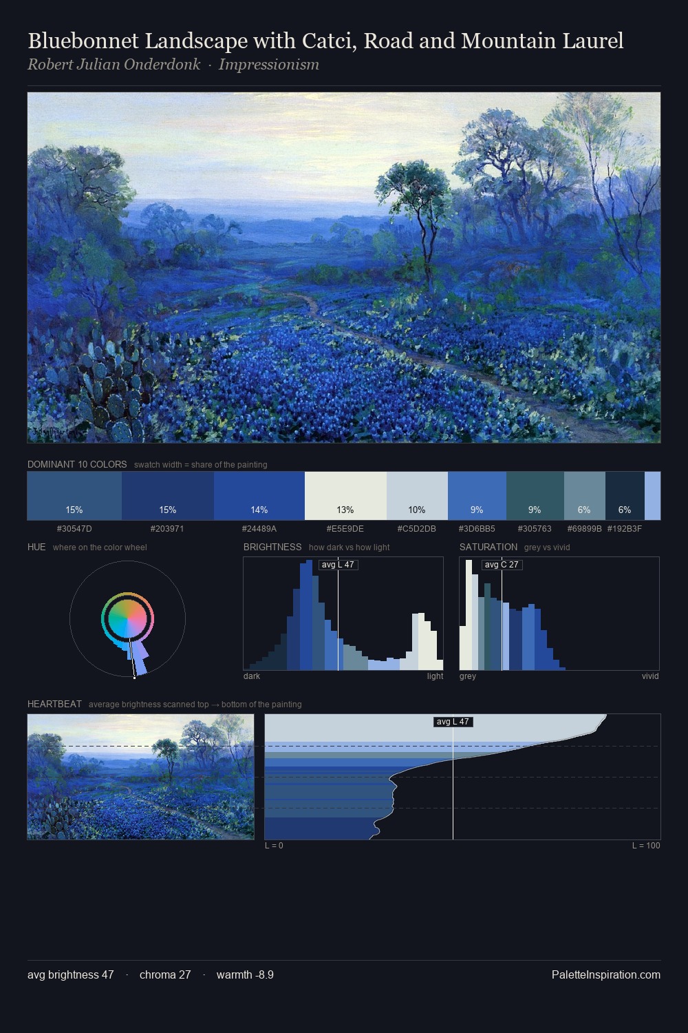
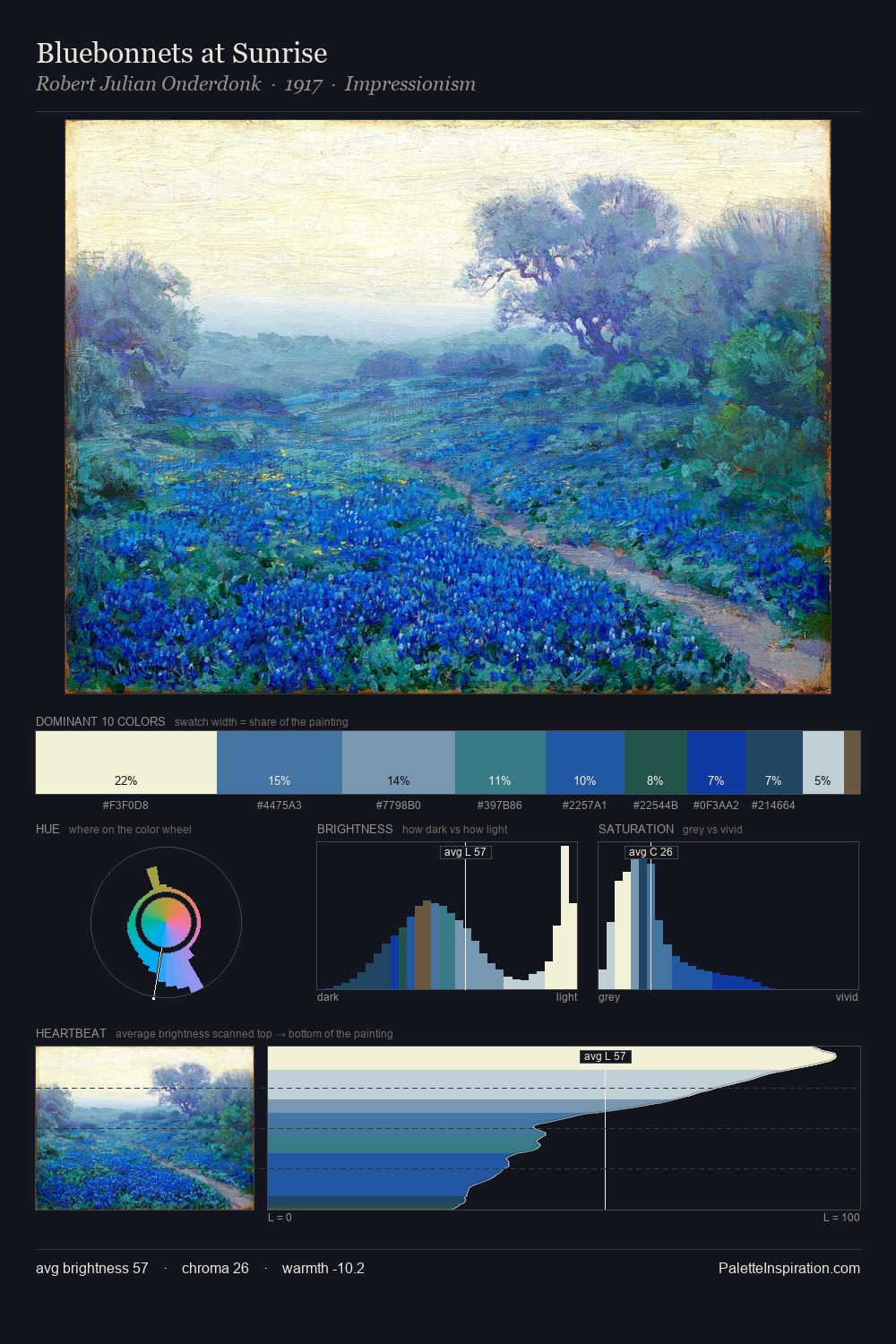
C. R. W. Nevinson occupies the comfortable middle of the value scale, avoiding both extremes to hold the eye in a sustained middle grey. A distinctly cool atmosphere runs through this palette: sky, water, and mist given colour form. Mid-range chroma keeps the palette grounded - colourful but not strident. The most saturated colour, #1D40AE, is reserved to 6.9% of the surface, where it acts as a focal punctuation. At 38 units across the value scale, the palette keeps contrast readable without letting it dominate. The palette has the character of outdoor light: cool, mid-bright, with colour rendered faithfully rather than expressively. Palette 8 sits within the larger chromatic argument that C. R. W. Nevinson's complete body of work advances.
Example use cases
- publishing
- corporate identity
- consumer apps
- hospitality
- design agencies
I Love This!
Copy, export, or download for your project