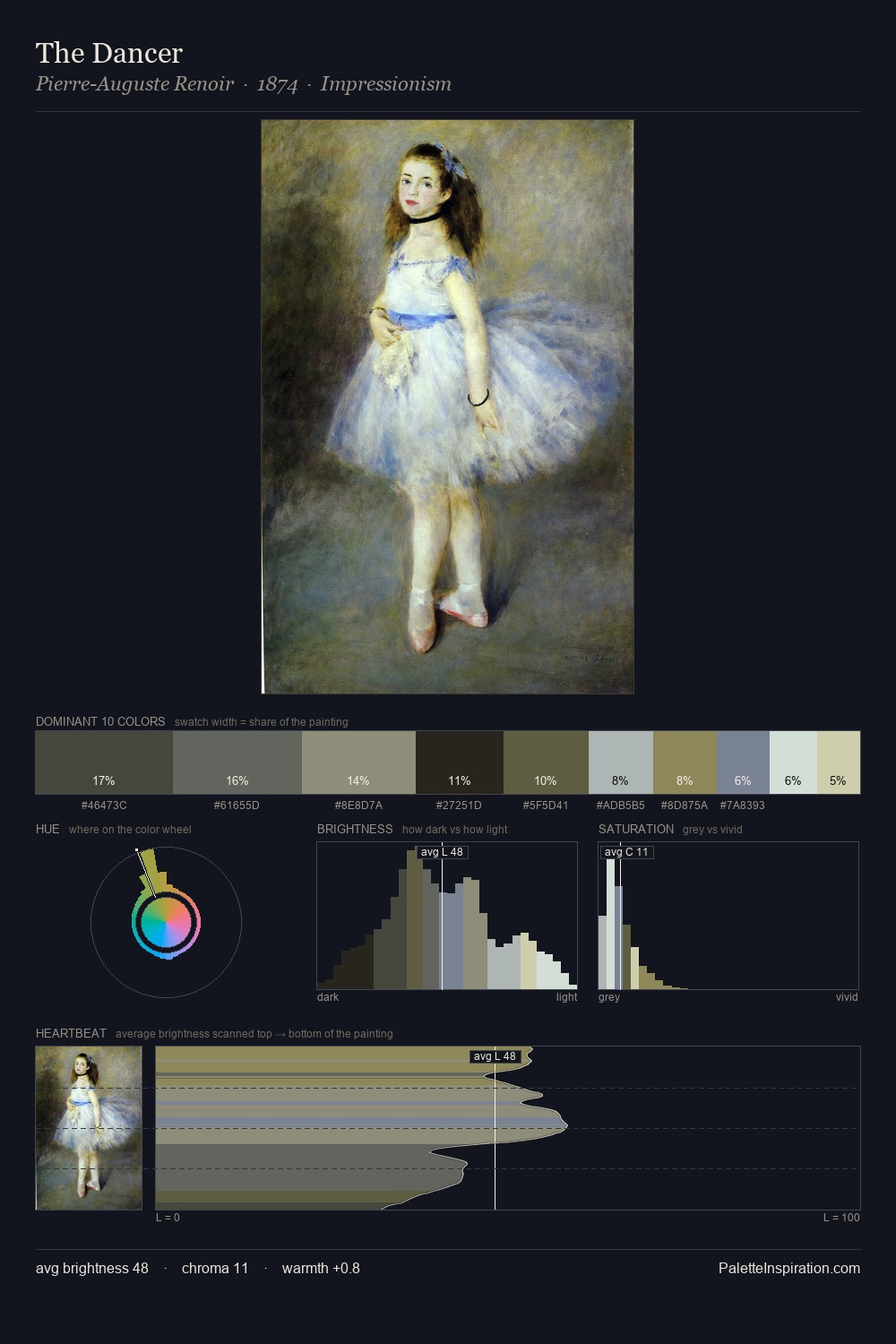
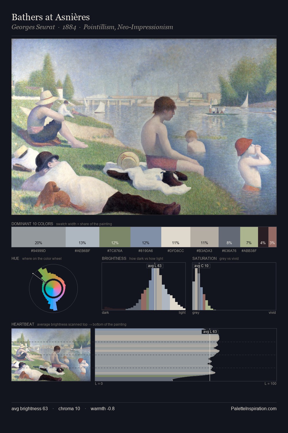
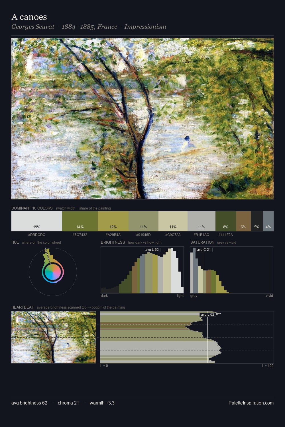
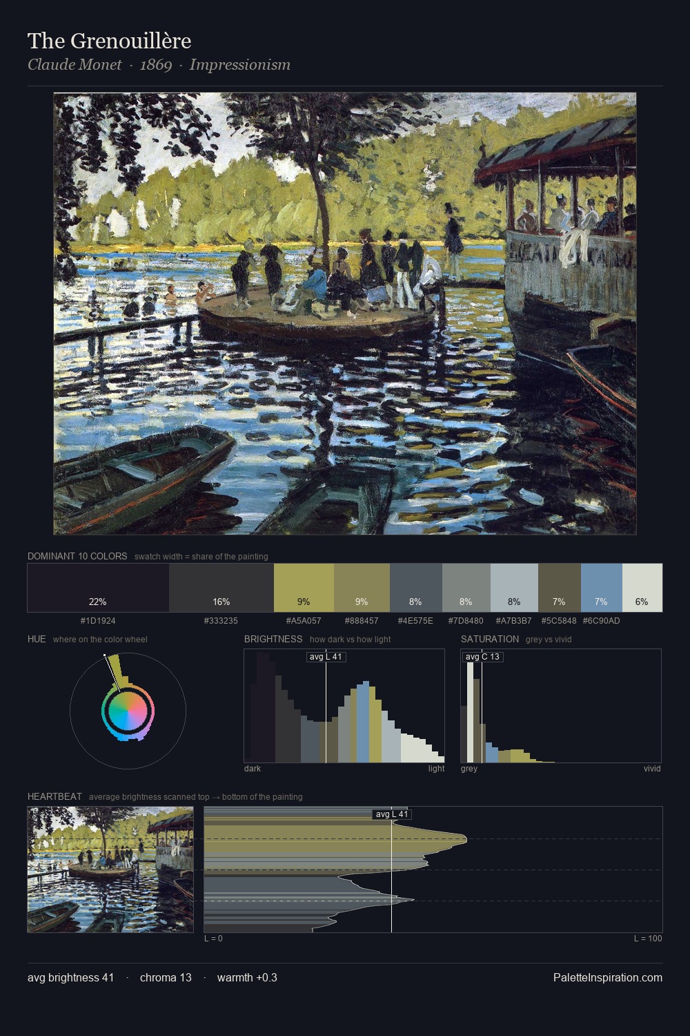
James McNeill Whistler Palette 3

Palette Analysis
Values in James McNeill Whistler tilt decisively toward white, giving the palette its luminous character. James McNeill Whistler tilts toward cool - blues and silver-greys carry the structural weight. Saturation is deliberately withheld - the beauty here lies in the near-monochromatic gradations rather than colour difference. #CCDDCD functions as the palette's exclamation mark: highest chroma, lowest percentage (10.2%). The value range spans 62 units across the palette, providing the full gamut from deep shadow to near-white and ensuring clear tonal hierarchy. The mid-to-high key, cool bias, and moderate chroma point to outdoor observation - sky and diffused daylight as the dominant light source. James McNeill Whistler's palette 3 carries its own internal logic while remaining in conversation with the artist's broader colour intelligence.
Example use cases
- museum collateral
- fashion lookbooks
- minimalist e-commerce
- interior design
- publishing
I Love This!
Copy, export, or download for your project