James McNeill Whistler Palette 9

Palette Analysis
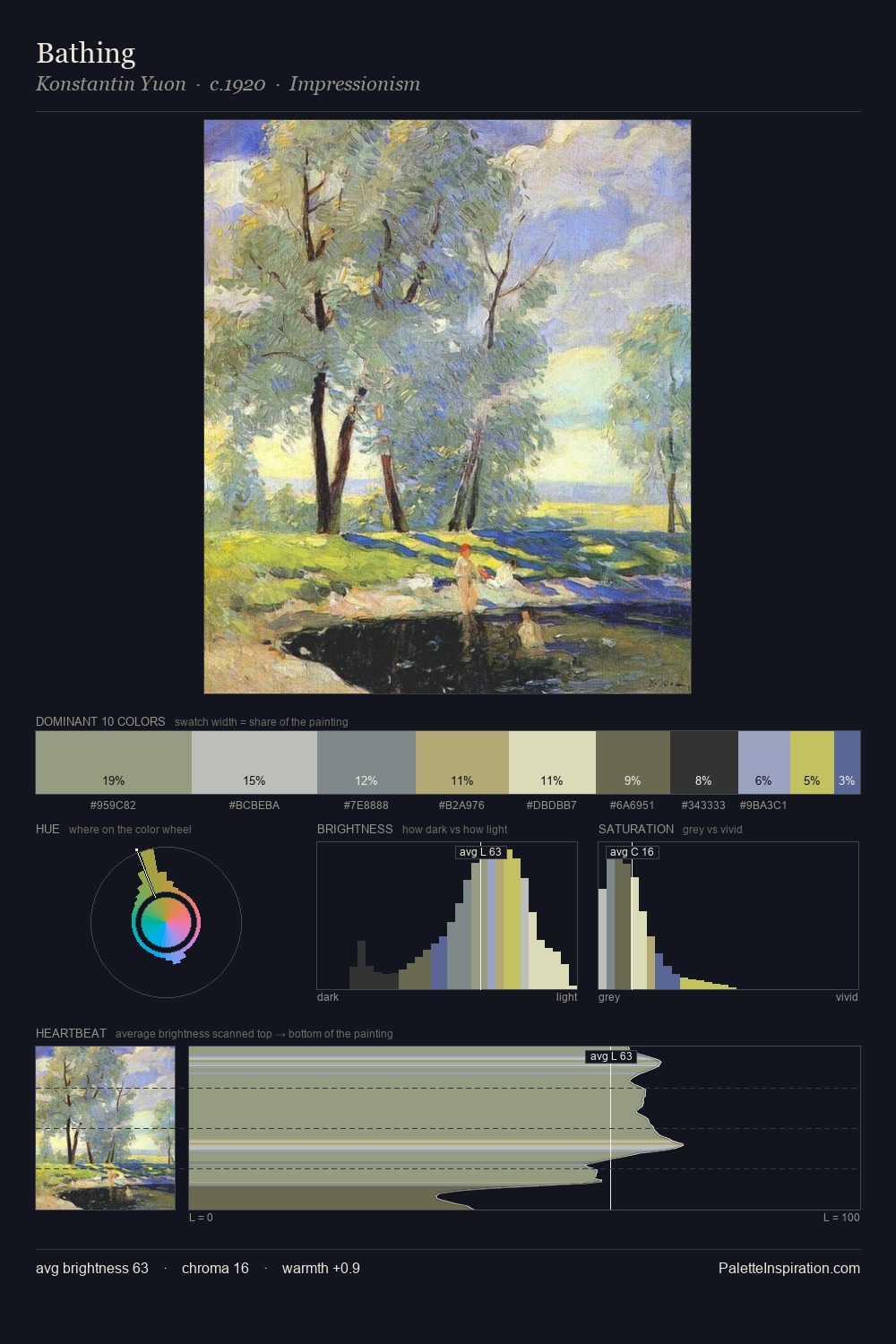
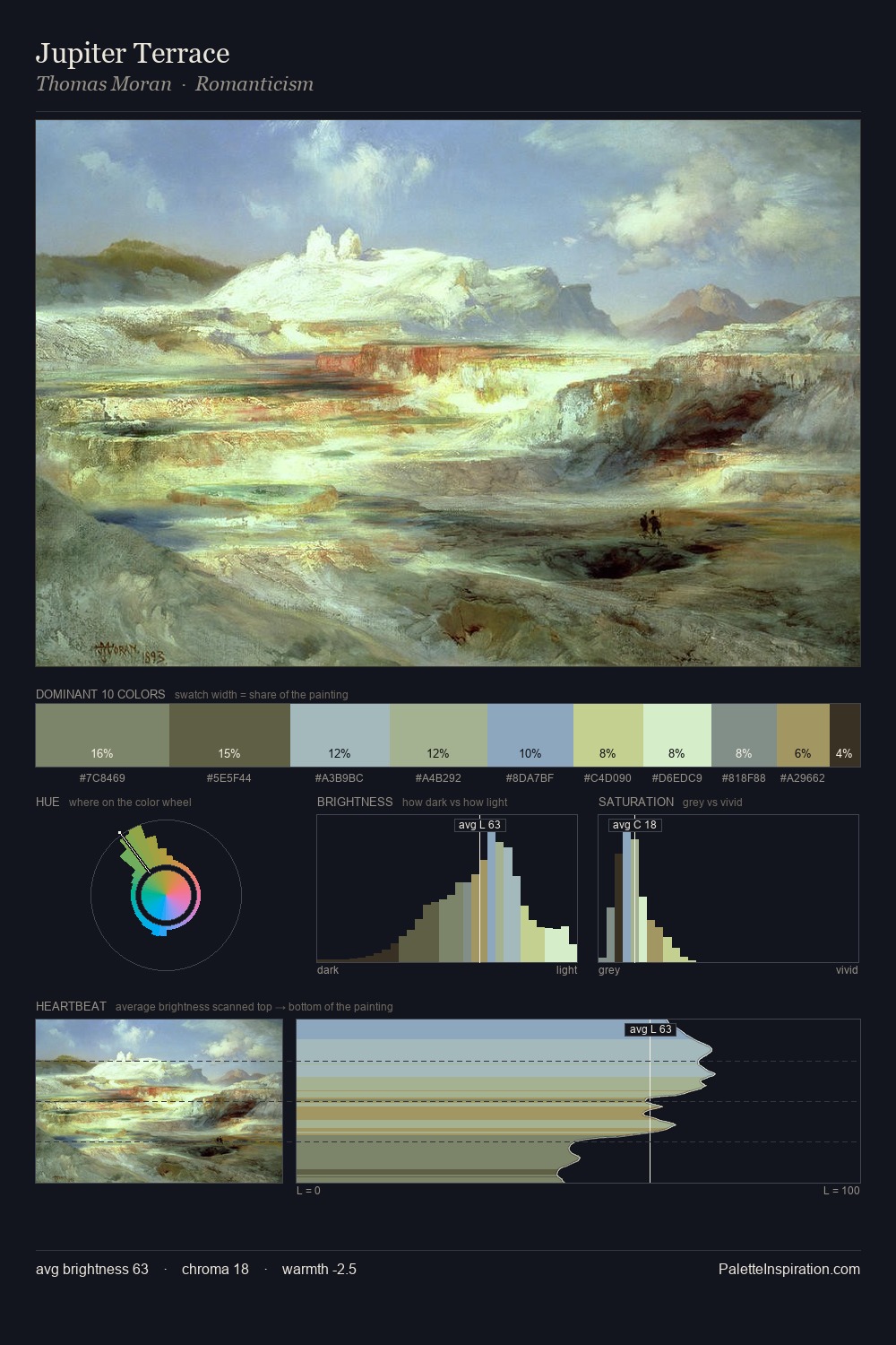
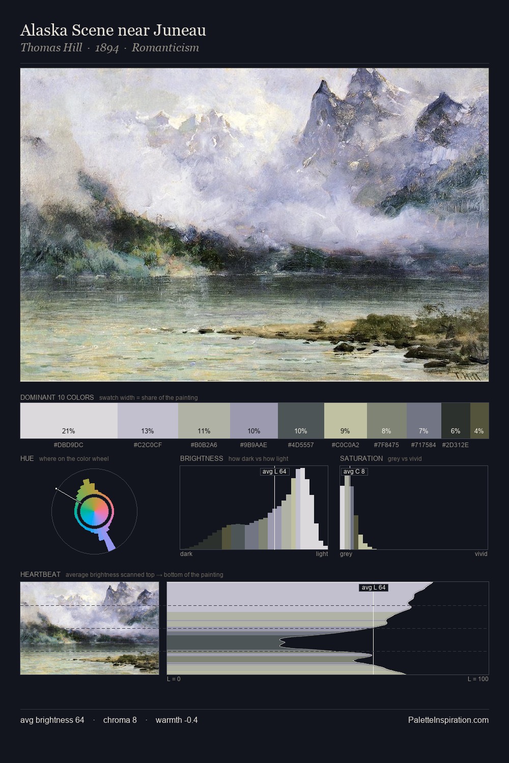
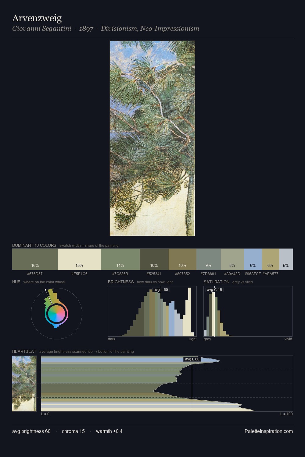
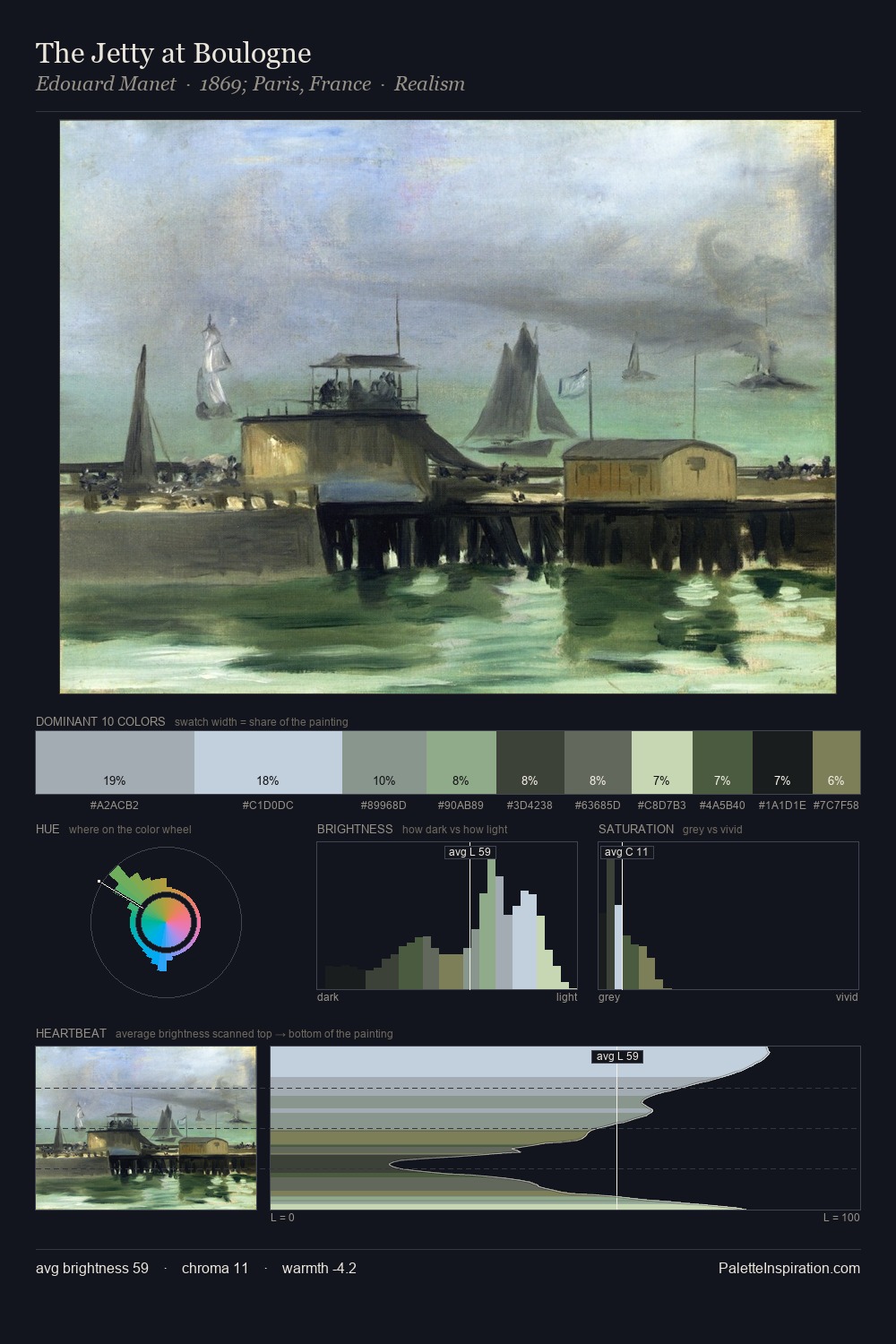
Values in James McNeill Whistler rest in the mid-range - neither dramatically lit nor steeped in shadow. Cool tones set the register here - the blues and greens easily outweigh any warm accents. Saturation is deliberately withheld - the beauty here lies in the near-monochromatic gradations rather than colour difference. At 7.5%, #5B5735 carries the palette's sharpest chromatic charge: an accent that earns its place precisely because it is withheld. Value range is moderate at 51 units - enough contrast for legibility, not so much as to fragment the tonal unity. High luminosity and cool temperature suggest the plein-air condition: unfiltered daylight and open sky. Palette 9 sits within the larger chromatic argument that James McNeill Whistler's complete body of work advances.
Example use cases
- exhibition design
- foundation branding
- estate management
- art education
- museums & galleries
I Love This!
Copy, export, or download for your project