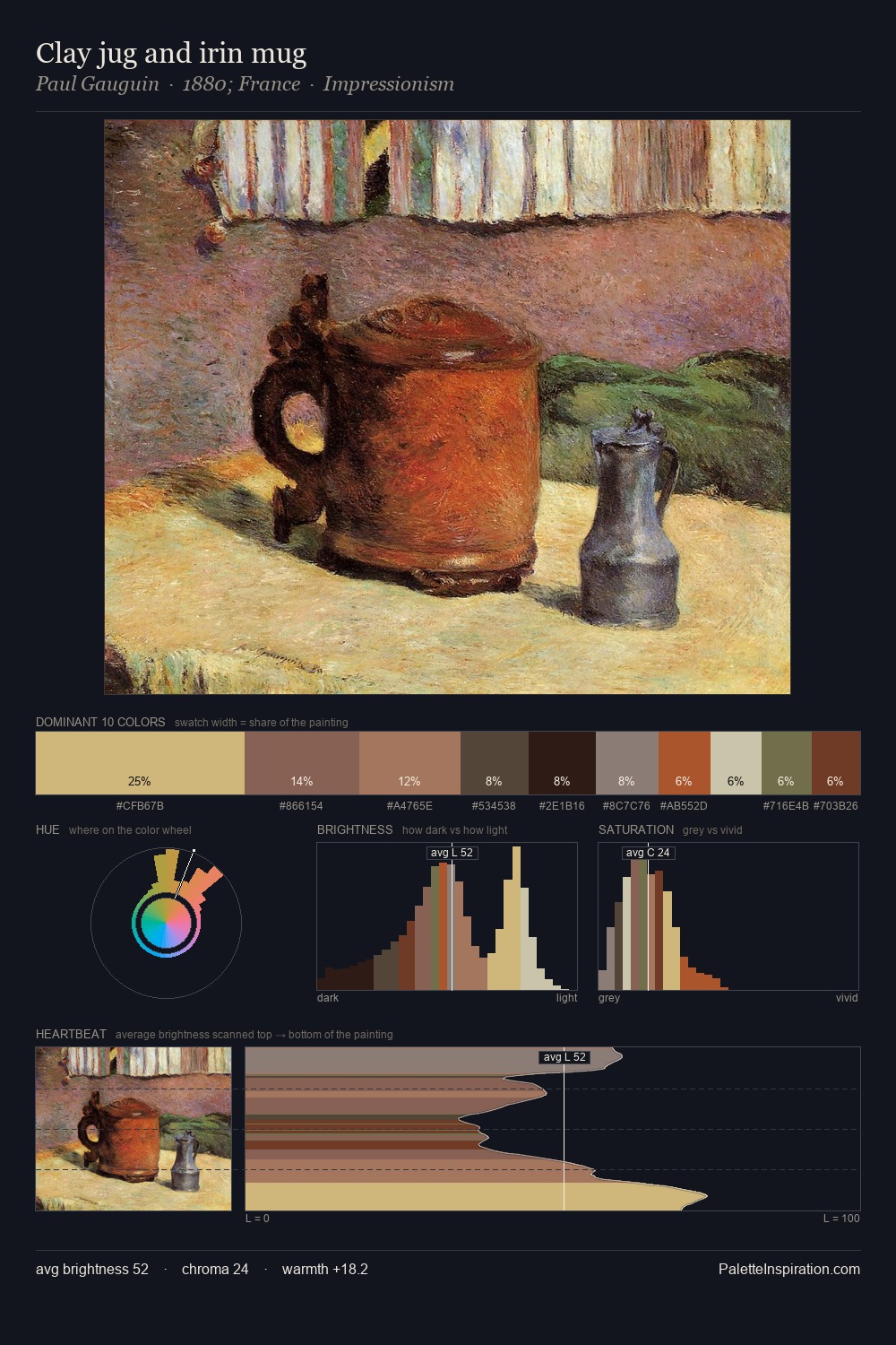
James McNeill Whistler Palette 14
Muted Tawny
Muted Deliberately desaturated - chroma pulled toward gray, the restraint of tonal painting.
Tawny Warm orange-brown - a traditional term for the color of tanned leather or lion fur.

Palette Analysis
James McNeill Whistler keeps values measured and balanced, a hallmark of tonal restraint. Warm hues command this palette; James McNeill Whistler favours the reds, oranges, and yellows of firelight and earth. All colours lean toward grey, building depth through value rather than colour punch. #B29D77 delivers the chromatic peak at only 11.7% - a small shot of colour with outsized visual impact. 51 units of value spread create a palette that is varied but unified - contrast in the service of harmony. In the context of James McNeill Whistler's full range of palettes, group 14 represents one movement in an ongoing chromatic dialogue.
Example use cases
- archival print
- university identity
- rare books
- cultural institutions
- nonprofit identity
I Love This!
Use This Palette
Copy, export, or download for your project
Copy, export, or download for your project
Copy:
Download:
Share: