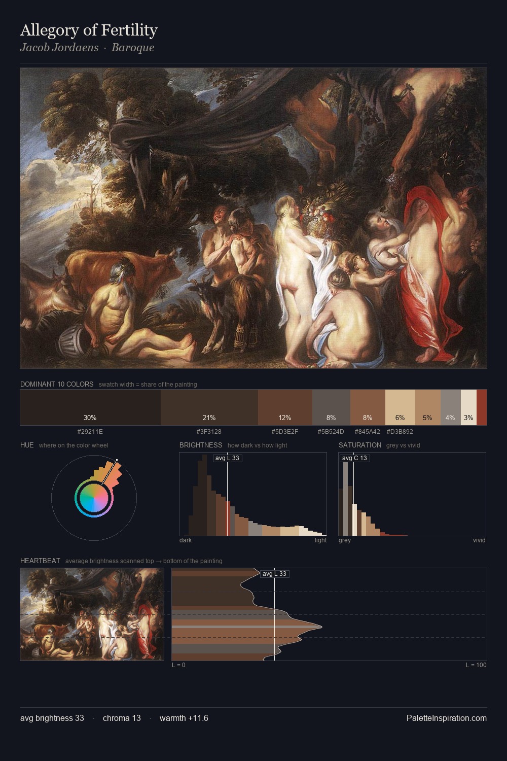
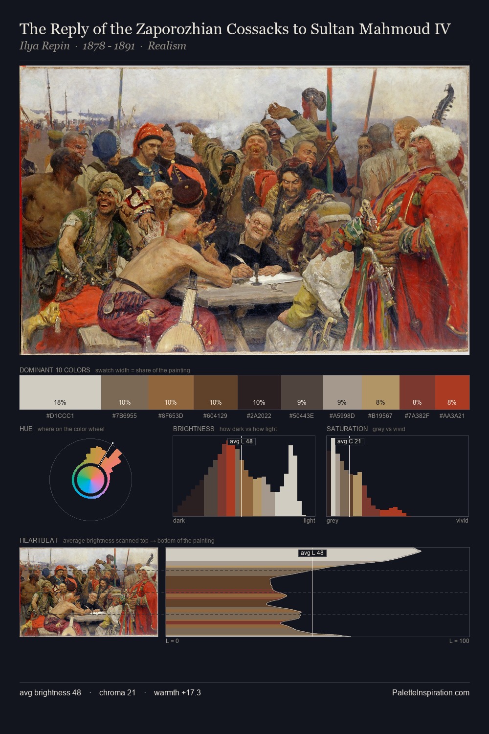
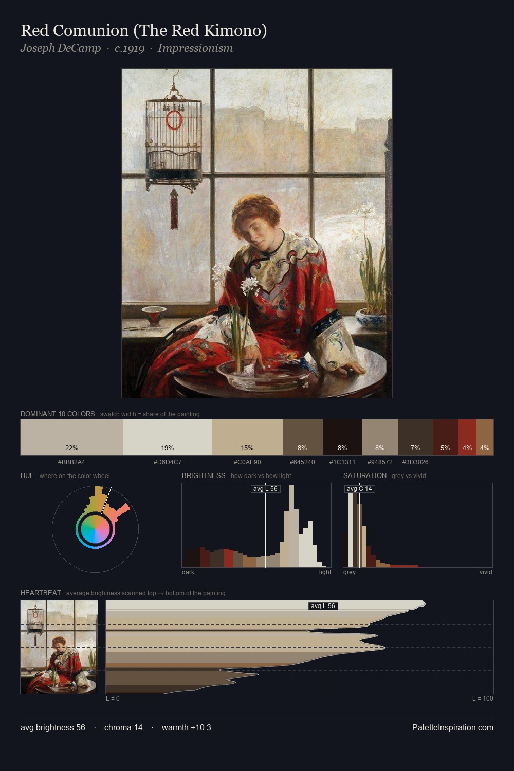
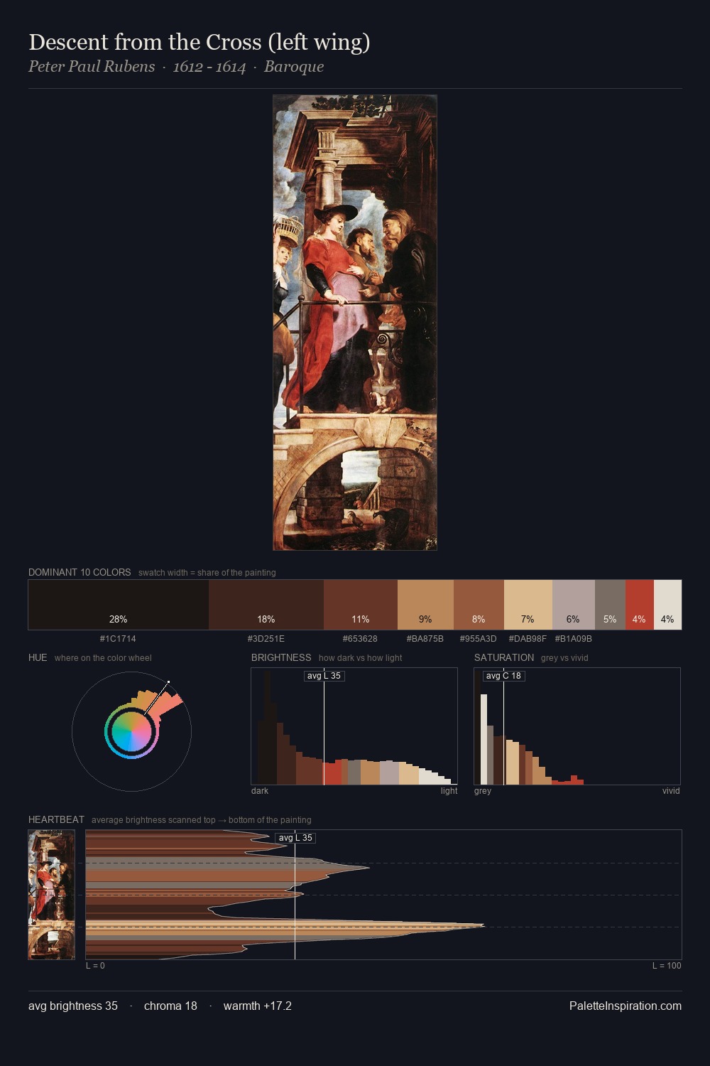
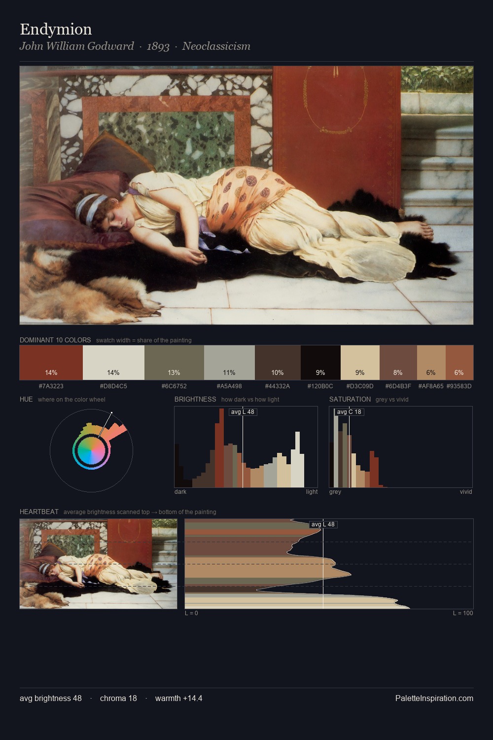
Biedermeier Master Palette
Muted Tawny
Muted Deliberately desaturated - chroma pulled toward gray, the restraint of tonal painting.
Tawny Warm orange-brown - a traditional term for the color of tanned leather or lion fur.

Palette Analysis
Across the Biedermeier movement, certain palette qualities recur - this distillation makes them visible at a glance. Values in Biedermeier rest in the mid-range - neither dramatically lit nor steeped in shadow. Warm and cool are kept in productive tension, creating the kind of chromatic harmony that sustains the eye. Saturation is deliberately withheld - the beauty here lies in the near-monochromatic gradations rather than colour difference. #5A392A functions as the palette's exclamation mark: highest chroma, lowest percentage (8.6%). 65 units of value range underpin the palette's structural clarity: the eye always knows where light falls. The Biedermeier movement spoke in this palette's vocabulary.
Example use cases
- exhibition design
- foundation branding
- estate management
- art education
- museums & galleries
I Love This!
Use This Palette
Copy, export, or download for your project
Copy, export, or download for your project
Copy:
Download:
Share: