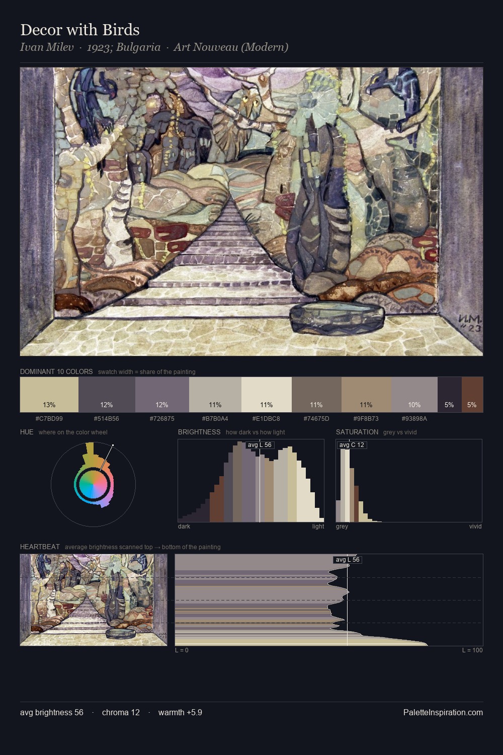
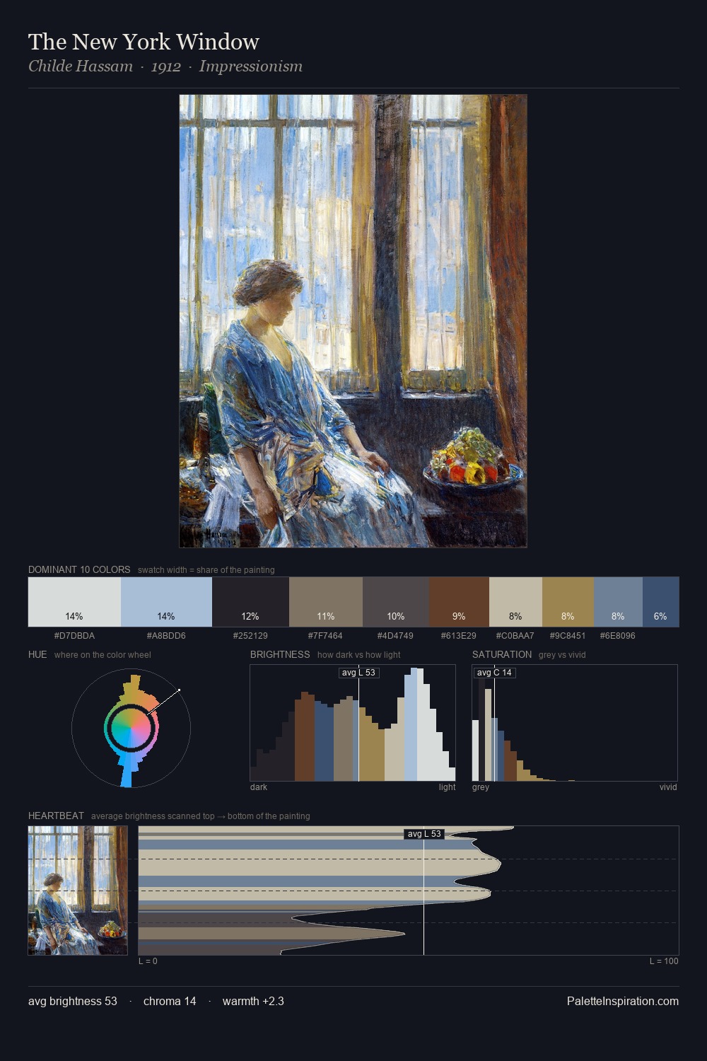
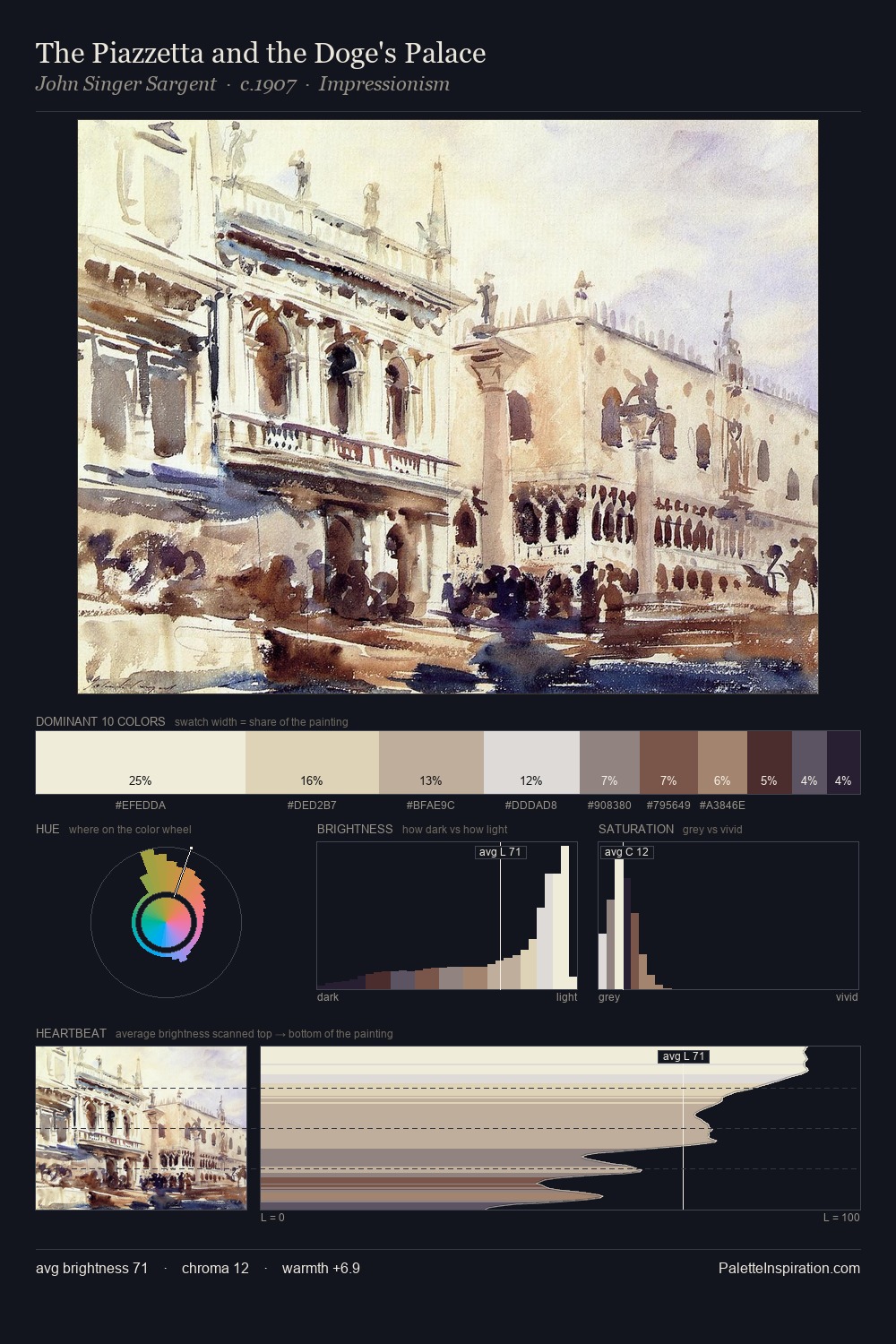
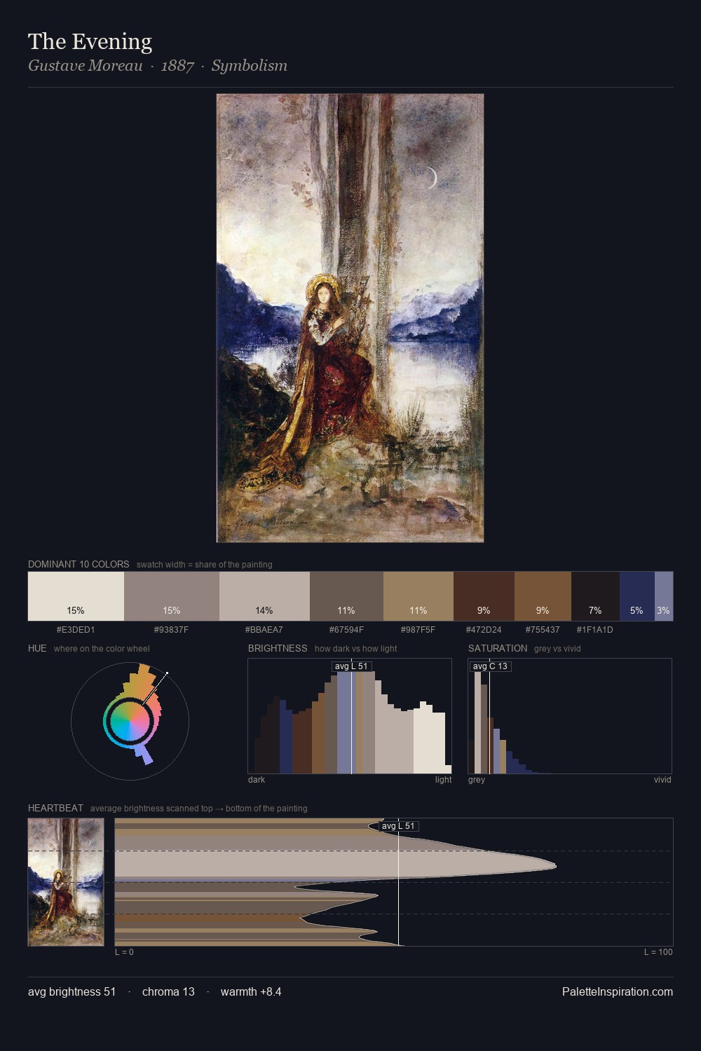
Biedermeier Palette 2
Soft Ivory
Soft Low-contrast, gentle chroma - mid-key values and low saturation, approachable and calm.
Ivory Warm creamy white - the color of natural ivory, warmer than pure white.

Palette Analysis
Biedermeier is strongly light-biased - shadow is suggested rather than declared. The palette orchestrates warmth above all else - reds, ambers, and siennas take the lead. The absence of saturated colour is itself an expressive choice: this is a palette of restraint and atmosphere. #251E31 functions as the palette's exclamation mark: highest chroma, lowest percentage (2.3%). A value spread of 69 units gives the palette both depth and air - shadows are genuinely dark, lights genuinely light.
Example use cases
- craft & artisan brands
- specialty coffee
- home goods
- lifestyle retail
- ceramics & pottery
I Love This!
Use This Palette
Copy, export, or download for your project
Copy, export, or download for your project
Copy:
Download:
Share: