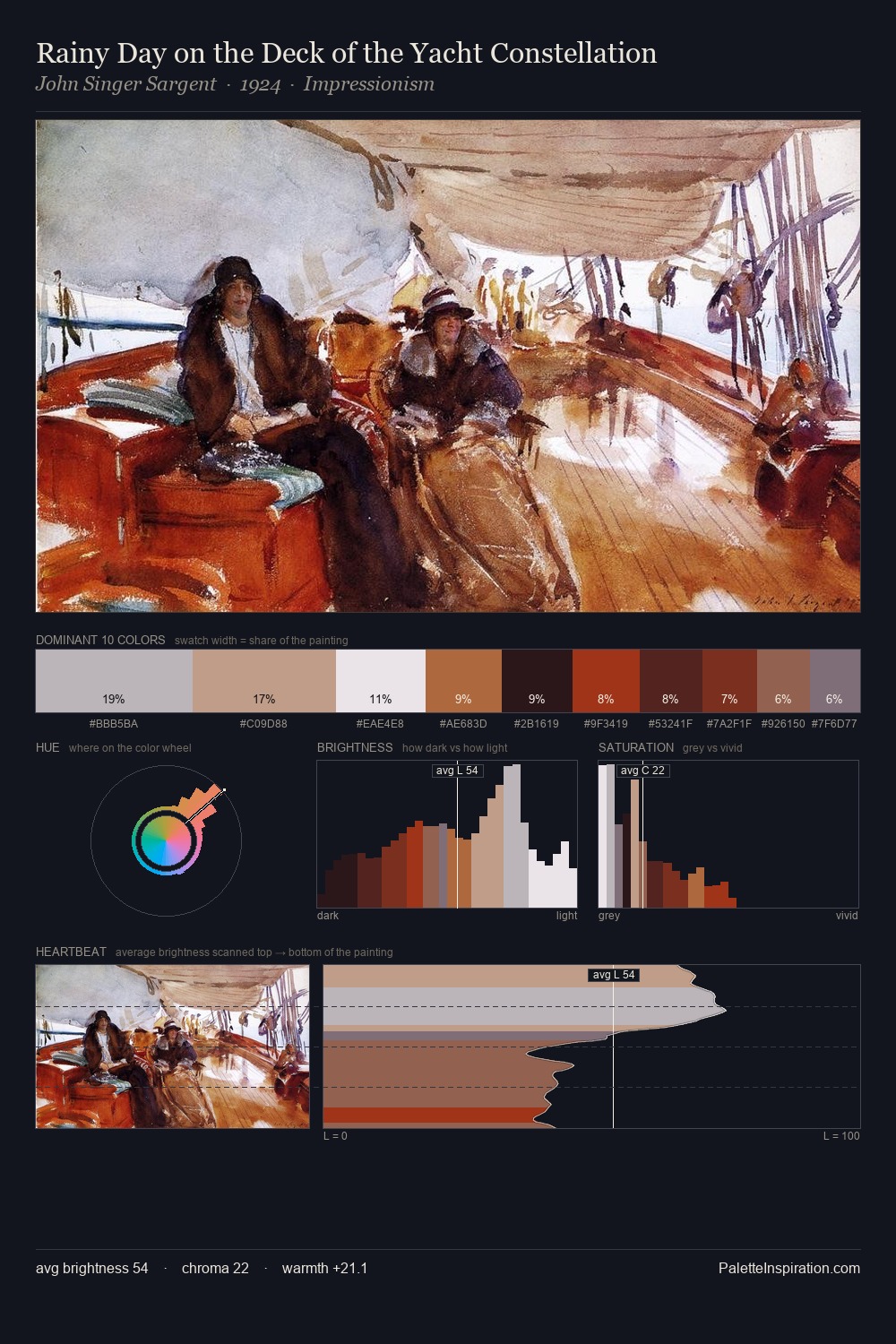
Biedermeier Palette 5
Pale Ivory
Pale High-key and low-chroma - delicate, bleached, washed with light.
Ivory Warm creamy white - the color of natural ivory, warmer than pure white.

Palette Analysis
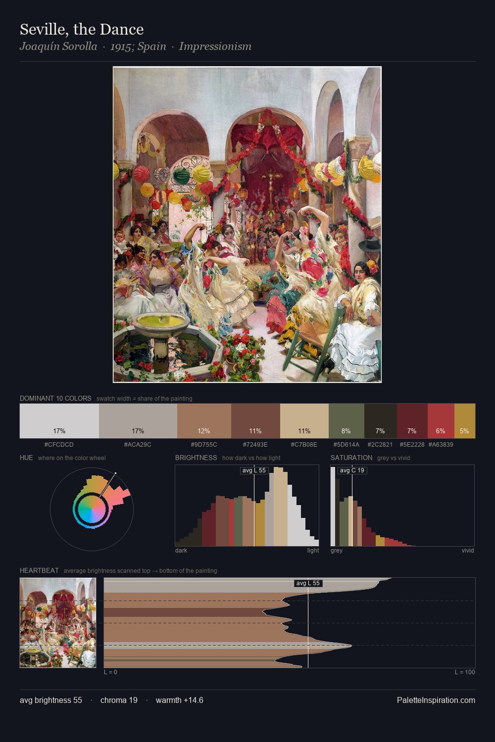
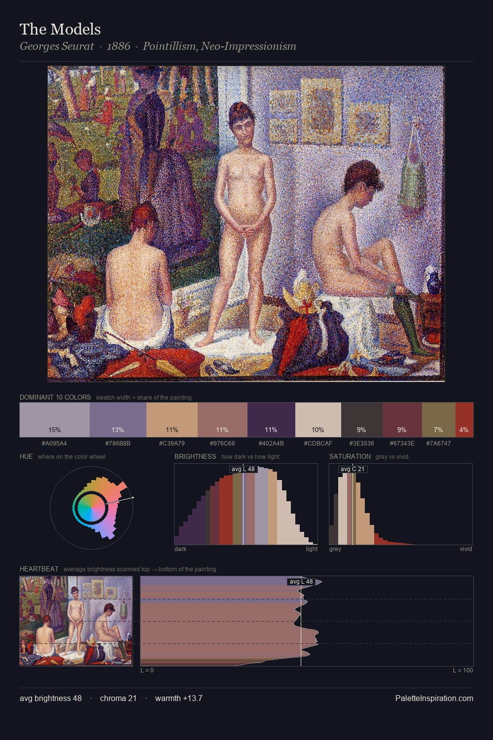
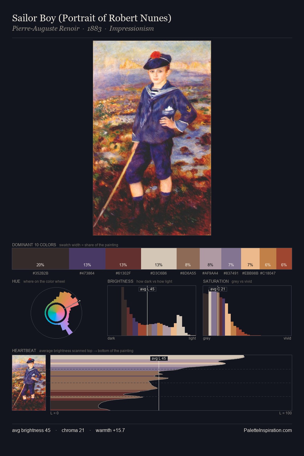
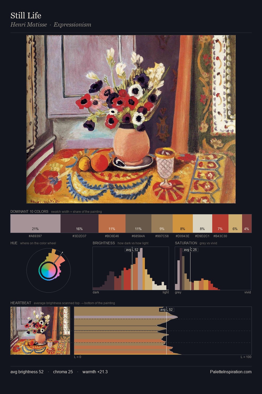
Biedermeier is high-key - luminous, open, and weighted toward light. Warm and cool are kept in productive tension, creating the kind of chromatic harmony that sustains the eye. All colours lean toward grey, building depth through value rather than colour punch. The most saturated colour, #902210, is reserved to 1.2% of the surface, where it acts as a focal punctuation. A value spread of 56 units gives the palette both depth and air - shadows are genuinely dark, lights genuinely light.
Example use cases
- florist branding
- event design
- real estate
- jewelry retail
- hospitality branding
I Love This!
Use This Palette
Copy, export, or download for your project
Copy, export, or download for your project
Copy:
Download:
Share: