Biedermeier Palette 12
Shadowed Sienna
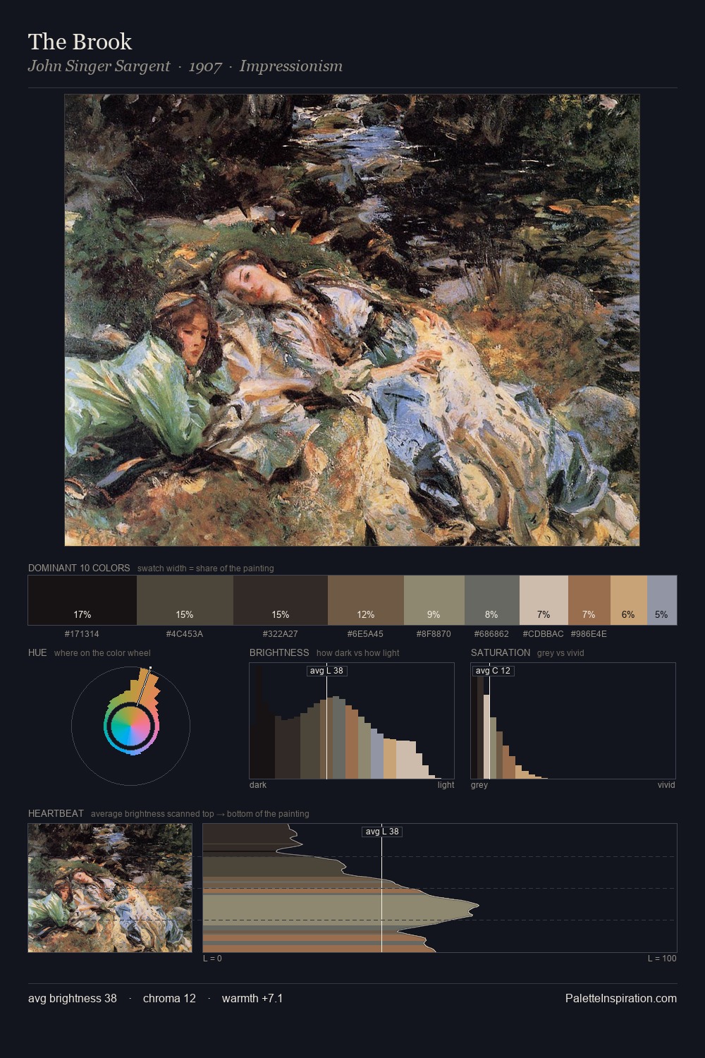
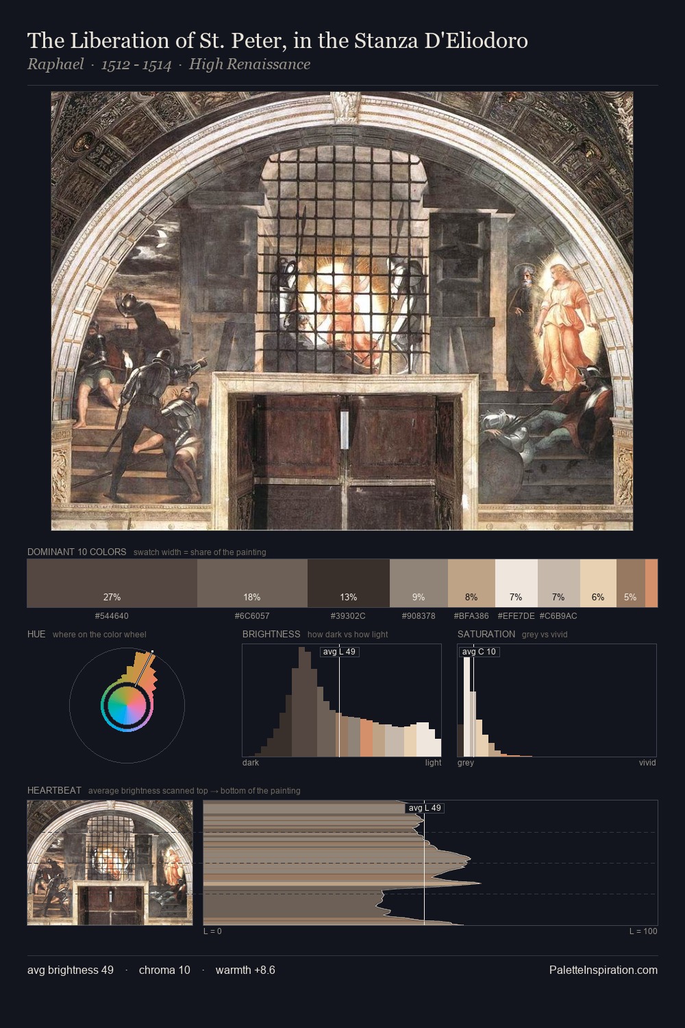
Shadowed Low-key - values weighted toward shadow, the palette of dim interiors and overcast skies.
Sienna Warm red-brown earth - named after the Sienese pigment, a fundamental artist earth color.

Palette Analysis
Biedermeier sits in the centre of the value range, lending the palette a sense of even, sustained light. Temperature reads distinctly warm: the reds and earth tones carry the compositional weight. All colours lean toward grey, building depth through value rather than colour punch. #3A353A claims 26.7% of the surface, functioning as the work's tonal foundation. Only 3.7% is devoted to #C4A77B, yet that small allocation delivers the palette's entire chromatic tension. 45 units of value spread create a palette that is varied but unified - contrast in the service of harmony.
Example use cases
- theater design
- jewelry brands
- tobacco-adjacent retail
- event branding
- film & entertainment
I Love This!
Use This Palette
Copy, export, or download for your project
Copy, export, or download for your project
Copy:
Download:
Share: