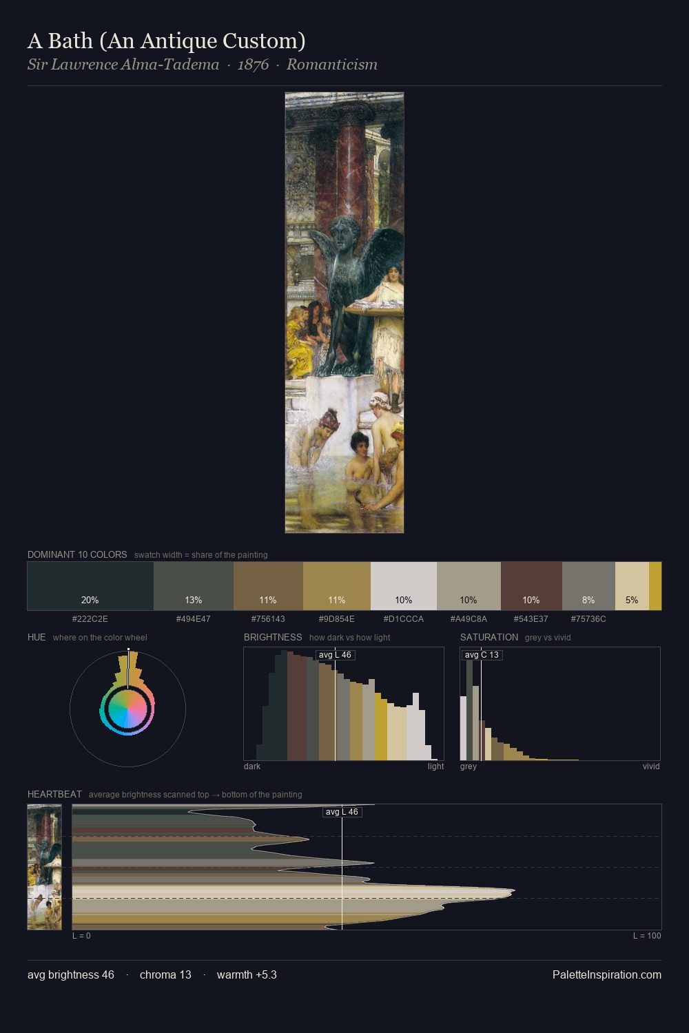
Biedermeier Palette 11
Veiled Tawny
Veiled Partially obscured light - mid-dark with a hazy, scrim-filtered quality.
Tawny Warm orange-brown - a traditional term for the color of tanned leather or lion fur.

Palette Analysis
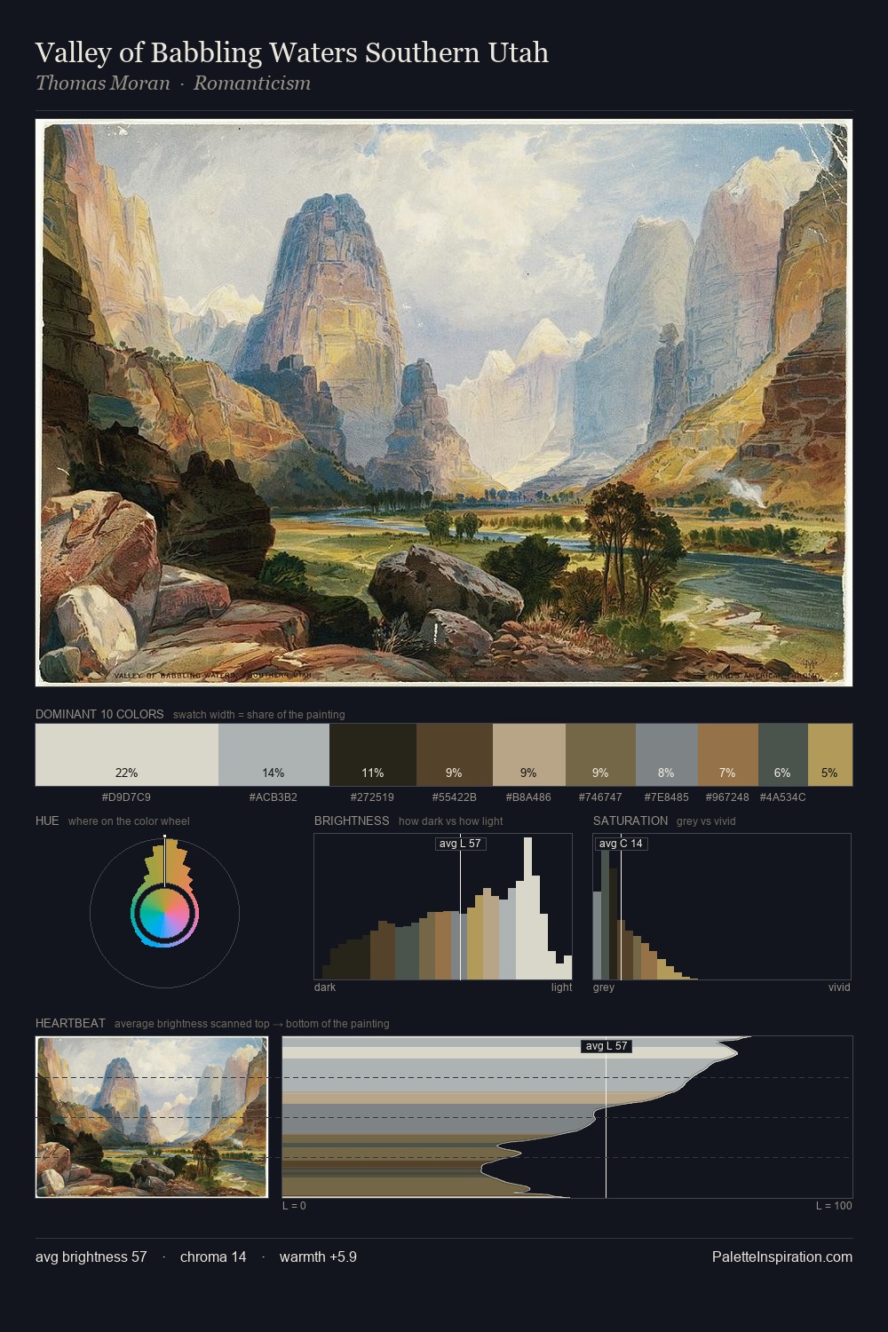
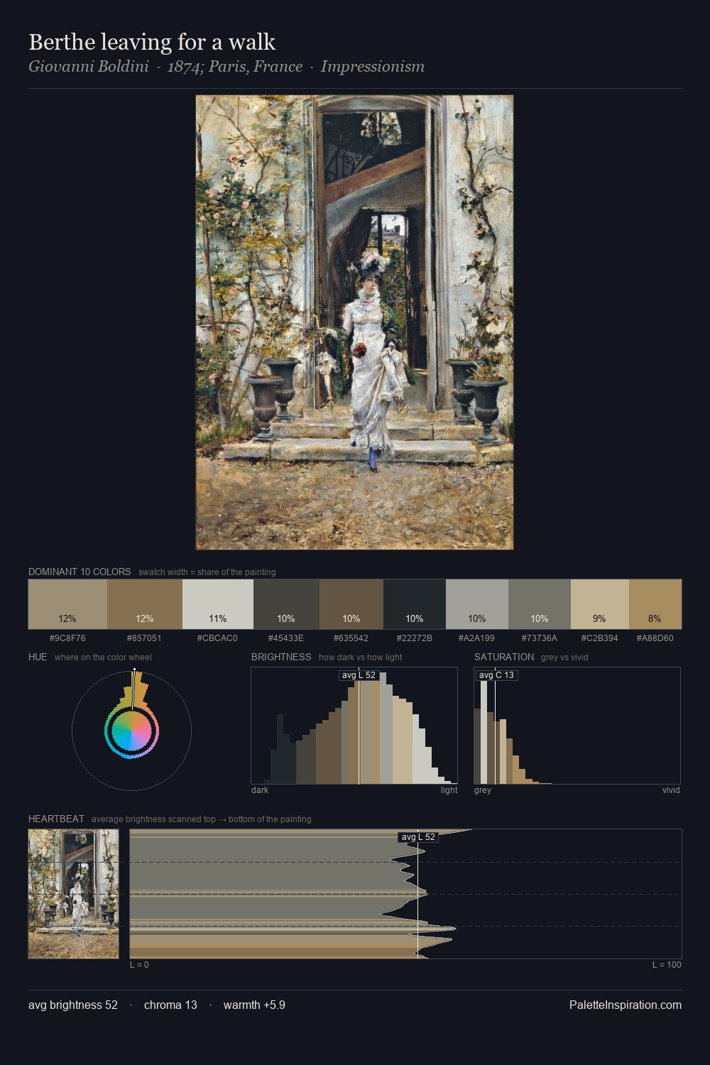
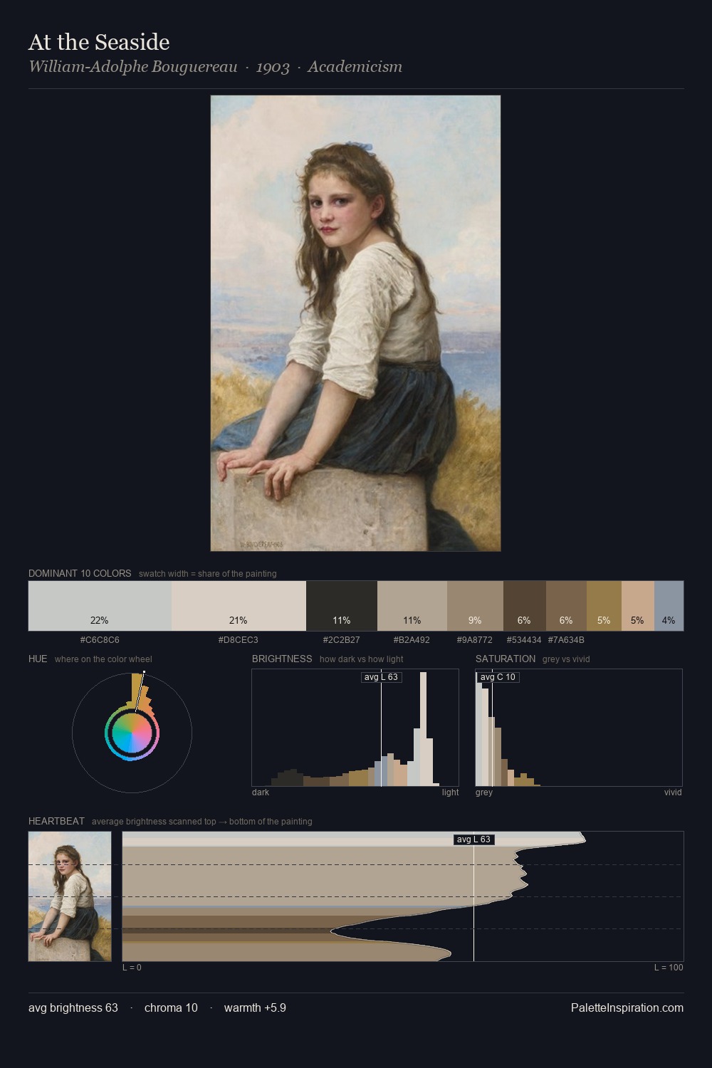
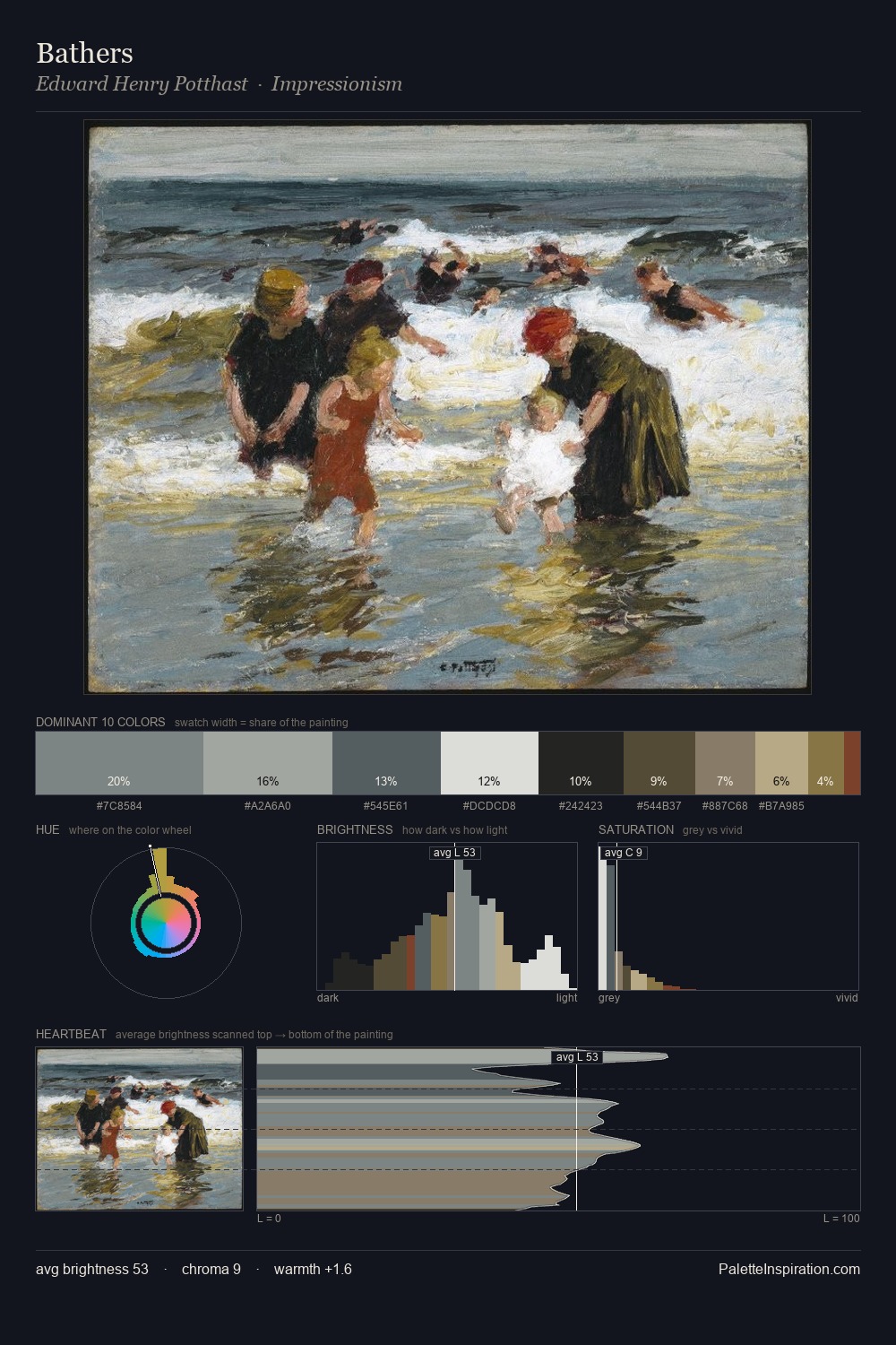
Biedermeier sits in the centre of the value range, lending the palette a sense of even, sustained light. Blues and teal-greys govern the palette, lending it an aquatic or atmospheric quality. The absence of saturated colour is itself an expressive choice: this is a palette of restraint and atmosphere. The most saturated colour, #544133, is reserved to 9.2% of the surface, where it acts as a focal punctuation. From deepest dark to palest light, the palette traverses 58 units of the value scale - a span that creates natural depth. The mid-to-high key, cool bias, and moderate chroma point to outdoor observation - sky and diffused daylight as the dominant light source.
Example use cases
- exhibition design
- foundation branding
- estate management
- art education
- museums & galleries
I Love This!
Use This Palette
Copy, export, or download for your project
Copy, export, or download for your project
Copy:
Download:
Share: