Adam van Noort Master Palette
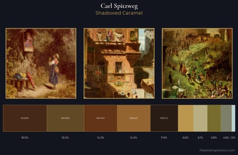
Shadowed Caramel
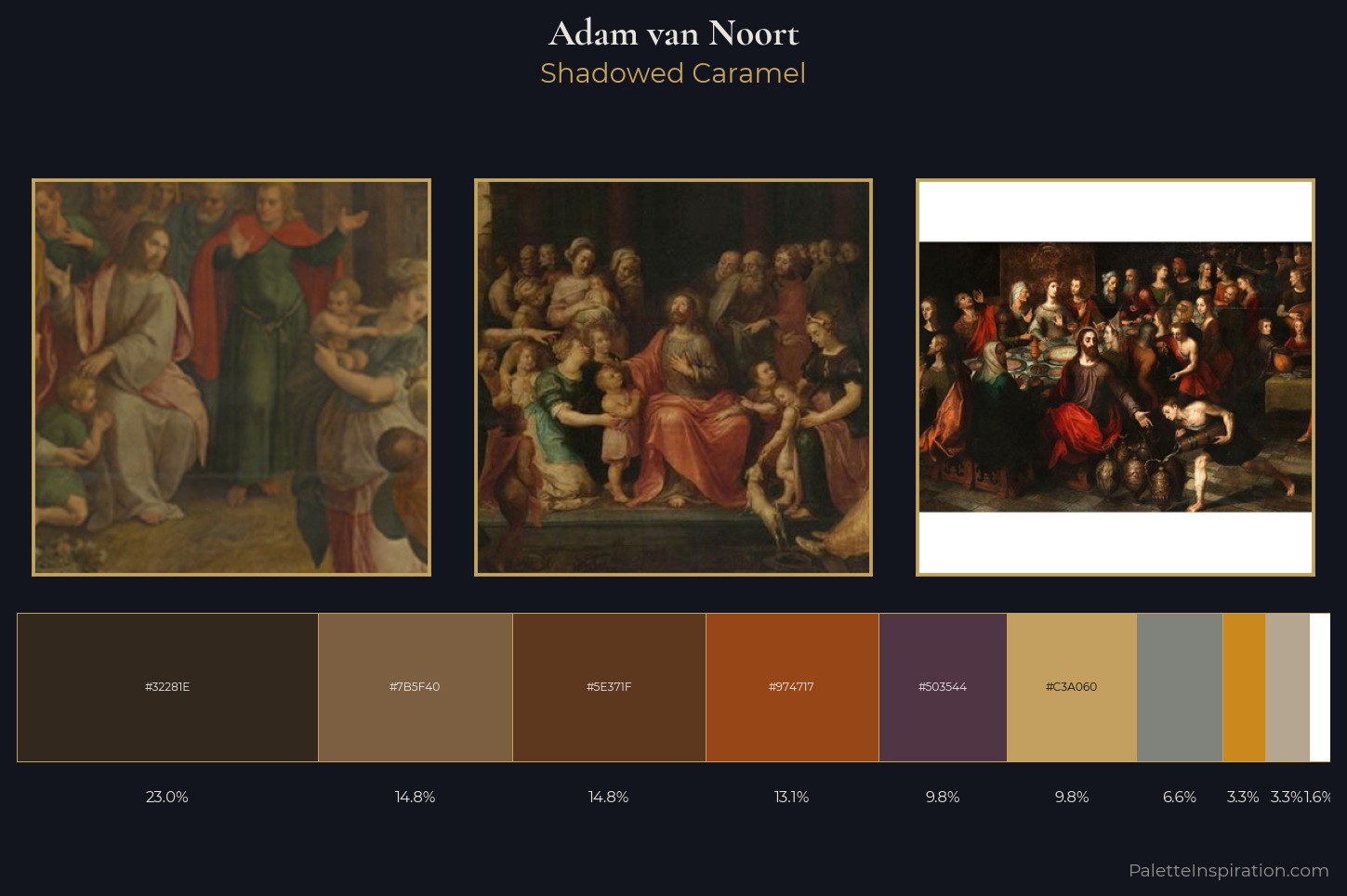
Shadowed Low-key - values weighted toward shadow, the palette of dim interiors and overcast skies.
Caramel Warm mid-brown - the color of cooked sugar, smooth and amber-toned.
Palette Analysis
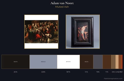
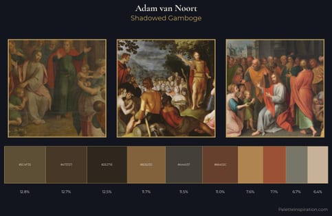
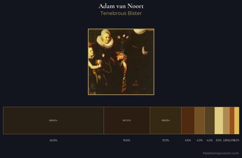
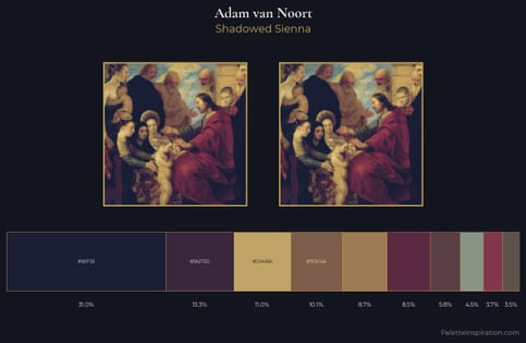
Adam van Noort distributes its values across the middle register, creating harmony without high contrast. Heat pervades this palette; warm chromatic identities outweigh cool ones at almost every weight. The absence of saturated colour is itself an expressive choice: this is a palette of restraint and atmosphere. Only 3.3% is devoted to #CB891D, yet that small allocation delivers the palette's entire chromatic tension. A value spread of 71 units gives the palette both depth and air - shadows are genuinely dark, lights genuinely light. Adam van Noort arrived at this balance through long practice; the palette carries the weight of that experience.
Example use cases
- theater design
- jewelry brands
- tobacco-adjacent retail
- event branding
- film & entertainment
I Love This!
Use This Palette
Copy, export, or download for your project
Copy, export, or download for your project
Copy:
Download:
Share: