Adam van Noort Palette 4
Shadowed Sienna
Shadowed Low-key - values weighted toward shadow, the palette of dim interiors and overcast skies.
Sienna Warm red-brown earth - named after the Sienese pigment, a fundamental artist earth color.
Palette Analysis
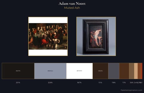
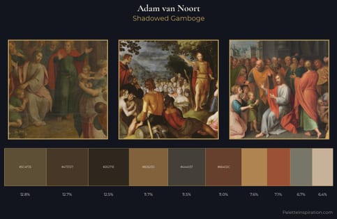
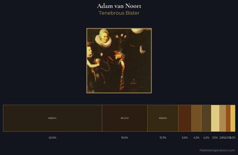
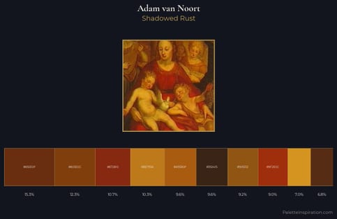
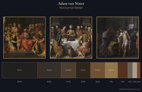
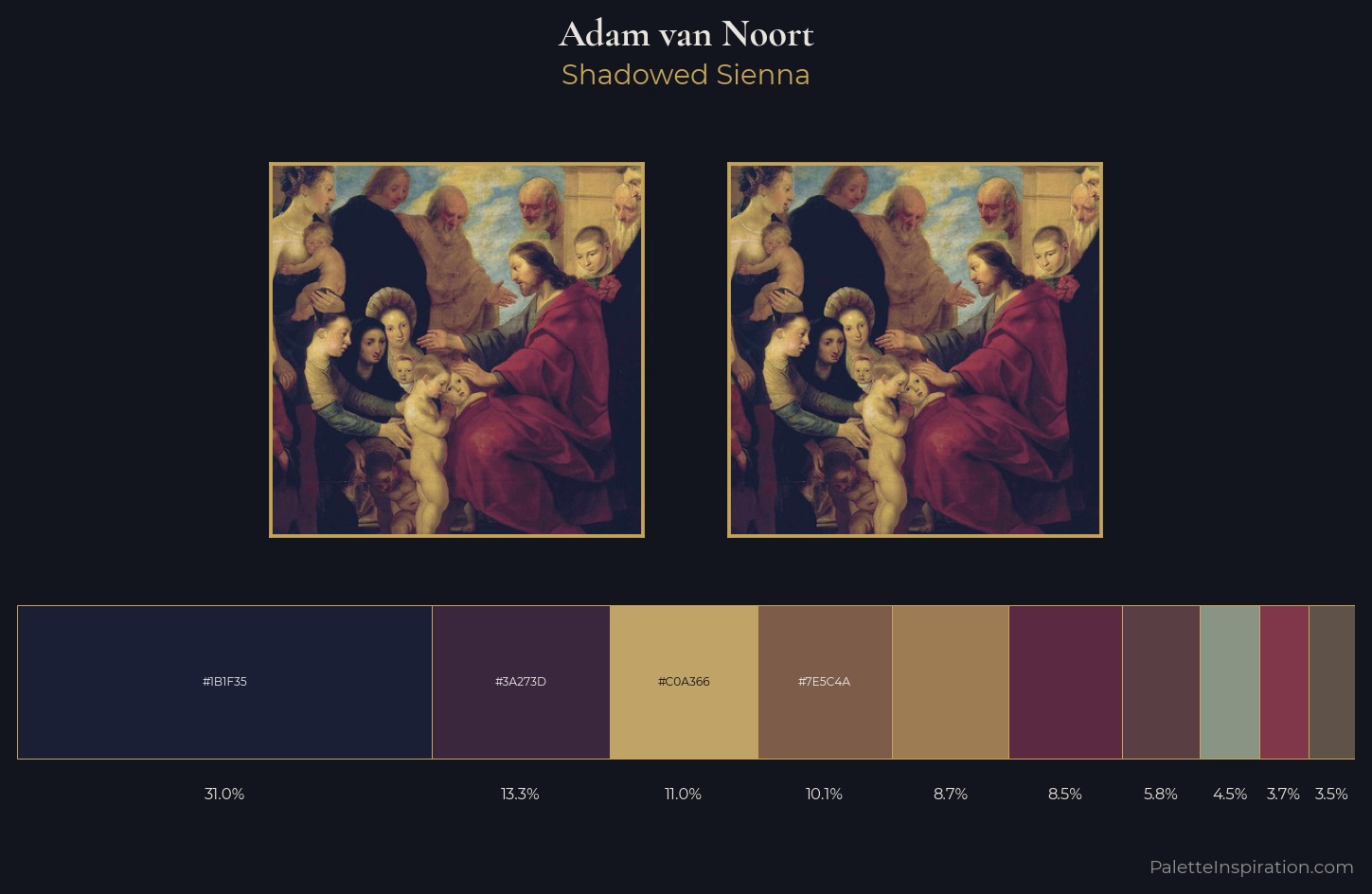
Adam van Noort keeps values measured and balanced, a hallmark of tonal restraint. Adam van Noort keeps warm and cool in parity, a balance that lends the work a perceptual shimmer. All colours lean toward grey, building depth through value rather than colour punch. The dominant colour, #1B1F35, takes 31.0% of the total area, establishing the overall mood before any other hue is introduced. The saturated accent, #5B2942, registers at 8.5% - sparse enough to feel like a deliberate surprise. At 48 units across the value scale, the palette keeps contrast readable without letting it dominate. Palette 4 sits within the larger chromatic argument that Adam van Noort's complete body of work advances.
Example use cases
- theater design
- jewelry brands
- tobacco-adjacent retail
- event branding
- film & entertainment
I Love This!
Use This Palette
Copy, export, or download for your project
Copy, export, or download for your project
Copy:
Download:
Share: