Adam van Noort Palette 1
Muted Ash
Muted Deliberately desaturated - chroma pulled toward gray, the restraint of tonal painting.
Ash Mid cool-gray - the neutral residue of fire, between white and charcoal.
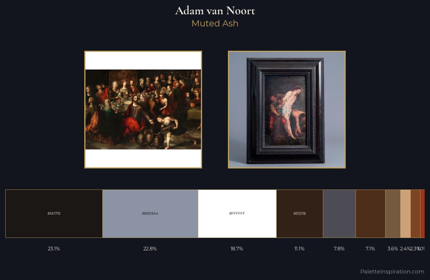
Palette Analysis
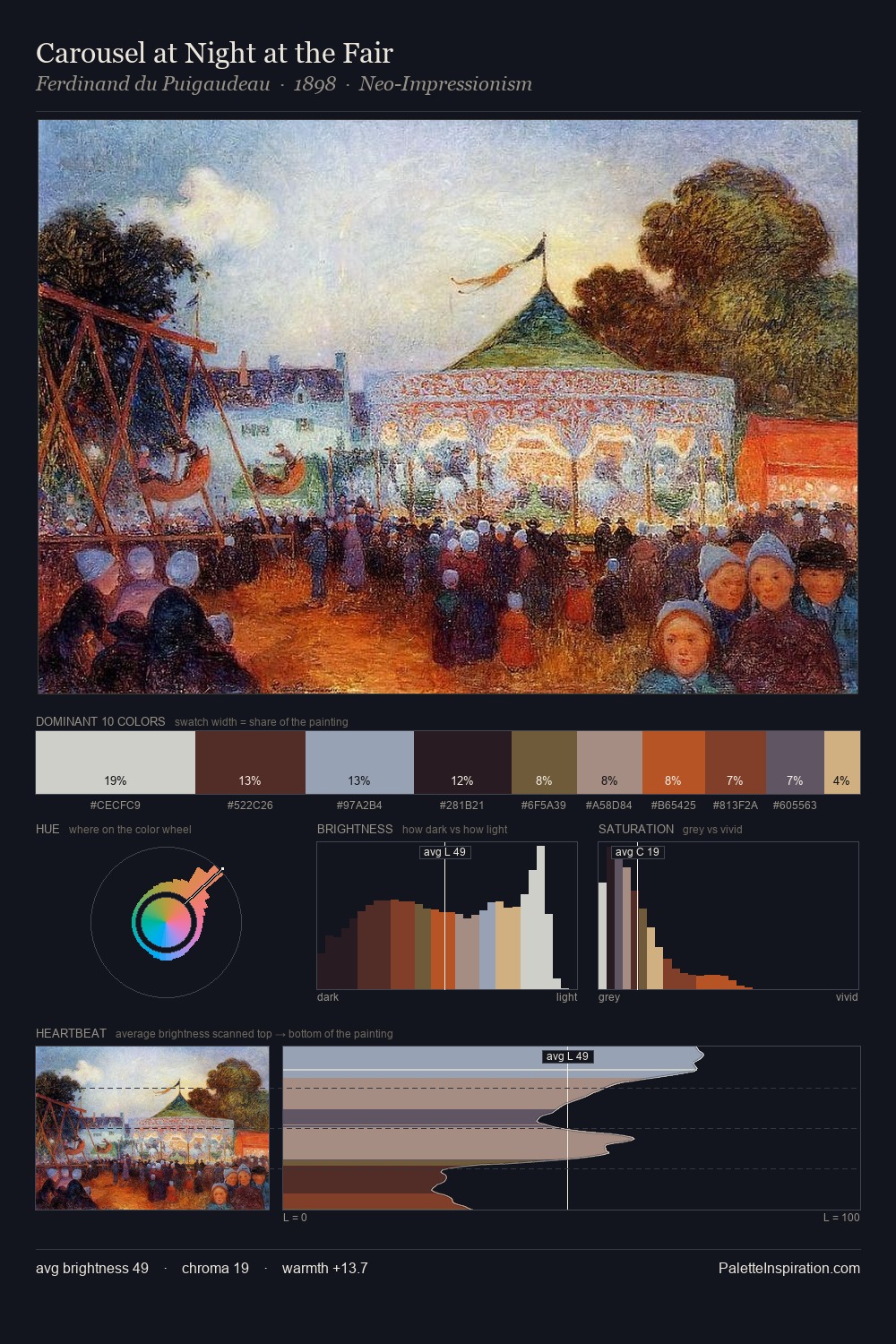
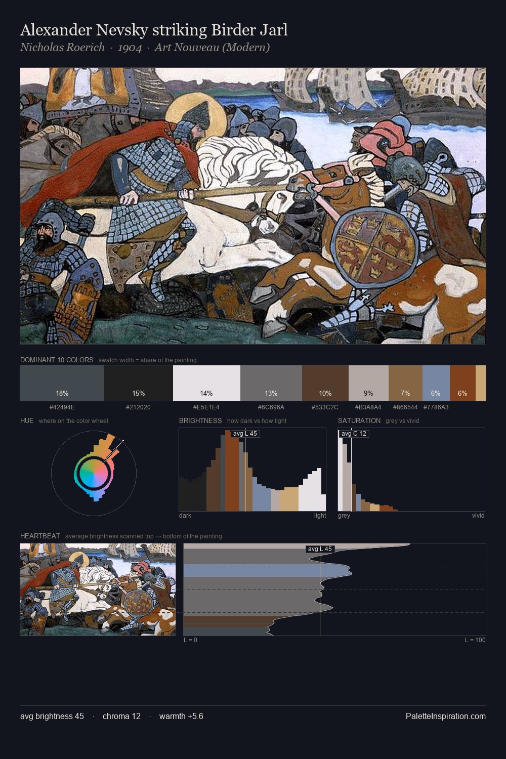
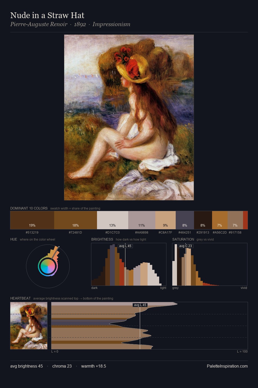
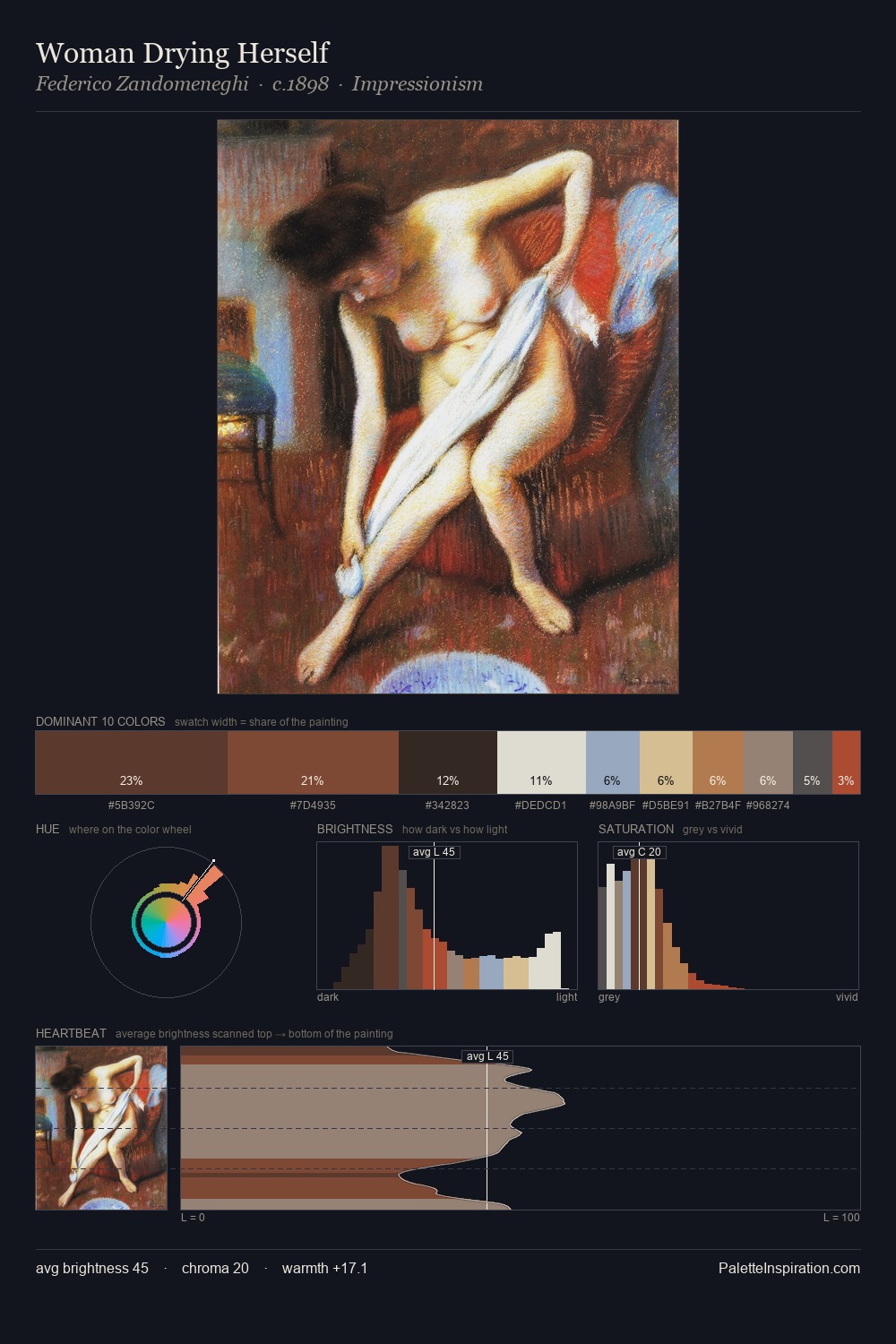
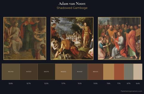
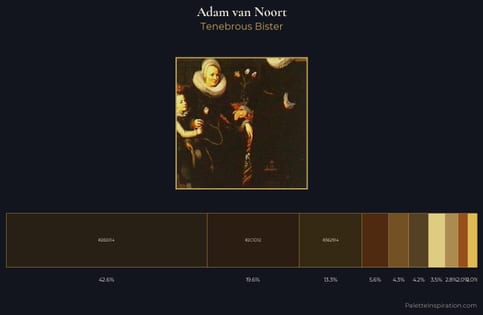
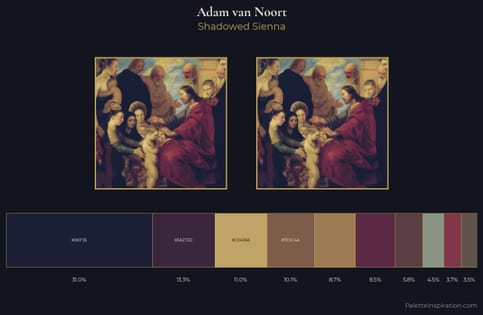
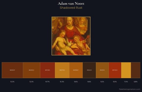
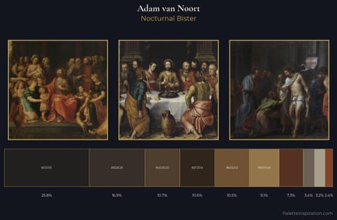
Adam van Noort occupies the comfortable middle of the value scale, avoiding both extremes to hold the eye in a sustained middle grey. Warm and cool are kept in productive tension, creating the kind of chromatic harmony that sustains the eye. The absence of saturated colour is itself an expressive choice: this is a palette of restraint and atmosphere. The most saturated colour, #4D2E1B, is reserved to 7.1% of the surface, where it acts as a focal punctuation. The value range spans 79 units across the palette, providing the full gamut from deep shadow to near-white and ensuring clear tonal hierarchy. This is palette 1 of Adam van Noort's sequence - a single chapter in a chromatic story told across many works.
Example use cases
- exhibition design
- foundation branding
- estate management
- art education
- museums & galleries
I Love This!
Use This Palette
Copy, export, or download for your project
Copy, export, or download for your project
Copy:
Download:
Share: