William Orpen Palette 3

Palette Analysis
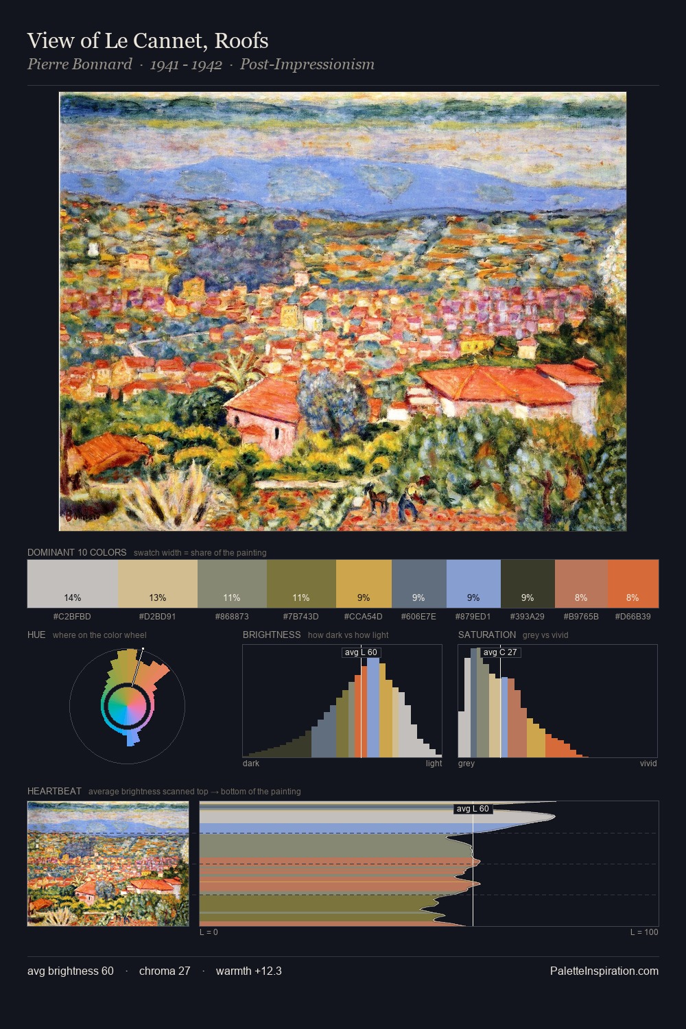
William Orpen is strongly light-biased - shadow is suggested rather than declared. Cool hues prevail: blues, greens, and greys anchor the palette's emotional temperature. Every colour is desaturated; the palette proceeds through near-neutrals and gently-coloured greys. #9DA0A7 claims 32.4% of the surface, functioning as the work's tonal foundation. The saturated accent, #BB8162, registers at 5.7% - sparse enough to feel like a deliberate surprise. Spanning 29 units on the value axis, the palette achieves the balance between tonal flatness and fragmentation. The palette has the character of outdoor light: cool, mid-bright, with colour rendered faithfully rather than expressively. Palette 3 sits within the larger chromatic argument that William Orpen's complete body of work advances.
Example use cases
- publishing
- corporate identity
- consumer apps
- hospitality
- design agencies
I Love This!
Copy, export, or download for your project