William Morris Palette 4

Palette Analysis
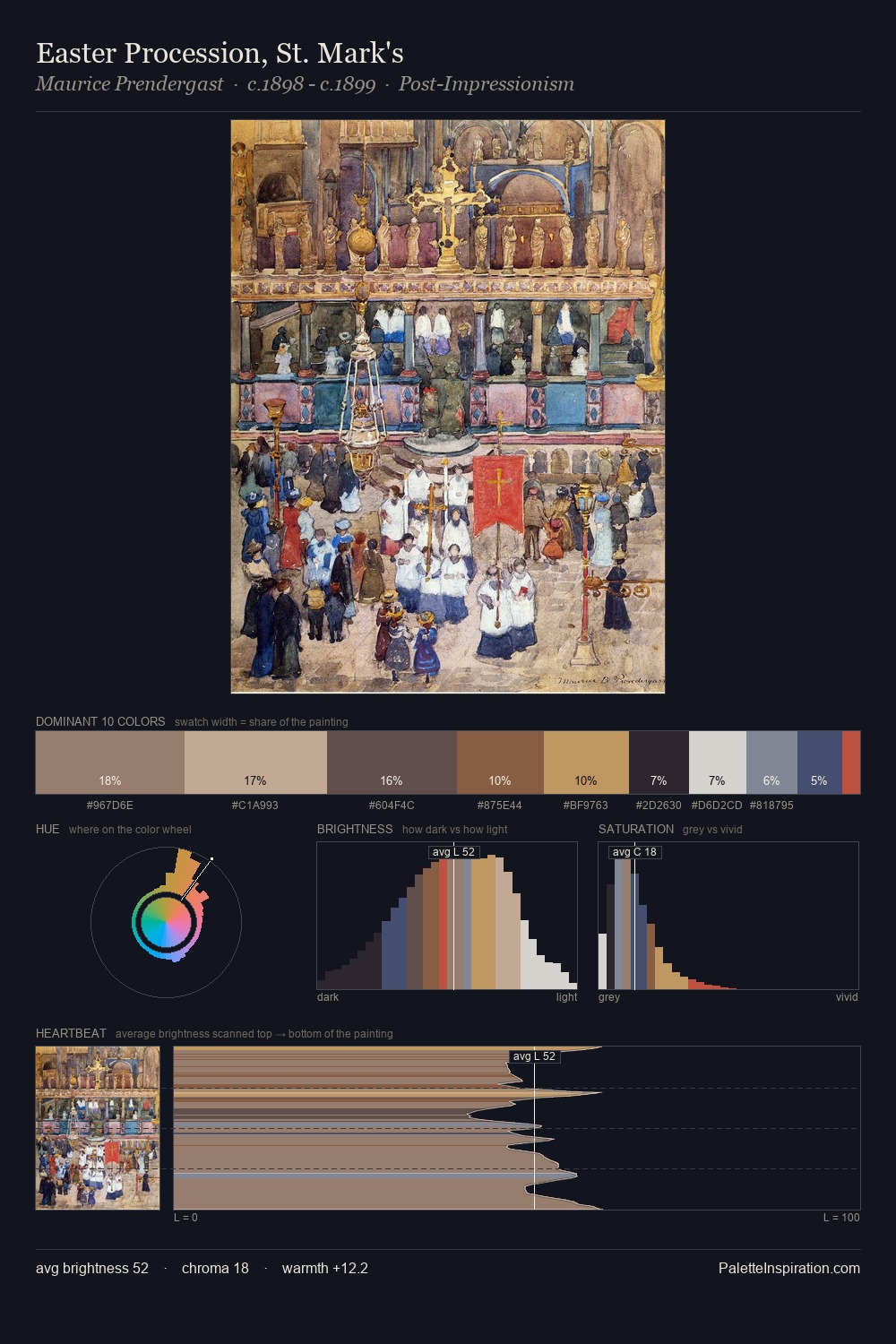
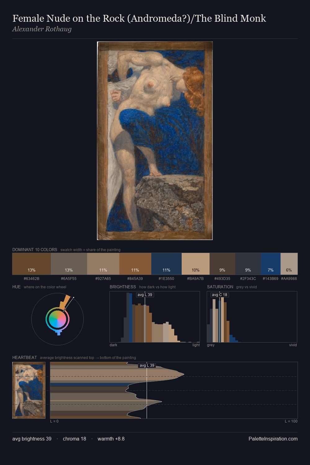
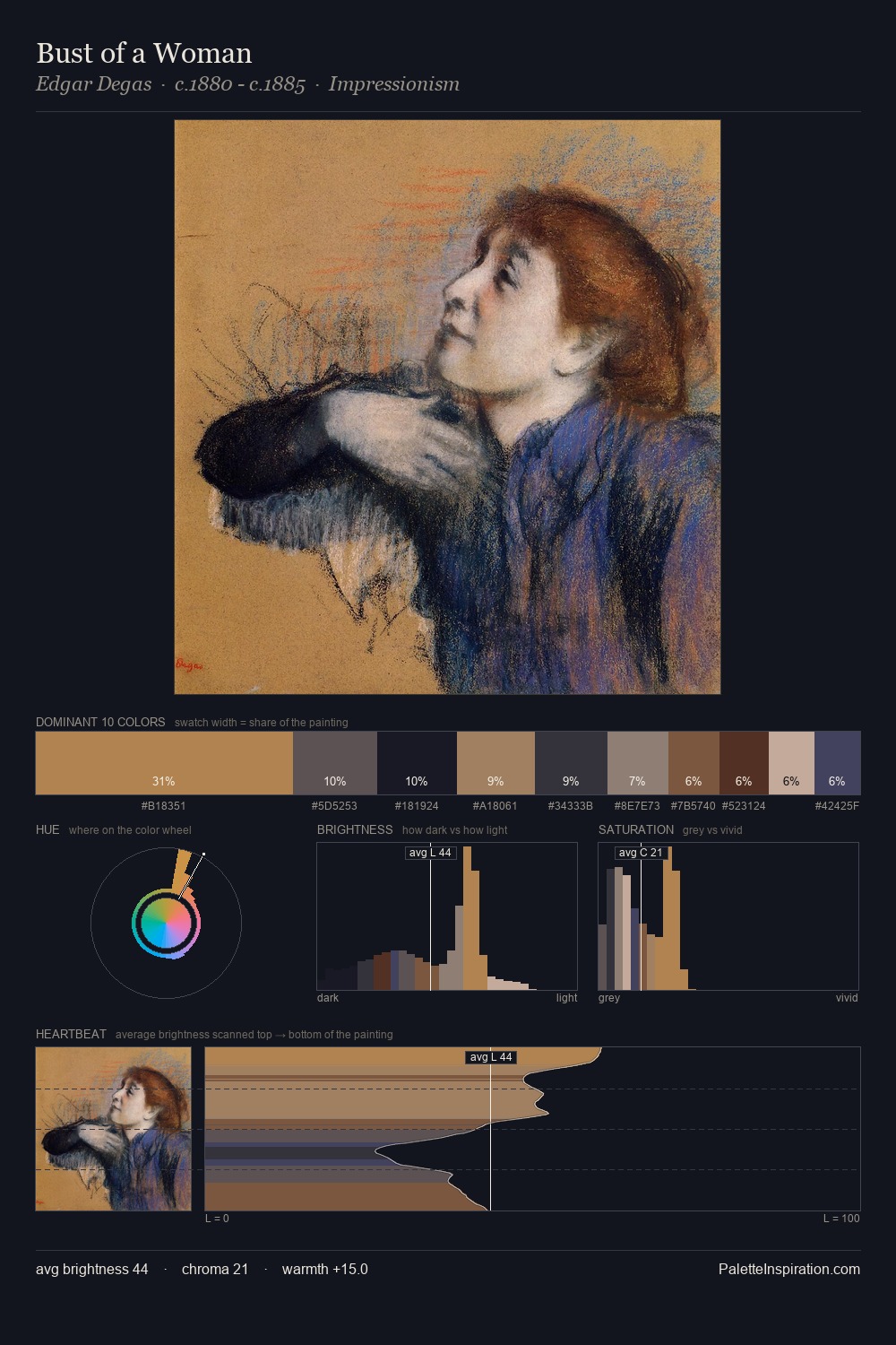
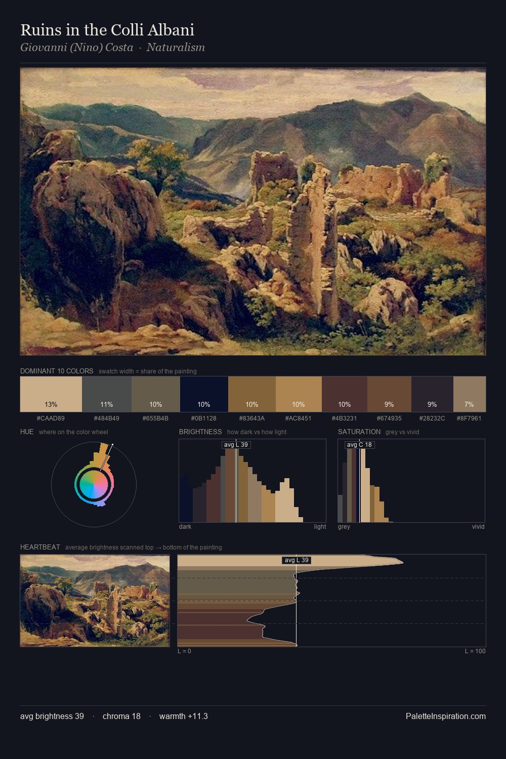
The value structure of William Morris is mid-key: quiet, controlled, and cohesive. William Morris orchestrates warmth above all else - reds, ambers, and siennas take the lead. Chroma is kept low across all colours, producing the soft, enveloping quality that characterises tonal painting. The dominant colour, #BFAA9B, takes 34.6% of the total area, establishing the overall mood before any other hue is introduced. #1F2743 functions as the palette's exclamation mark: highest chroma, lowest percentage (3.8%). The value range of 48 units sits in the comfortable middle: enough depth, enough light, neither extreme. William Morris's palette 4 carries its own internal logic while remaining in conversation with the artist's broader colour intelligence.
Example use cases
- ceramics & pottery
- boutique hospitality
- menswear
- heritage food brands
- craft & artisan brands
I Love This!
Copy, export, or download for your project