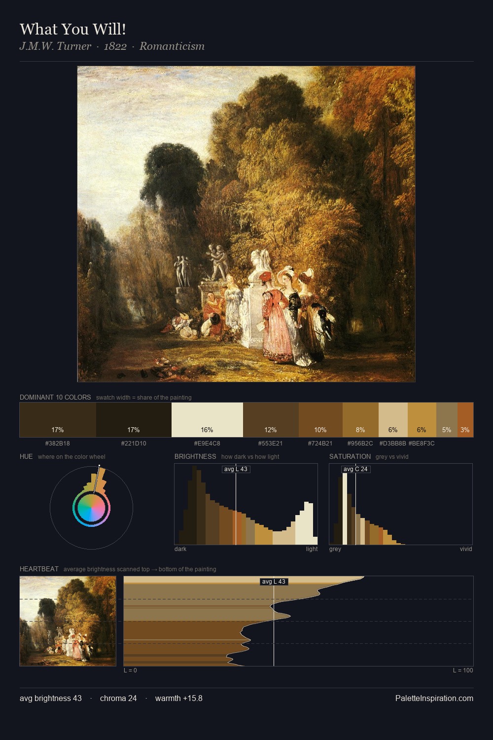
William Collins Palette 9

Palette Analysis
The value structure of William Collins is mid-key: quiet, controlled, and cohesive. William Collins tilts toward cool - blues and silver-greys carry the structural weight. The absence of saturated colour is itself an expressive choice: this is a palette of restraint and atmosphere. The saturated accent, #55391D, registers at 9.6% - sparse enough to feel like a deliberate surprise. Spanning 54 units on the value axis, the palette achieves the balance between tonal flatness and fragmentation. The palette has the character of outdoor light: cool, mid-bright, with colour rendered faithfully rather than expressively. William Collins's palette 9 carries its own internal logic while remaining in conversation with the artist's broader colour intelligence.
Example use cases
- theater design
- jewelry brands
- tobacco-adjacent retail
- event branding
- film & entertainment
I Love This!
Copy, export, or download for your project