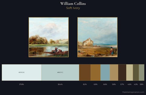
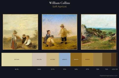
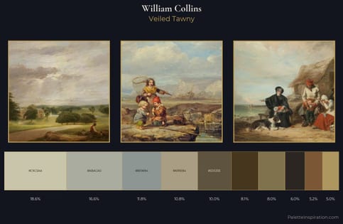
William Collins Palette 1
Palette Analysis
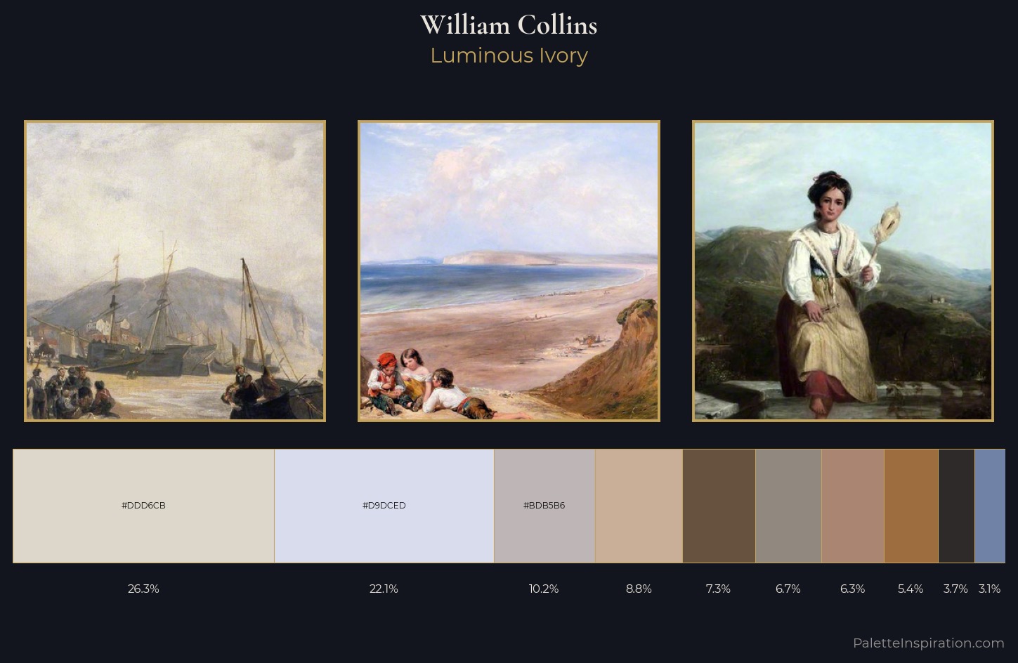
William Collins is strongly light-biased - shadow is suggested rather than declared. Neither warm nor cool has the upper hand here; the equilibrium between the two generates the palette's visual energy. Chroma is kept low across all colours, producing the soft, enveloping quality that characterises tonal painting. #DDD6CB at 26.4% of the palette: an overwhelming presence that pulls all other colours into its gravitational field. The saturated accent, #AA8572, registers at 6.3% - sparse enough to feel like a deliberate surprise. The value range spans 61 units across the palette, providing the full gamut from deep shadow to near-white and ensuring clear tonal hierarchy. This is palette 1 of William Collins's sequence - a single chapter in a chromatic story told across many works.
Example use cases
- ceramics & pottery
- boutique hospitality
- menswear
- heritage food brands
- craft & artisan brands
I Love This!
Copy, export, or download for your project