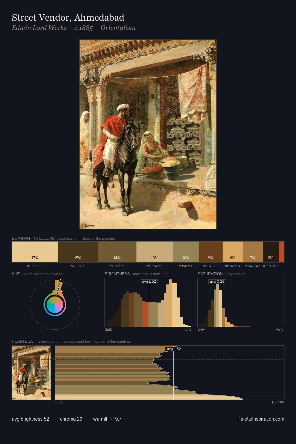
William Collins Palette 7
Penumbral Caramel
Penumbral Partial shadow - the transitional zone between light and full dark, soft-edged.
Caramel Warm mid-brown - the color of cooked sugar, smooth and amber-toned.

Palette Analysis
William Collins occupies the comfortable middle of the value scale, avoiding both extremes to hold the eye in a sustained middle grey. Yellow, ochre, sienna: warm hues that William Collins deploys as the palette's primary energy. A restrained, mid-chroma palette: every hue is present and legible, but nothing shouts. The saturated accent, #713D21, registers at 10.1% - sparse enough to feel like a deliberate surprise. At 62 units of value range, the palette has the tonal breadth to sustain complex spatial readings. William Collins's palette 7 carries its own internal logic while remaining in conversation with the artist's broader colour intelligence.
Example use cases
- film & entertainment
- fine dining
- spirits branding
- menswear
- theater design
I Love This!
Use This Palette
Copy, export, or download for your project
Copy, export, or download for your project
Copy:
Download:
Share: