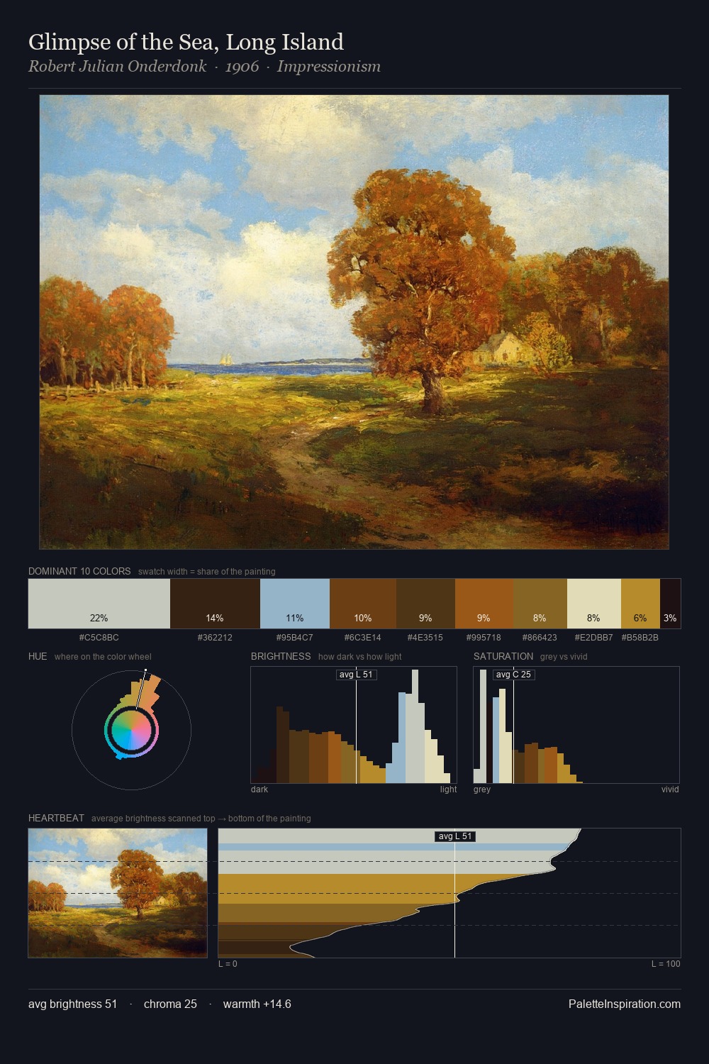
William Collins Palette 3

Palette Analysis
William Collins works in the upper reaches of the value scale, creating an atmosphere of brightness and expansiveness. A distinctly cool atmosphere runs through this palette: sky, water, and mist given colour form. A restrained, mid-chroma palette: every hue is present and legible, but nothing shouts. #DFD6A8 at 26.3% of the palette: an overwhelming presence that pulls all other colours into its gravitational field. #523B1C delivers the chromatic peak at only 4.2% - a small shot of colour with outsized visual impact. The value range spans 62 units across the palette, providing the full gamut from deep shadow to near-white and ensuring clear tonal hierarchy. The palette has the character of outdoor light: cool, mid-bright, with colour rendered faithfully rather than expressively. This is palette 3 of William Collins's sequence - a single chapter in a chromatic story told across many works.
Example use cases
- ceramics & pottery
- boutique hospitality
- menswear
- heritage food brands
- craft & artisan brands
I Love This!
Copy, export, or download for your project