William Collins Palette 2

Palette Analysis
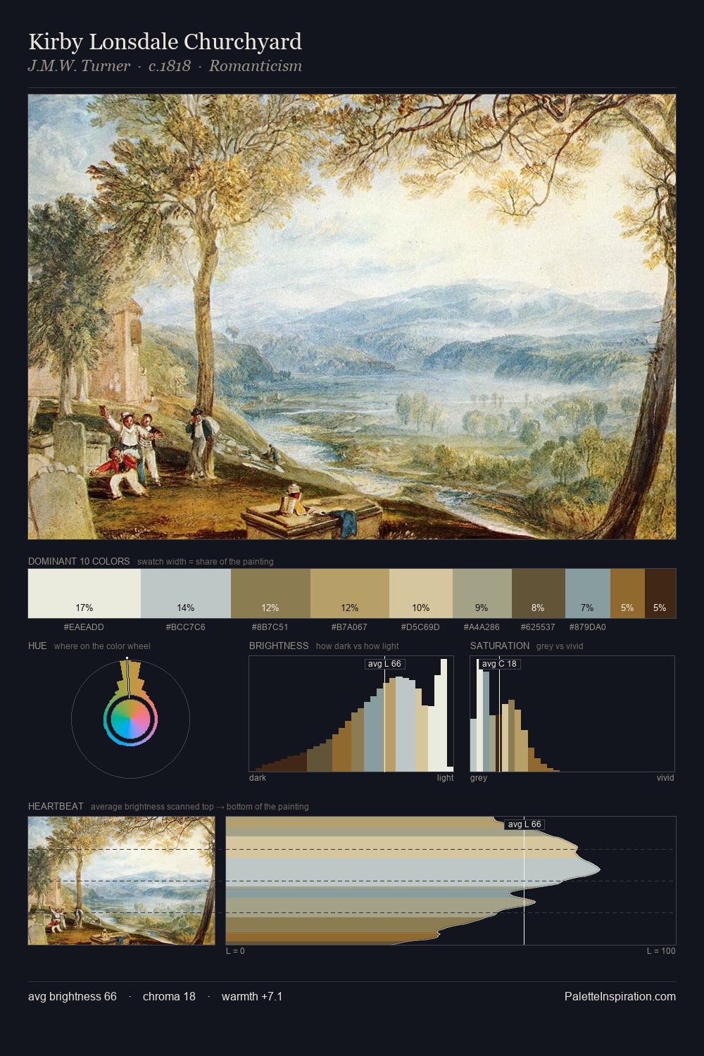
Light floods William Collins; the palette keeps values pale and airy across its range. Blues and teal-greys govern the palette, lending it an aquatic or atmospheric quality. Chroma hovers near zero; colour declares itself through subtle shifts in hue rather than outright saturation. A single dominant - #DFECEC at 27.8% - sets the character of the whole composition. At 5.7%, #3D2A1E carries the palette's sharpest chromatic charge: an accent that earns its place precisely because it is withheld. A value spread of 63 units gives the palette both depth and air - shadows are genuinely dark, lights genuinely light. The mid-to-high key, cool bias, and moderate chroma point to outdoor observation - sky and diffused daylight as the dominant light source. Palette 2 sits within the larger chromatic argument that William Collins's complete body of work advances.
Example use cases
- publishing
- corporate identity
- consumer apps
- hospitality
- design agencies
I Love This!
Copy, export, or download for your project