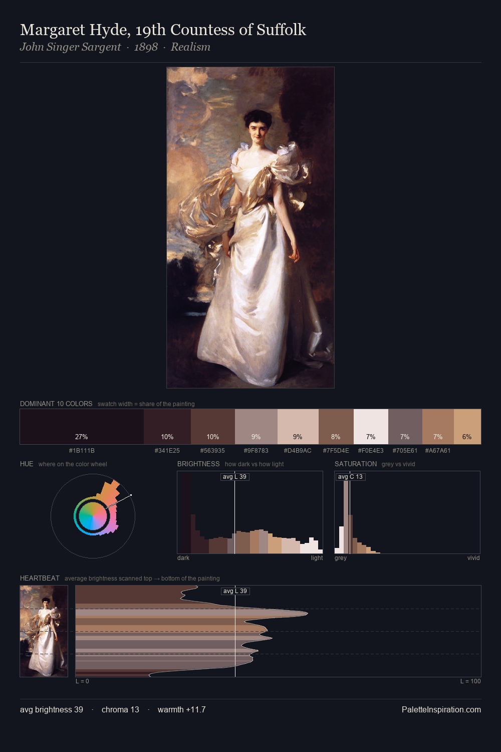
William Blake Palette 4

Palette Analysis
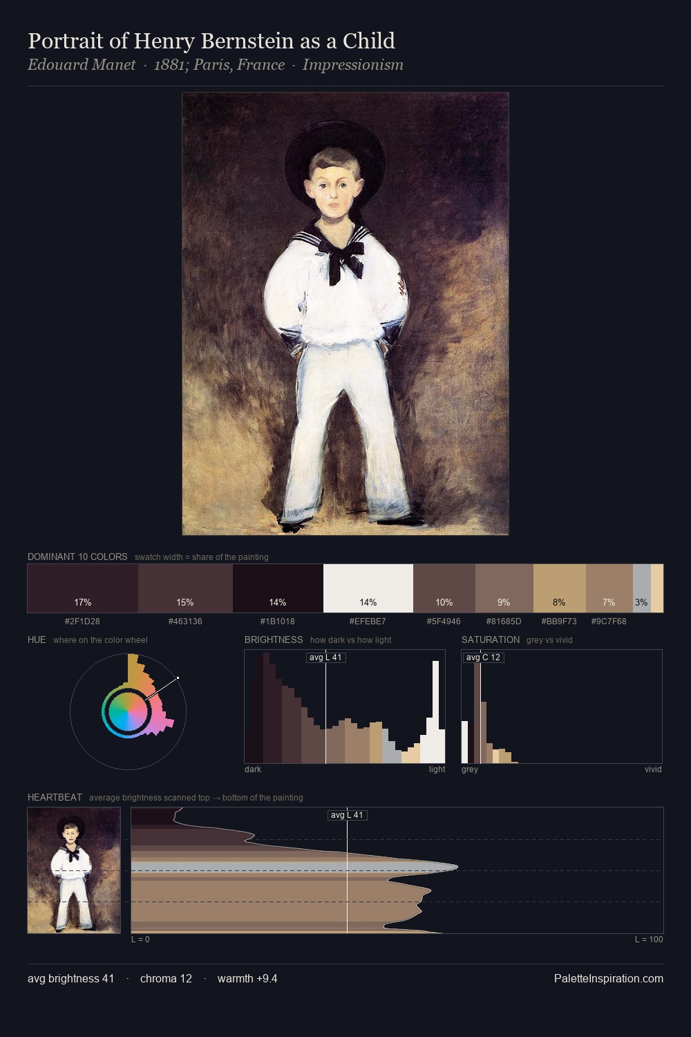
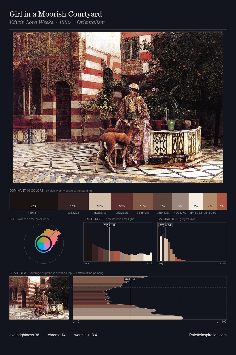
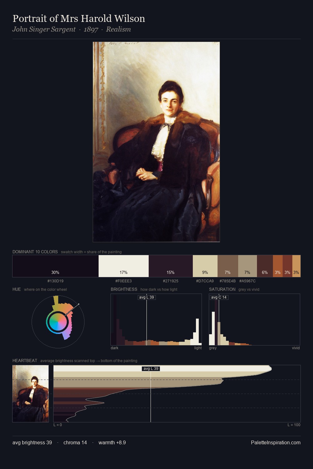
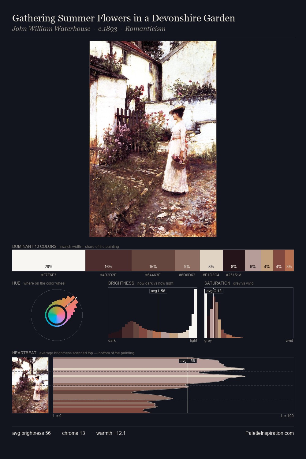
Light floods William Blake; the palette keeps values pale and airy across its range. Cool hues prevail: blues, greens, and greys anchor the palette's emotional temperature. Muted throughout, the palette achieves its effects through value and temperature rather than chromatic force. The dominant colour, #FEFEFC, takes 58.2% of the total area, establishing the overall mood before any other hue is introduced. #67353B functions as the palette's exclamation mark: highest chroma, lowest percentage (3.2%). The full value range is 84 units: broad enough to build convincing three-dimensional form. High luminosity and cool temperature suggest the plein-air condition: unfiltered daylight and open sky. This is palette 4 of William Blake's sequence - a single chapter in a chromatic story told across many works.
Example use cases
- publishing
- corporate identity
- consumer apps
- hospitality
- design agencies
I Love This!
Copy, export, or download for your project