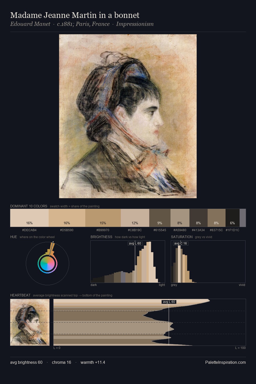
William Blake Palette 1
Soft Ecru
Soft Low-contrast, gentle chroma - mid-key values and low saturation, approachable and calm.
Ecru Unbleached linen - warm mid-neutral, slightly grayed, raw and natural.

Palette Analysis
William Blake is strongly light-biased - shadow is suggested rather than declared. Yellow, ochre, sienna: warm hues that William Blake deploys as the palette's primary energy. The absence of saturated colour is itself an expressive choice: this is a palette of restraint and atmosphere. #AF965D functions as the palette's exclamation mark: highest chroma, lowest percentage (2.3%). The value range of 53 units sits in the comfortable middle: enough depth, enough light, neither extreme. William Blake's palette 1 carries its own internal logic while remaining in conversation with the artist's broader colour intelligence.
Example use cases
- exhibition design
- foundation branding
- estate management
- art education
- museums & galleries
I Love This!
Use This Palette
Copy, export, or download for your project
Copy, export, or download for your project
Copy:
Download:
Share: