Willem Wissing Palette 4

Palette Analysis
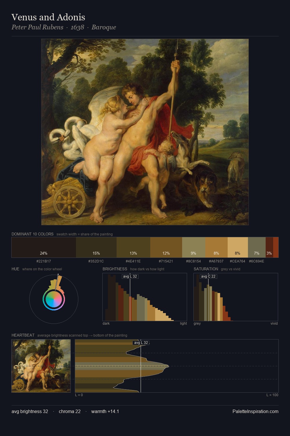
Willem Wissing works almost entirely in the lower half of the value scale, privileging depth over brilliance. Blues and teal-greys govern the palette, lending it an aquatic or atmospheric quality. Every colour is desaturated; the palette proceeds through near-neutrals and gently-coloured greys. At 31.4%, #40331A functions less as a colour accent and more as a complete atmospheric environment. The most saturated colour, #A4783C, is reserved to 1.2% of the surface, where it acts as a focal punctuation. 45 units of value spread create a palette that is varied but unified - contrast in the service of harmony. This tonal restraint is characteristic of the Willem Wissing approach: colour serves light, not the reverse. In the context of Willem Wissing's full range of palettes, group 4 represents one movement in an ongoing chromatic dialogue.
Example use cases
- theater design
- jewelry brands
- tobacco-adjacent retail
- event branding
- film & entertainment
I Love This!
Copy, export, or download for your project