Albert Herter Palette 5

Palette Analysis
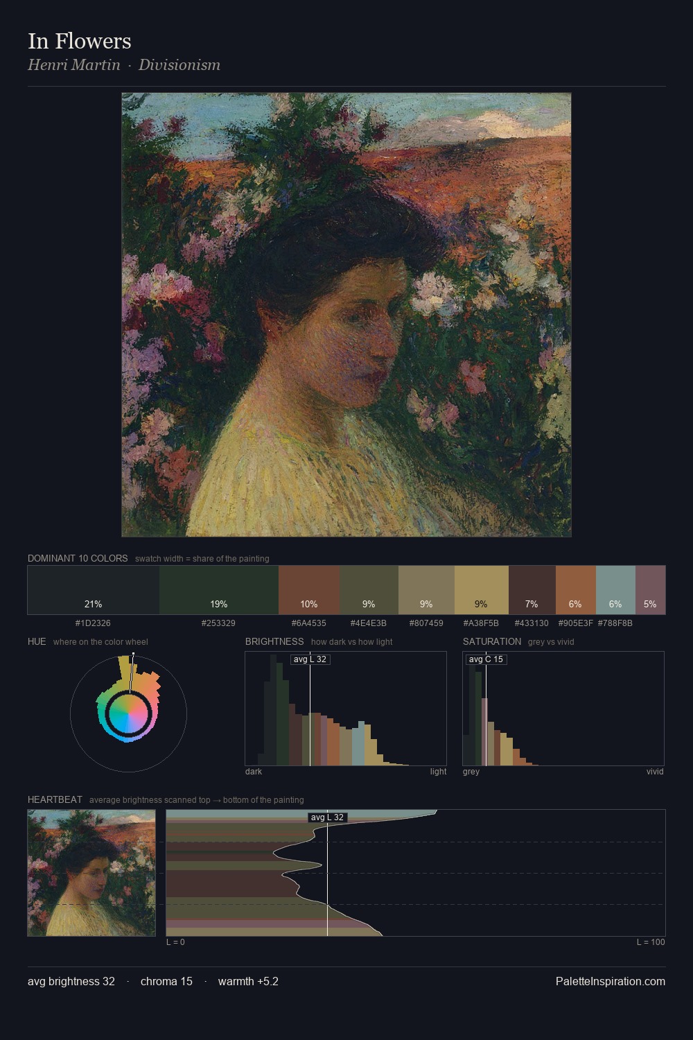
The palette of Albert Herter sits in the lower register of the value scale - dense, contained, and weighted. Warm hues command this palette; Albert Herter favours the reds, oranges, and yellows of firelight and earth. Saturation is deliberately withheld - the beauty here lies in the near-monochromatic gradations rather than colour difference. #2D2119 at 47.1% of the palette: an overwhelming presence that pulls all other colours into its gravitational field. The most saturated colour, #AA9A5F, is reserved to 1.4% of the surface, where it acts as a focal punctuation. Value range is moderate at 43 units - enough contrast for legibility, not so much as to fragment the tonal unity. This tonal restraint is characteristic of the Albert Herter approach: colour serves light, not the reverse. Palette 5 sits within the larger chromatic argument that Albert Herter's complete body of work advances.
Example use cases
- music labels
- luxury hospitality
- editorial photography
- leather goods
- premium streaming
I Love This!
Copy, export, or download for your project